
Frustratingly Imperfect Design Choices That Push Us To The Brink Of Madness
All of us get annoyed at different things. There are times when we’re eating lunch with someone and their loud chewing makes us weigh the pros and cons of an assault charge. Maybe you hear a baby crying loudly on a bus and want to take a long walk off a short bridge. But then, there are those tiny little inconveniences that almost everyone shares. Ever seen a car parked just enough in the adjacent spot that you can’t pull in? Yeah, that’s the kinda stuff we’re talking about.
Somehow, it’s the small things that frustrate us most of all! Since everyone’s a bit of a masochist, have a peek at this maddening list of design fails people have found that just grinds our gears. We know you want to.
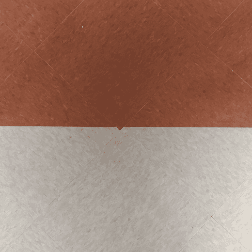
Geometric Mess
Our first stop on this tour of annoying things is this geometric floor pattern. Carpenters and other people who have to fit flooring get all of our respect because it is a pretty difficult task to do. We couldn’t do it!
That being said, we think that whoever created this floor pattern needs to go back to trade school. Just look at that huge mix-up in the middle — it is enough to make anyone go crazy! We hope that they fixed it.
Chandelier Problems
Here is another housing problem that annoys us. If you are rich enough to have a chandelier in your house or apartment, then you should count yourself lucky. They’re not for everyone as they can be pretty expensive, but they certainly look beautiful.
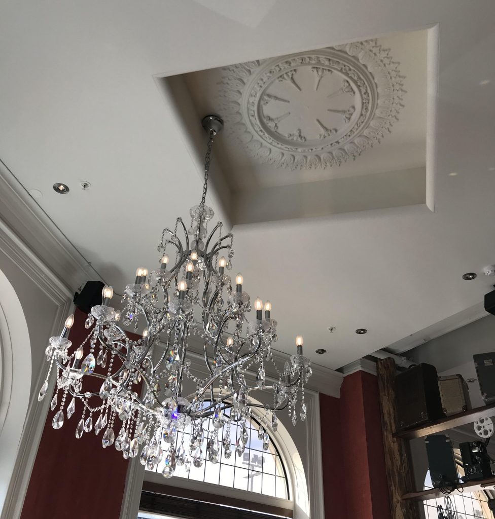
If we had to guess, we’d say that whoever owns this house is not feeling lucky at all. In fact, they are most likely very annoyed because of how badly it has been fitted into the wall. It’s not even close to the center!
Clean It Up!
We all remember the days of being in high school and having a teacher write things on the board. For some of us, we remember it being on a smartboard, whereas others may remember whiteboards — or even blackboards! However, one thing remains the same…
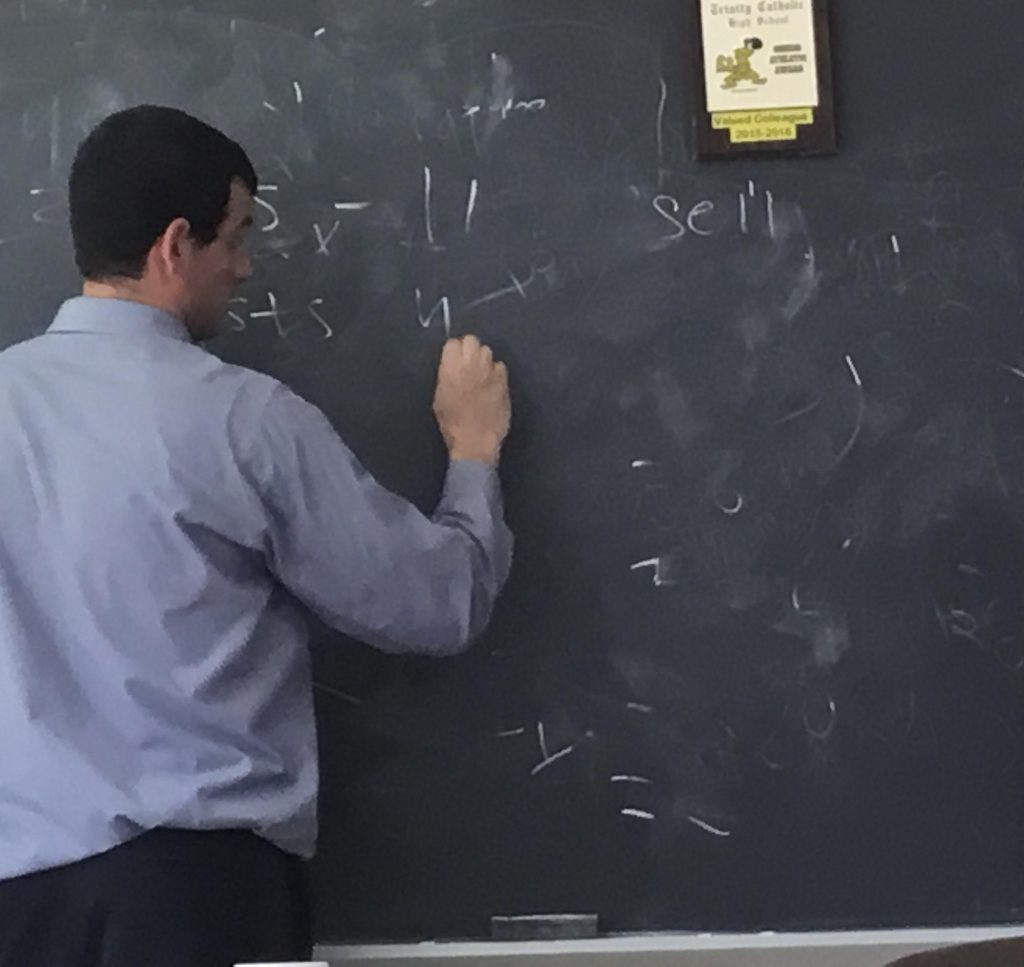
That is the fact that teachers never seem to clean the board thoroughly; they end up leaving behind parts of their writing! It just seems so annoying and lazy — you should try to clean it all up or risk facing the wrath of an angry classroom.
Air Bubbles
Whenever you open a new electronic device, there is almost always a thin plastic covering. This protects the device from any scratches before you get a chance to use it, and it is usually a pretty good idea. Well, most of the time…
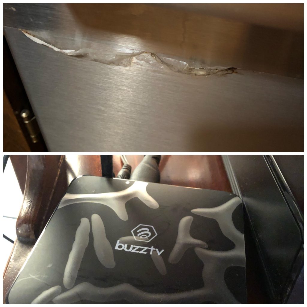
Just take a look at these pictures above — those protective covers are doing more harm than good! It feels so annoying because sometimes you can’t peel them off, so they seem to be stuck on there permanently. And don’t get us started on the air bubbles!
Dodgy Window
Now it is time for another example of building design that has gone wrong. We have no idea why it is so difficult to put these things in line with each other, but it really makes our blood boil to see it!

The most annoying thing about this window is that it is only slightly off the mark. It would not look too bad if it were entirely on the wrong side. But being so close yet so far is really annoying!
Light Bulbs
At least whoever put these light bulbs into position appears to have gotten one thing right — the placement of them. They seem to be relatively well-spaced apart from each other and in line vertically, which is a good thing. So what was the mistake?
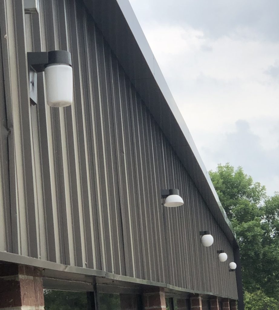
Well, there are two things here. The first is that they didn’t use the same lightbulb shape for each fixture. The second, and possibly most infuriating, is that they didn’t install them facing the same direction. Just look at that last round bulb. It’s upside-down!
Car Strip
Everyone is passionate about something. For some, it’s their car. They go crazy upgrading and customizing it, often with paint jobs and personalized flair to match their vibe. Well, this person should have put in a bit more effort when styling their car…

Here we have another case of “so close, yet so far” with the black stripe on the car’s hood. It is ever so slightly out of line with the car’s logo on the front, which gets us feeling kind of annoyed!
Wrong Door
Here we have another example of building construction gone wrong. This time, we are not even sure how this problem began as there are so many mistakes with the house. To start with, the steps to the front door are entirely off-center.
If that was not enough, it seems that they decided to fit some windows around the entrance, but they are all different sizes. The one on the top of the awning does not match the others, and the bottom one is missing part of the shutter. What a disaster!
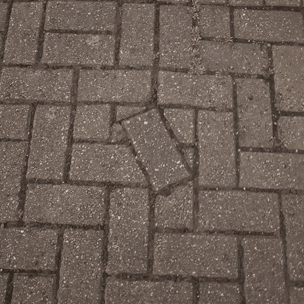
Out of Place
Some of the most annoying things in the world are the things that could easily have been fixed or avoided altogether. Take this brick, for example. Someone was either really lazy or really bad at their job for this to have happened.
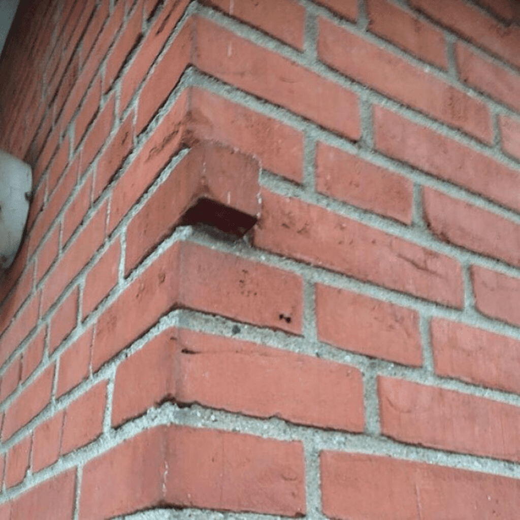
Had the builders planned ahead, they could have avoided this mistake completely. But, for some strange reason, they decided that the best thing to do was to leave it sticking out. That is most definitely a safety hazard right there!
Comic Conundrum
Comic book covers are notoriously creative and colorful, whereas the spines are more sleek and plain. This simplicity makes it easy for people to find which series or volume they’re looking for. That’s why it bugs us so much when they’re not well organized.
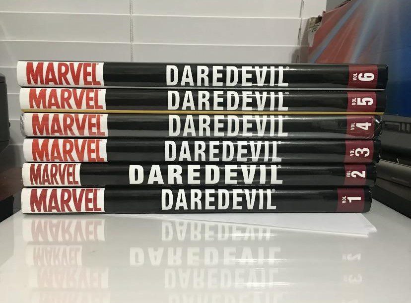
Just how on Earth did Marvel let this happen? Was there a problem with the printer when it was produced? The only thing that consoles us with this mistake is that Daredevil himself will never know that they messed up his comic book design.
Computer Screen
Society isn’t black and white, but it does seem that there are only two categories with computer users: those with a lot of desktop files and shortcuts and those with virtually blank backgrounds. Even if you’re in the former category and aren’t annoyed by a cluttered desktop, we’re sure you’ll still find this annoying.
Check out that one tiny gap on the right side of the screen of the page — it is so annoying! It seems that the owner wanted the astronaut to fit in there, but they just missed out. At least it is a relatively simple fix.
Yellow and Orange
Here’s another example of how not to design a pathway. We think that whoever made this mistake needs to be fired — seriously. This mistake has to be something that they must have done deliberately. There’s no way it’s an accident!
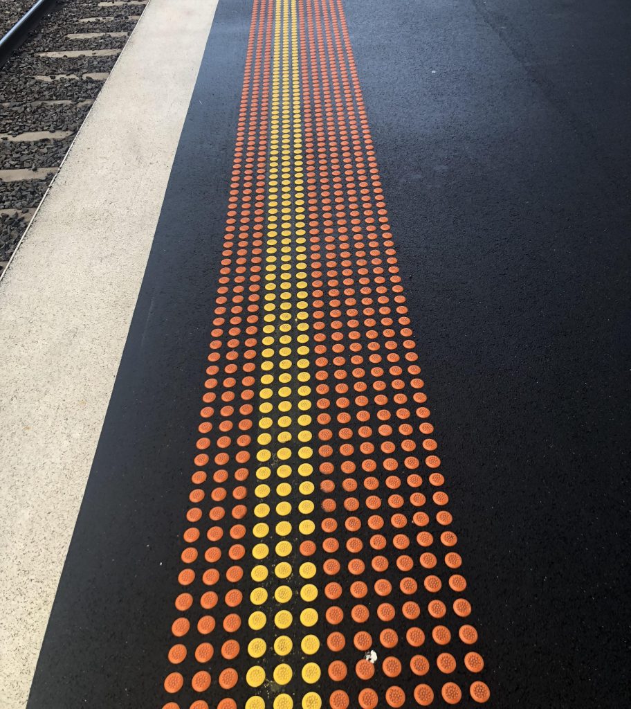
All of the dots in that line are yellow, apart from one. This is clearly not a case of them running out of paint since the rest of the dots are perfectly fine. Someone did this on purpose just to annoy us!
Repaving
If you live in a city, you will surely know the struggles of driving on roads with plenty of potholes. It feels like they are everywhere, and they always make the car journey uncomfortable. Although it may be safer, this picture feels so much worse.
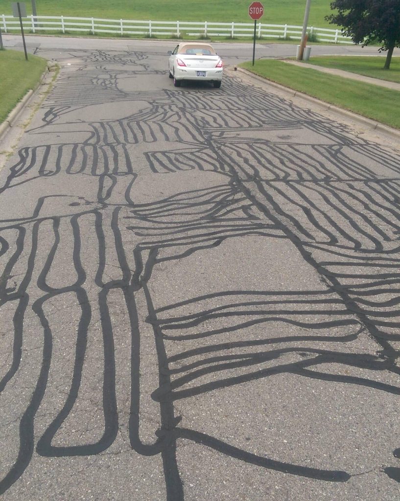
Honestly, there is absolutely no point in continually repaving the road over and over if it ends up looking like this. It makes the road seem like a mess — you might as well just repave the whole road instead.
Red and Green
In most places in the world, red and green are associated with a few things. In traffic lights, for example, they are stop and go respectively. The same goes for on and off switches, with the former being off. Well, apparently, not everyone got that memo…
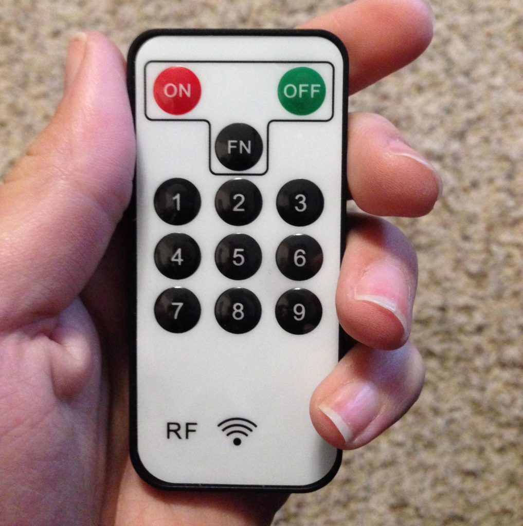
Whoever designed this remote made a huge mistake with the colors, as they made the “on” button red and the “off” button green. That just seems so wrong and pretty confusing too. We do not understand why anyone would do this!
Pipe Problem
We have no idea how someone created this problem in the first place, but we do know that it is pretty darn annoying! If they took a bit more thought and care, the pipes would have been installed along the wall, rather than becoming clunky railings.
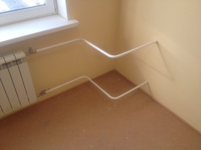
We have to assume that some structural issue prevented the builders from placing the pipes correctly. Or maybe it’s still a work in progress, and the person who posted this picture just came at a bad time. Either way, this is lazy workmanship and a complete waste of space!
Manhole Mystery
Why are there so many paving mistakes on this list? We honestly have no idea why. Surely it cannot be that hard to put in the tiles at the correct angle and direction?! It really is such a mystery why so many people make these mistakes!
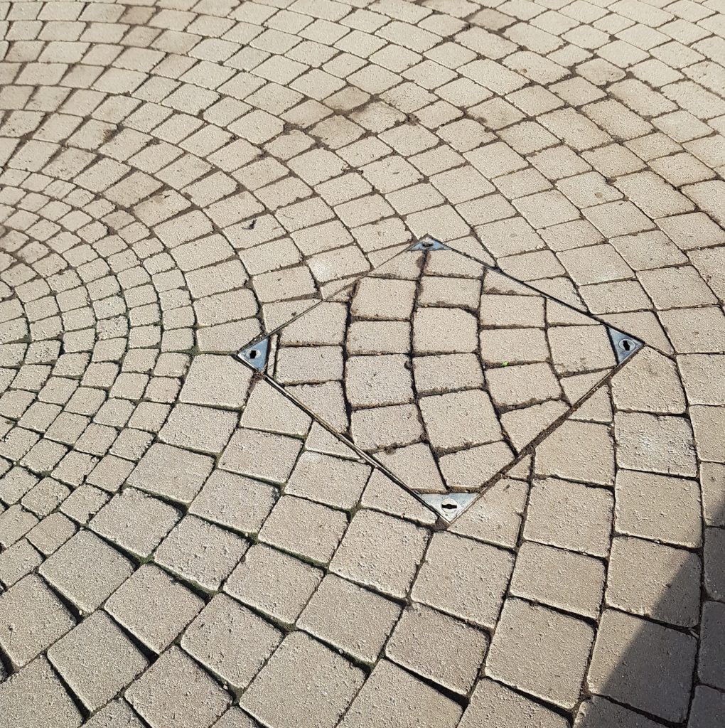
We’re willing to give the architect a break with this one. It seems that whoever was responsible for replacing the manhole cover didn’t care how they put it. That’s almost worse because it is such an easy task — at least, in comparison to constructing it in the first place.
Plain Lazy
This next building has so many problems that we genuinely do not know where to begin. You shouldn’t need to look too closely in order to spot the biggest issue. No, we’re not talking about the missing fan unit on the right…
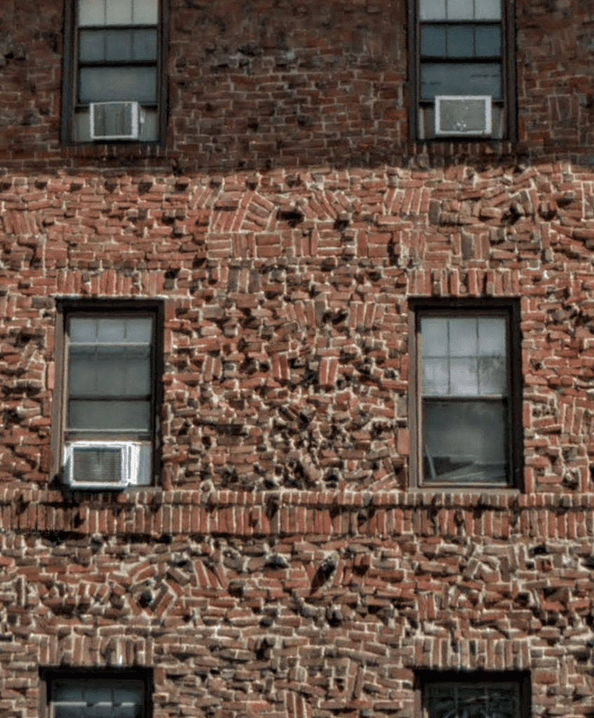
The bricks are all over the place! Is this even safe? It looks like the bricks could fall out at any minute and send the whole thing tumbling down. We hope that this laziness is only for the facade of the building and that the structure is more stable than that.
Blocking the View
The next entry on this list is something with a relatively easy fix, but that does not make it any less annoying. This user’s mother always insists on putting lots of things in front of the television set. Have a look…
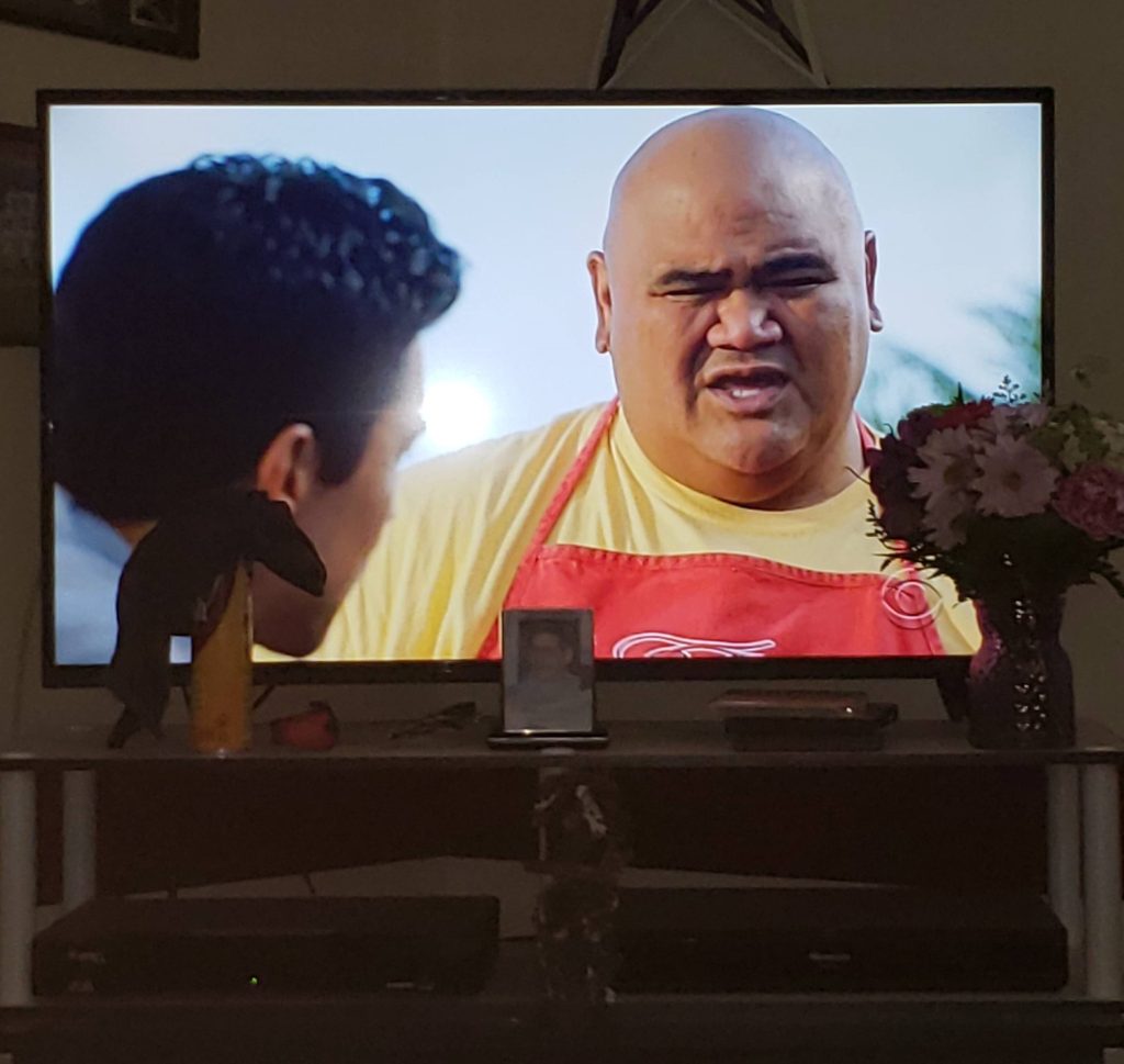
That is — if you can. All of those flowers, pictures, and other things are blocking the view of the television screen! There must be someplace else for her to put these things that don’t block the screen. That’s what coffee tables are for, after all.
Poor Papercutting
Did you know that fortune cookies aren’t part of Asian cuisine? Even though we feel lied to about their origin, we still love to crack them open. There’s just something so nice about seeing what the future has in store for us…even if we don’t entirely believe it.
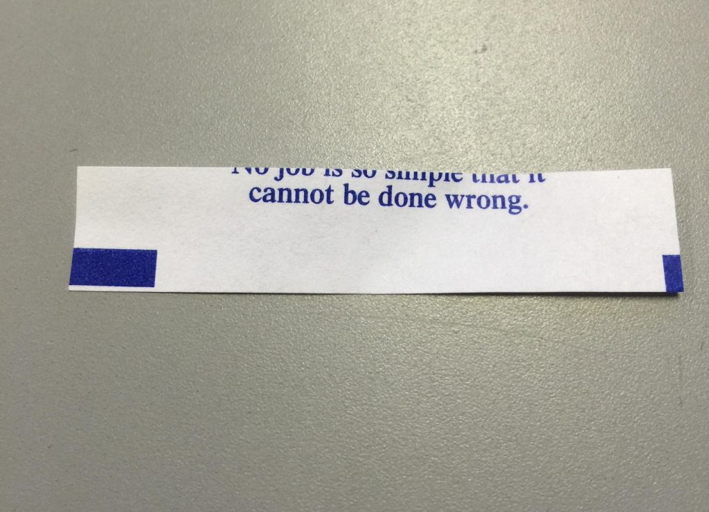
Well, this is certainly unfortunate (get it?). It’s annoying for sure, but we’re too busy laughing at this one. The message that’s cut off is just too perfect. Maybe whoever wrote that fortune should take a moment to reconsider, don’t you think?
Off the Hob
Electric stoves are all the rage in many places because they are relatively easy to install and can save you a lot on your gas bills. Unfortunately, it seems that they can cause a lot of anger and frustration, too!
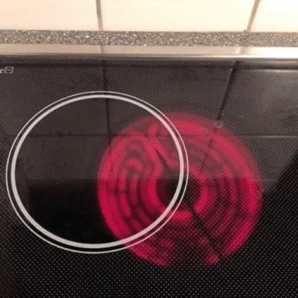
Take this hob, for example, where the outline of the stove is entirely off-center from the actual heated part. Just how is a mistake like this even made? This is infuriating and also a hazard. Hopefully, the homeowners were able to exchange it for a centered one.
Banister Blues
If you are assembling a house, you need to have a keen eye for detail. If you don’t, then you could be responsible for mistakes that end up on lists like this. The off-center chandelier was bad, but this is even worse.
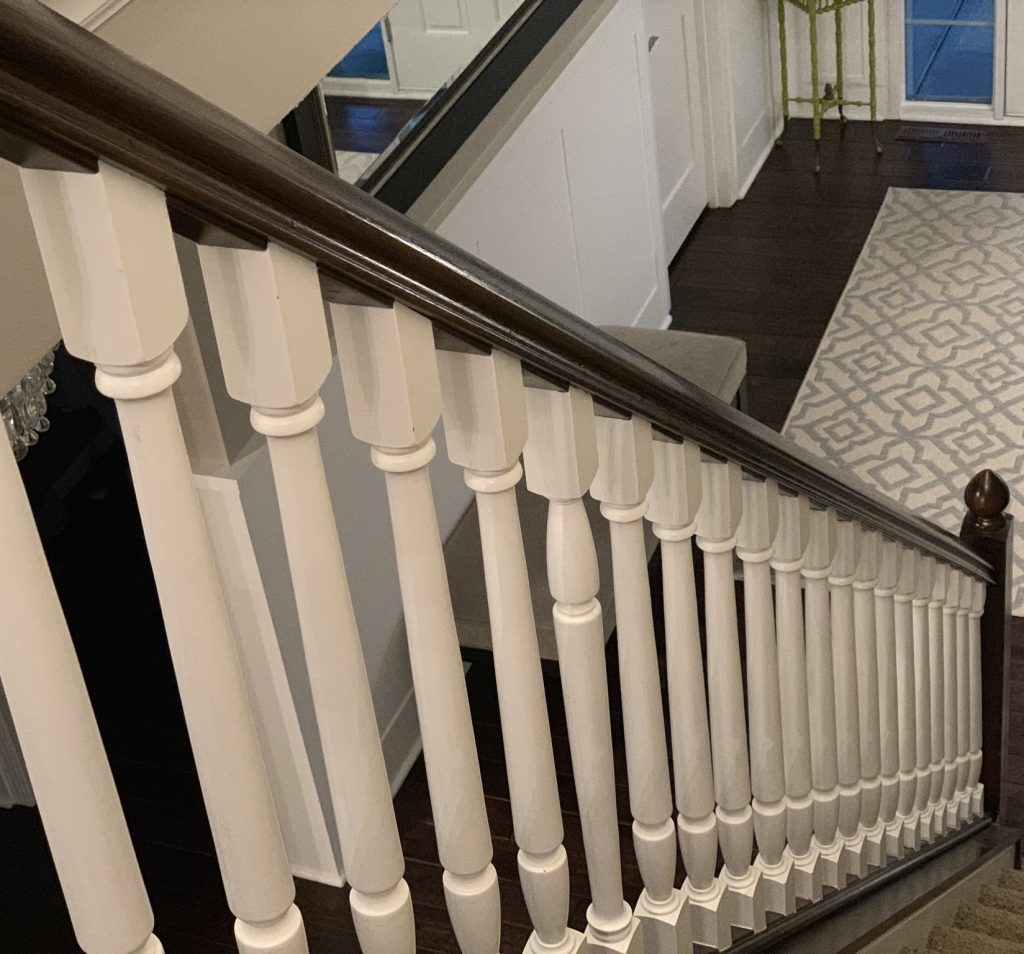
It is clear that whoever was putting this banister together did a rush job. That is the only explanation we can think of for a disaster like this to happen. How did they put that single column upside-down like that?
Pizza Slice
No matter where you are from in the world, we can all agree that there is only one way to eat a pizza, and that is to cut it into slices. If it’s a round pizza, then the classic isosceles triangles are a must.

Unfortunately, it seems that not every person got the memo, as you can see in the picture above. What even happened here? How did someone manage to cut this pizza into rectangles and scalene triangles? And why did it make it onto the advertisements?
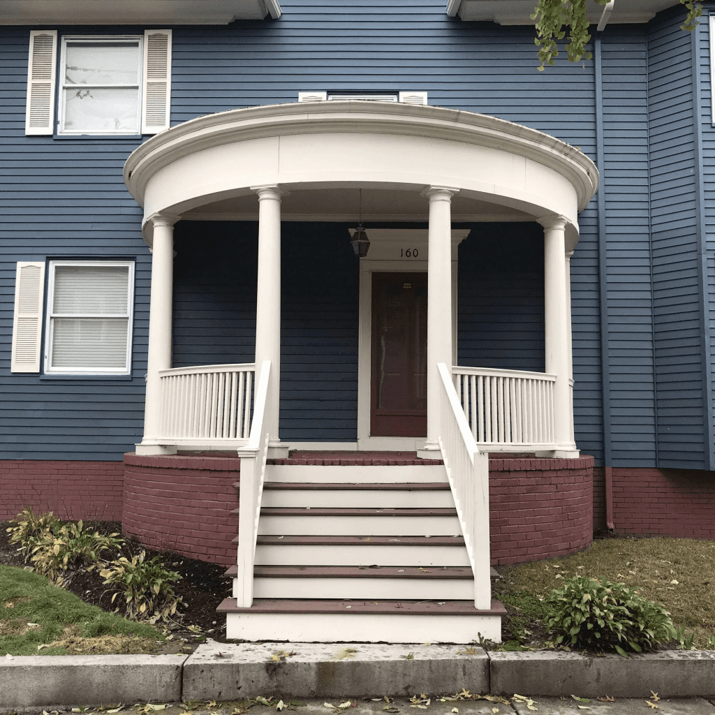
Off-Centered Door
As we’ve seen before, when building a house, mistakes can be made both inside and outside. Previously we saw a door off-center with the stairs and porch doorway. Well, the architect must have worked on several houses. As you’ll see below, the door is ever so slightly off-center from the awning.
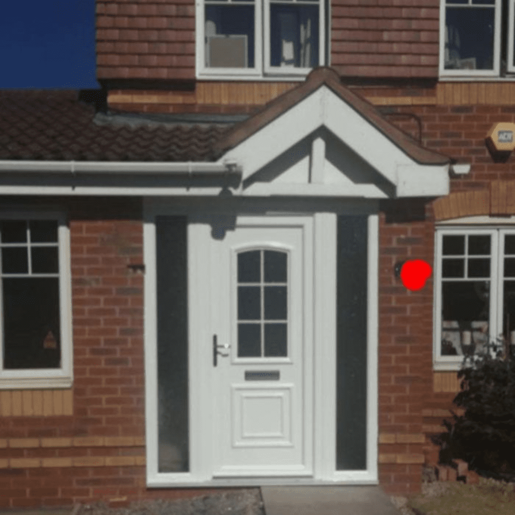
And is that walkway also out of line? If this was our house, we’d be cringing every single time we got home. We hope these poor homeowners got it fixed for free because this mistake was one hundred percent the fault of the architect.
So Close
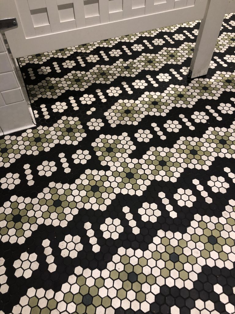
Our next mistake is only for those with a really keen eye. It might not be as easy to spot at first glance as some of the others on this list, but when you do, it is sure to get your blood boiling. Take a good look at the hexagon in the middle…
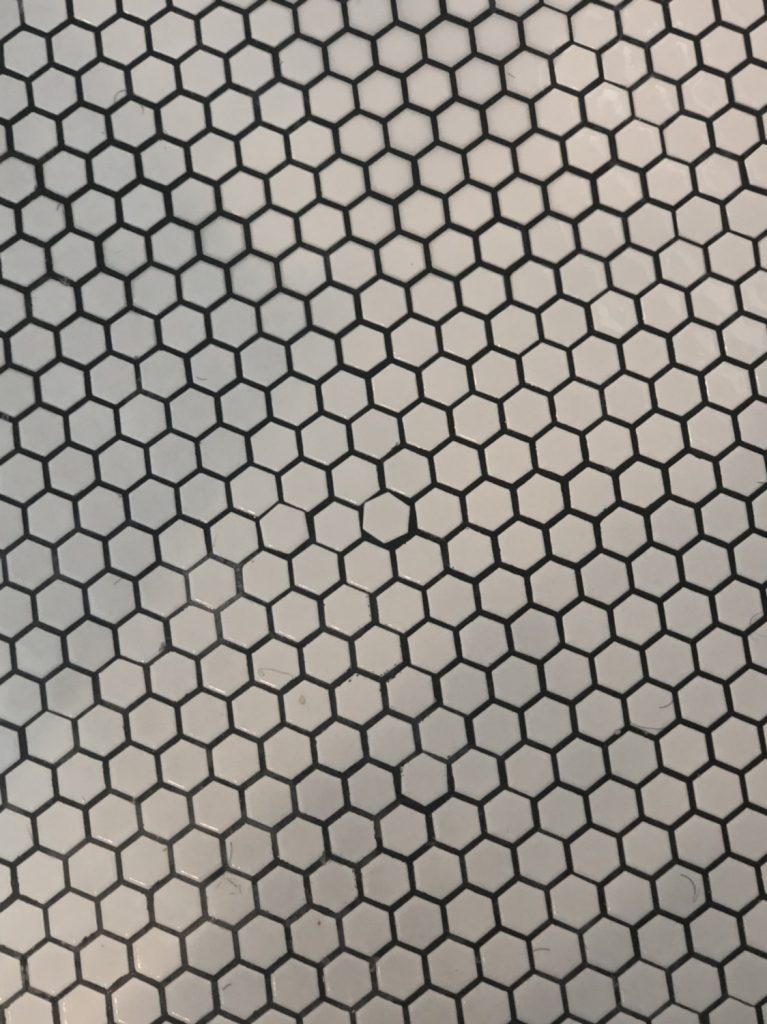
It is just so very slightly tilted at the wrong angle. Once you notice it, you won’t be able to unsee it — how frustrating is that?! Do you think the person who did this even noticed their silly mistake?
Door Handle
Honestly, this mistake is so ridiculous. We have a few ideas on how this could have happened, but at the end of the day, there’s no good excuse for mismatched door handles. At least, not with a glass window where you can see both of them at the same time.
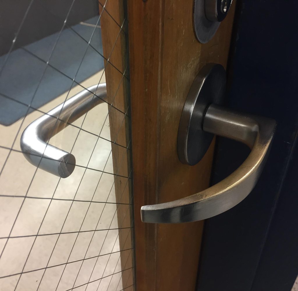
Maybe one side broke off, and they needed to replace it. Or perhaps there weren’t two of the same handle design at the hardware store. We are at least glad that they used the same type of handle. If one side were a knob and the other a long handle, we’d absolutely lose it.
Chocolate Conundrum
Mistakes made by companies are even worse because many people had to approve of a design or style before it was put into production. Take Lindt chocolate, for instance. The marketing department was apparently feeling lazy when they came up with the names.

“Intense” is a good word to describe flavors, but what bothers us is that they don’t use it consistently. Intense orange, intense mint, and raspberry intense? How did they miss this? Or did someone mention it but just not care?
Look Up
The next entry on this list is only something that you will probably notice if you look up right next to this building. If you look straight on, you may miss this glaring mistake. This pedestrian was just unlucky enough to have looked up.
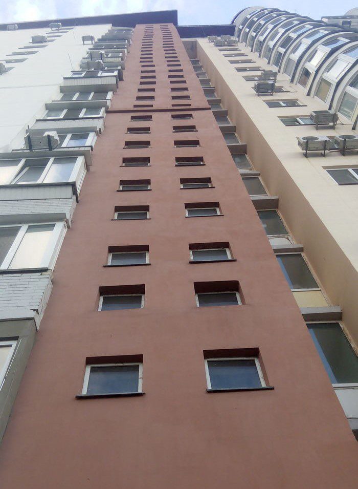
In case you don’t know what we’re referring to, look at the windows. It makes us dizzy looking at it. With the windows not in-line with each other, it feels like the building is swaying. To make it worse, some of the lower ones aren’t even spaced the same as the ones above.
1, 2, and 3
While there are debates on what is the most difficult language to learn, some have said that English is the hardest because of all of the complex grammar rules. If English isn’t your native language, it’s understandable if mistakes are made.
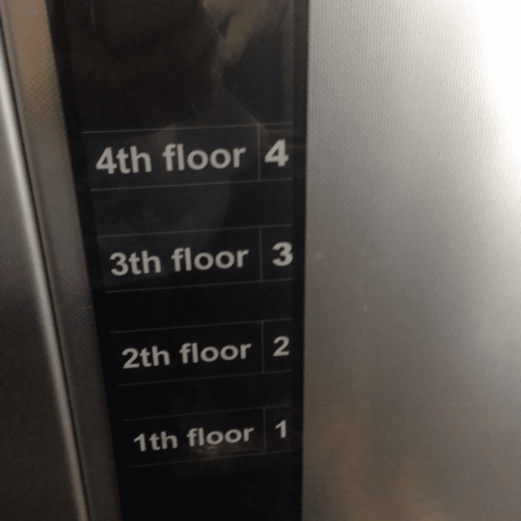
But that doesn’t make mistakes like this any less annoying. Whoever was designing the floors for this elevator must not have a good grasp of the English language. Either that or they were copy-and-pasting “th floor” and forgot to adjust for 1, 2, and 3.
Pointy Problem
It seems like there is no end to floor tile mistakes. Is it really that hard to keep things in line when laying down tiles? Surely this error could have easily been avoided. This one is so frustrating because it’s just a small section.
At least once they made this mistake, they could have done the right thing and painted over it — but no! Perhaps they felt particularly proud of making such a huge mistake and decided to keep it there. If it were us, we would certainly not be happy!
Why, oh why?!
There are some mistakes on this list that are almost understandable, and we can see how easy it would have been for someone to make these errors. Our next one is not one that we can understand, however, as it is pretty odd.
There does not seem to be any reason why this random block sticks out further than the rest of the wall. Our only thought could be that maybe there is something structural under there that couldn’t be moved. And what’s worse is that the lighting makes the top of it look like a different shade of red.
Copy and Paste
Whoever created this room must have thought that they were in a video game or something. The uneven spacing just isn’t normal, and it makes no sense. And why did they need to put so many lightbulbs, anyway? Do they not understand how light works?
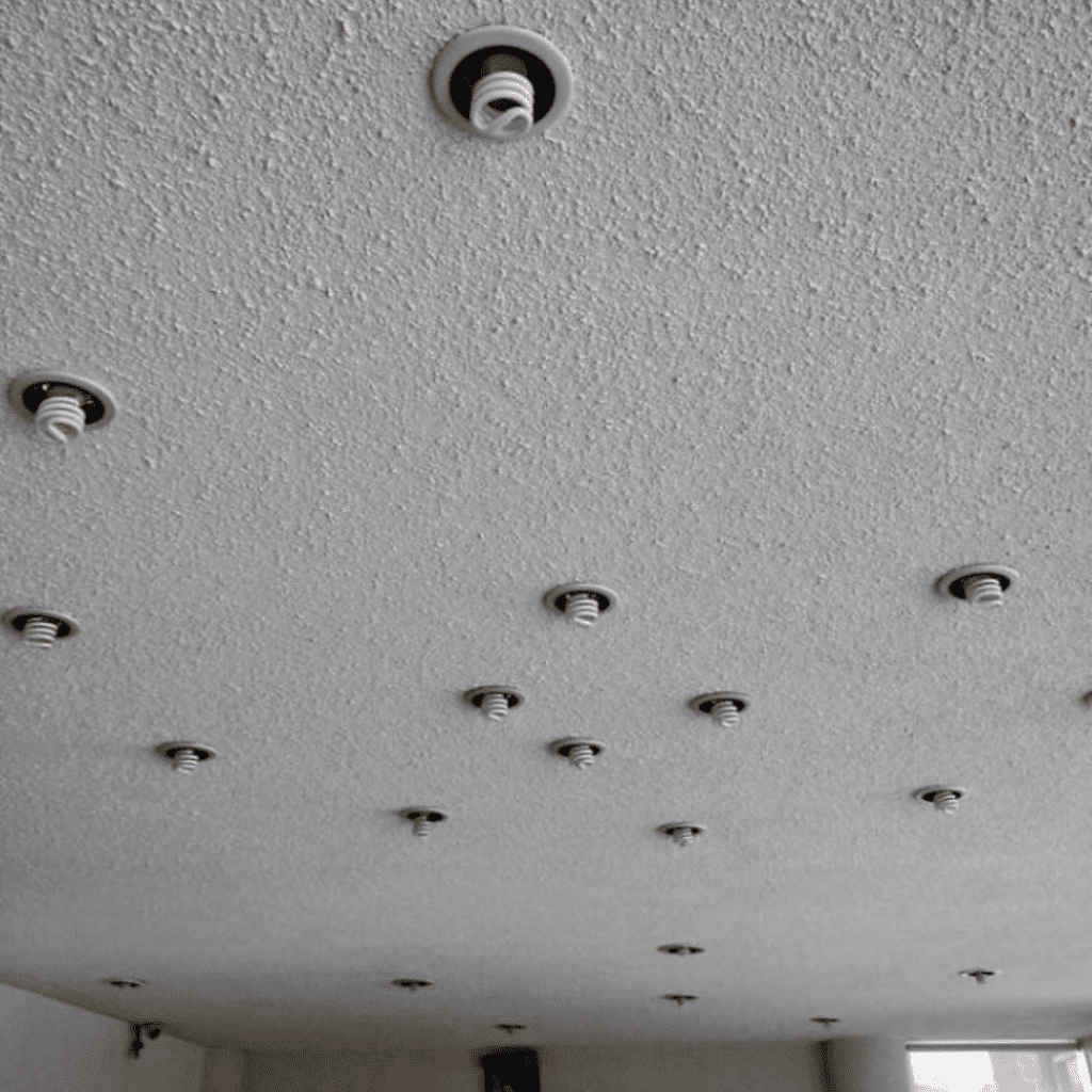
There doesn’t appear to be any rhyme or reason for why they have stuck the bulbs into such places. We can only think that this builder must have been pretty angry to make something as strange as this room. Hopefully, those are energy-saving bulbs otherwise the power bills will be through the roof.
Unnecessary
Honestly, the worst part of our next mistake is not the mistake itself but the fact that it is so unnecessary and avoidable. The brick in the center is entirely at the wrong angle, and it does not even need to be there.
Just look at the bricks underneath it — they would have been perfectly fine without this odd brick right in the middle. We really cannot think of any reason why someone would have done this on purpose. We hope it was a mistake!
Wonky Door
This next mistake is dizzying and confusing. The garage door itself is perfectly straight, but why is the building itself leaning to the side? Did something happen to knock it off-center? Or is it just a poor design, and it’s falling apart?
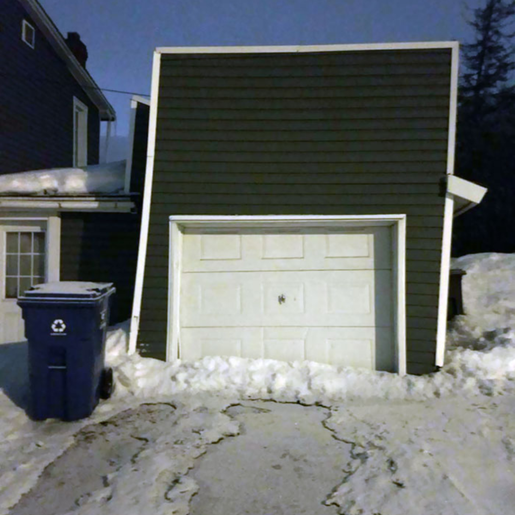
The whole building needs to be shifted slightly for this mistake to go away, so we cannot blame the people who put in the garage door. The building itself is what we have a problem with. Hopefully, the homeowners see to it before the garage collapses in on itself.
Hole in the Wall
Most of us will have visited a tourist place before with one of these photograph frames, where there is a hole in the frame. This is where you put your face for a funny photo — or at least, you are supposed to!

If you somehow ended up going to the place where this frame was, then, unfortunately, you will not get a good photo. Whoever made this frame had just one job and did it terribly. Was it really that hard to cut out a space in the right area?
L L V E
Car stickers have been popular for almost as long as people have had cars, and we understand why people get them and decorate their cars. They are a simple and easy way to show your personality to other drivers. But for some, it might not be a compliment…
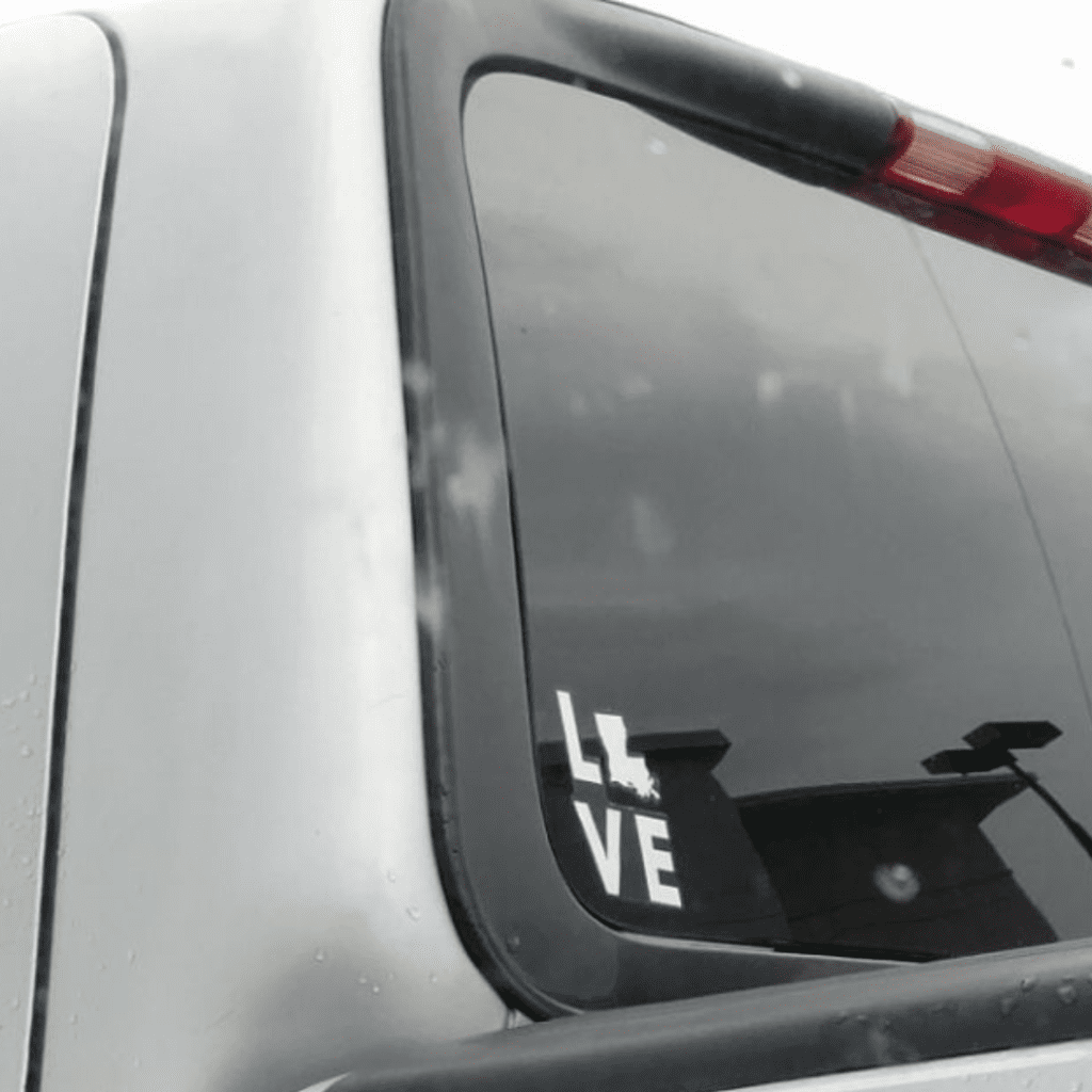
According to the Redditor, the car owner is displaying their love of the state of Louisiana. Whoever designed this sticker either doesn’t know how to spell or didn’t think about the shape of the state. Didn’t they know that Louisiana is the perfect shape for the L spot?
Dividing Wall
Our next entry seems to have been taken at a school, so we can imagine that there must be a ton of students who noticed the mistake in this picture every day. The teachers also probably cringe whenever they walk down this hallway.
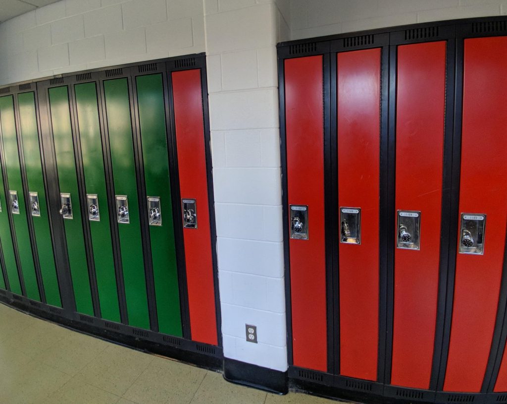
Again, this is another mistake with a really simple and easy fix — just paint the locker green. That way, nobody will ever notice that the red one is on the wrong side of the wall. It is really not difficult at all!
Silly Squares
We are really struggling to wrap our heads around the next mistake, as we do not understand how someone could have done this. We hope it was just a computer error or something that made these squares diverge. Or perhaps it was an error with the printer?
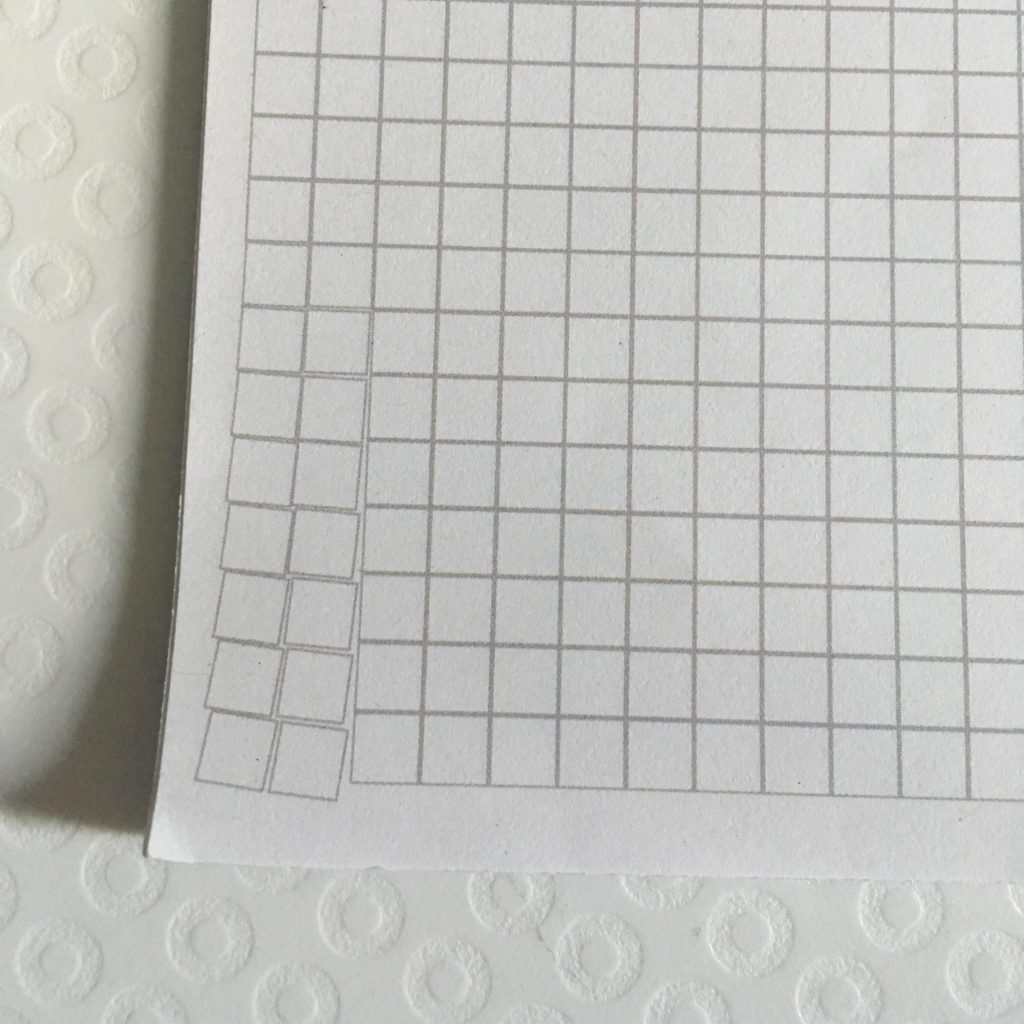
After all, how else can you explain such a glaring mistake like this?! For this user’s sake, we just hope that this mistake was only on this page and that all the other ones were okay. Otherwise, it would be pretty annoying!
City Layout
We have already seen quite a few houses with mistakes on the outside, as well as some other buildings with obvious architectural errors. But it seems that city planning needs some work, too, judging by this next picture! It shouldn’t be too hard to see what we’re referring to.
We truly cannot understand how anyone could make a mistake as significant as this one. All the houses in the middle section are completely out of line with the others. This is such a huge mistake that it cannot have been an accident!
Urine Trouble
Here is another picture that will simply have you asking, “why?!” Urinals in male bathrooms can be pretty disgusting. Still, this entry definitely takes the cake for being the most annoying bathroom. Have a look at the urinal in the middle…
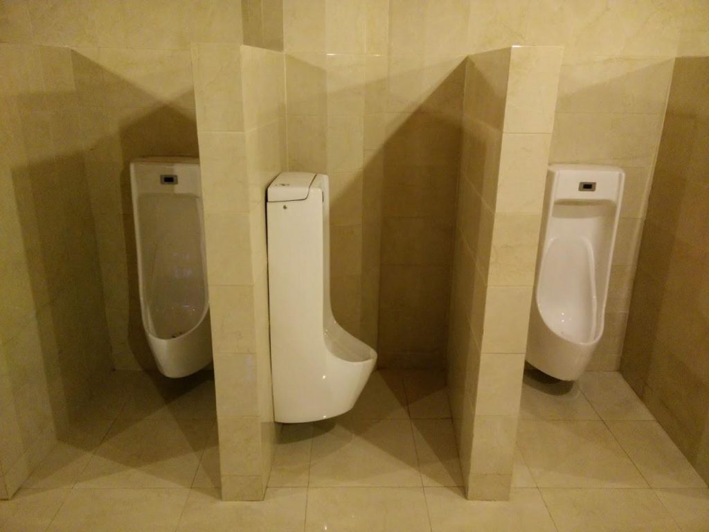
What even is the purpose of installing a urinal facing sideways? It must be uncomfortable for whoever uses it, or just whoever walks by and sees the odd placement of it. Perhaps there was a plumbing issue? We can’t think of any other good reason why it’d be placed like that.
Laziness
The next entry on this list just speaks of pure laziness, as whoever put these tiles down did not even try to put them in a line. They must have just shoved them on the floor and finished the job as quickly as humanly possible.
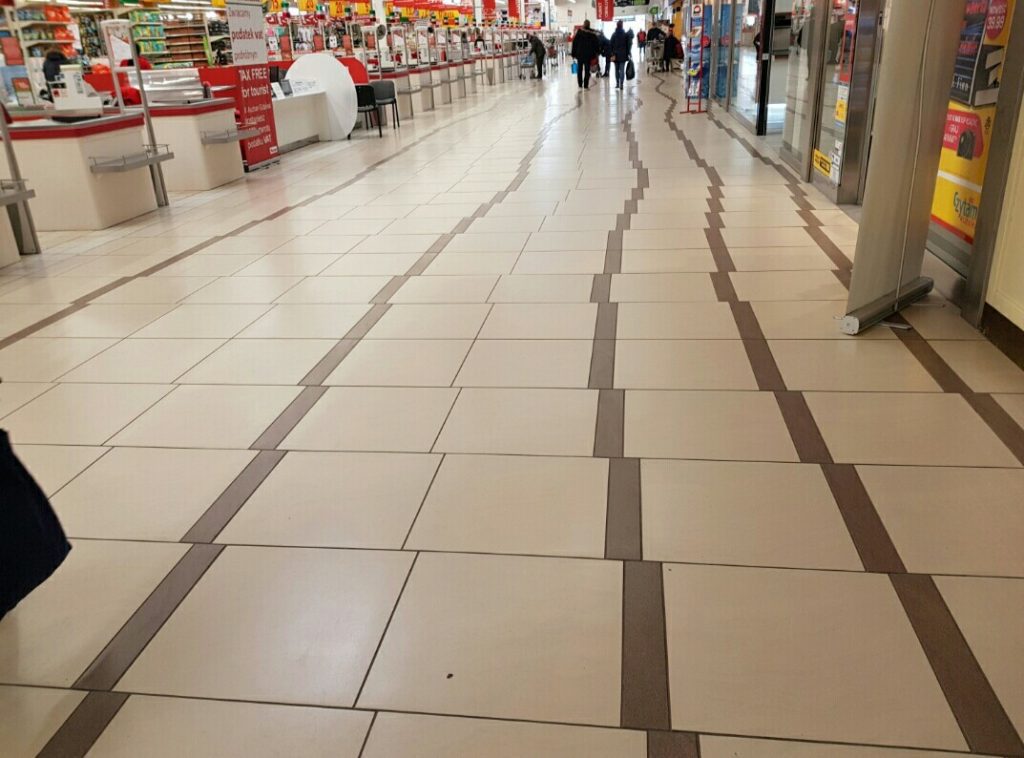
There are a few of them that appear to be in the right position, but we reckon that this was a complete fluke. There is no way that the original worker was actually trying to align them correctly — the ones that are correct are a mistake in this instance.
Dodgy Die
Did you know that the singular version of dice is actually called a “die”? Well, you might feel like doing just that when you look at the next picture here. Have a look at the dot that should be in the center.
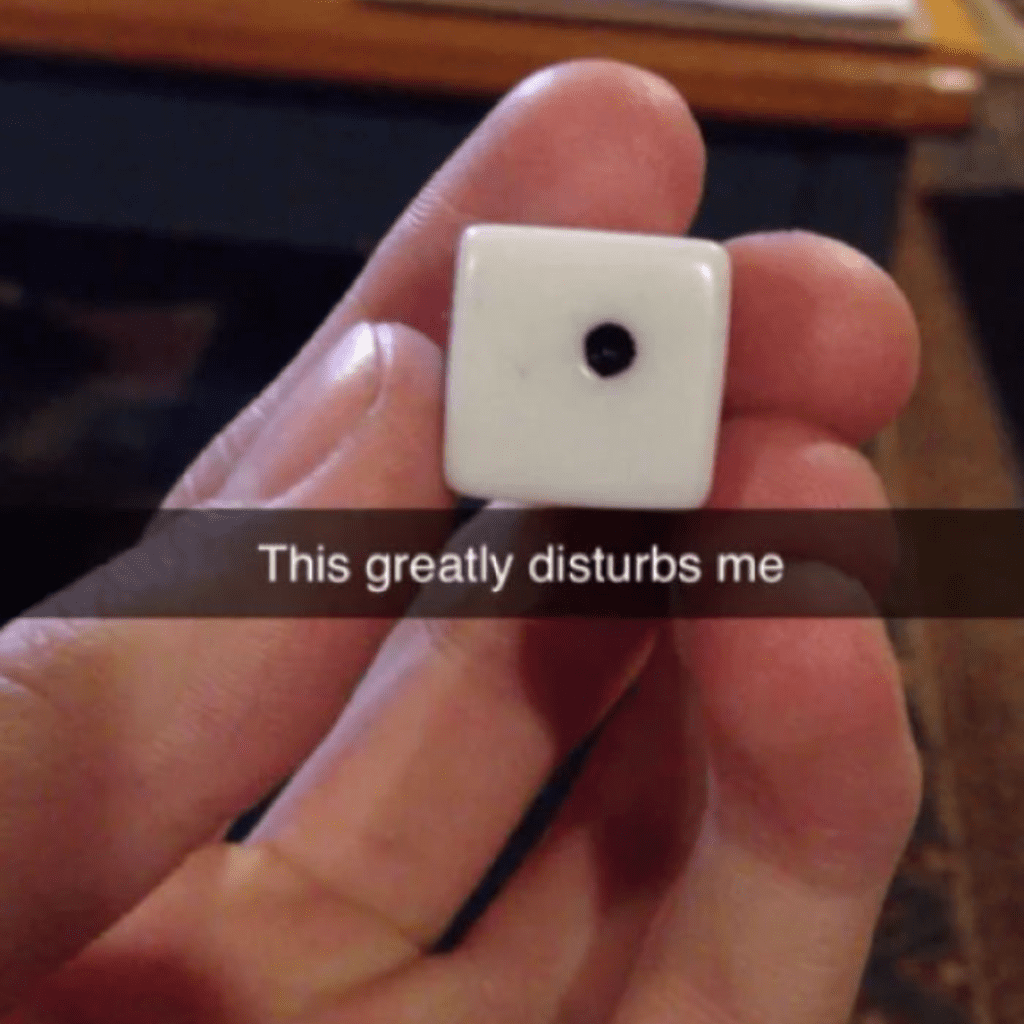
Instead of being a slap bang in the middle, it is just ever so slightly to the side. This is surely enough to drive anyone mad and make them want to stop playing. All we can say is that this D6 is a critical fail.
Letter Boxes
If you work in an office or live in an apartment building, then you are probably familiar with these letterboxes. Each office/apartment has its own designated box so that no one gets their mail mixed up with their neighbors. It seems simple enough, right?
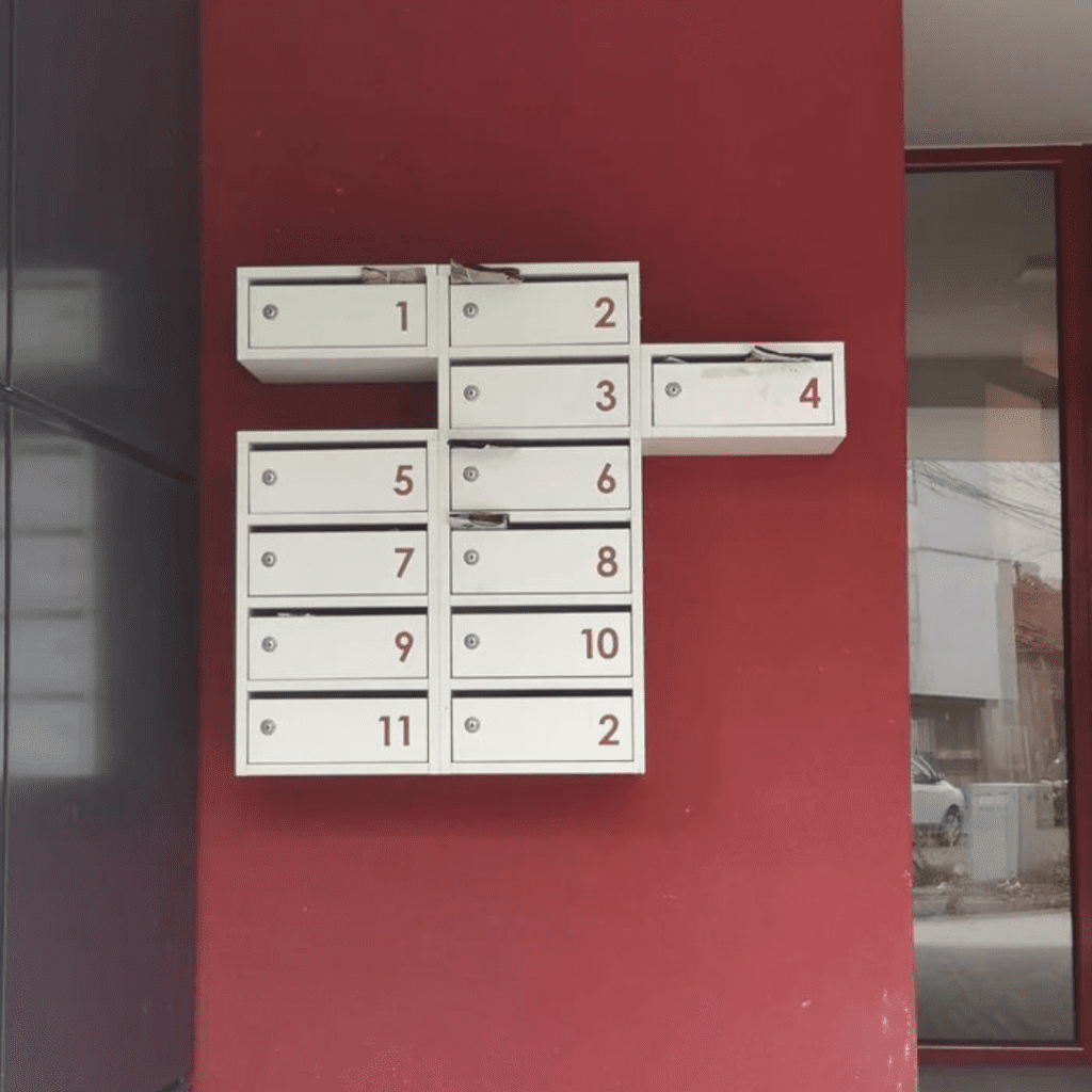
There are no excuses for making a mistake as huge as this one — language barriers aren’t even an excuse as these are just numbers. There’s no way that the person who installed it didn’t notice. It is so annoying!
Silly Sink
We really do wonder about the thought process of some people out there. There are such obvious mistakes, as we’ve already seen dozens of times. This next one is no different. The builders just needed to take one quick look to see the problem that they created here.
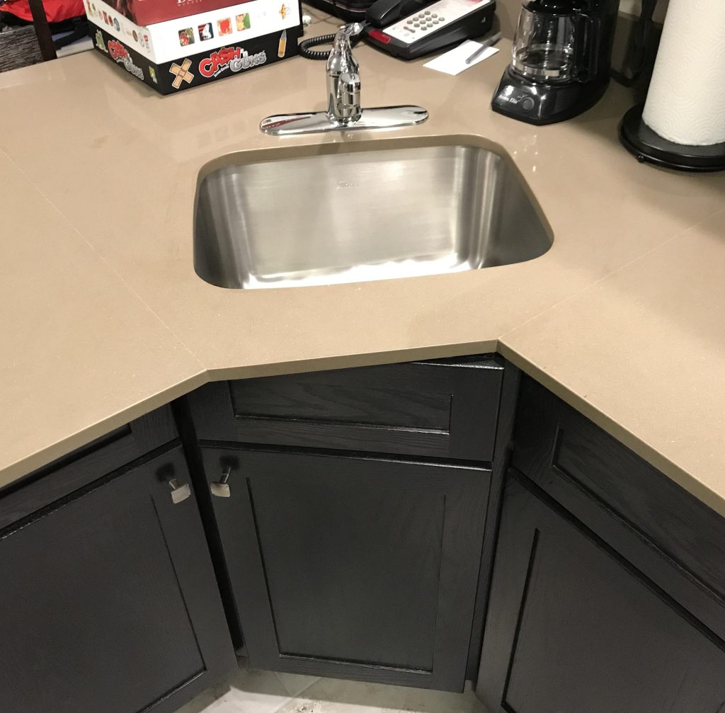
However, it seems that they were completely unable or unwilling to even spare a glance because they left the sink as it is. We are not sure which mistake came first — the cabinet doors or the misaligned sinks. Either way, it is irritating for sure!
Funny Fan
Here is a mistake that you will probably only notice if you look directly up at the ceiling. Can you spot what it is yet? Just have a very good look at the position of the fan and the ceiling decorations.
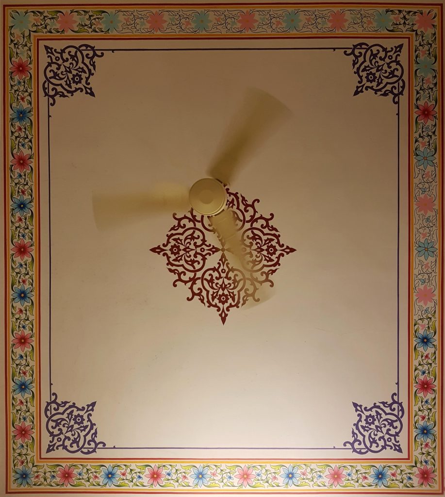
In case you did not spot it, the fan is just ever so slightly out of alignment with the designs on the ceiling. This should have been quite an easy thing to spot, and we are surprised that nobody ever did!
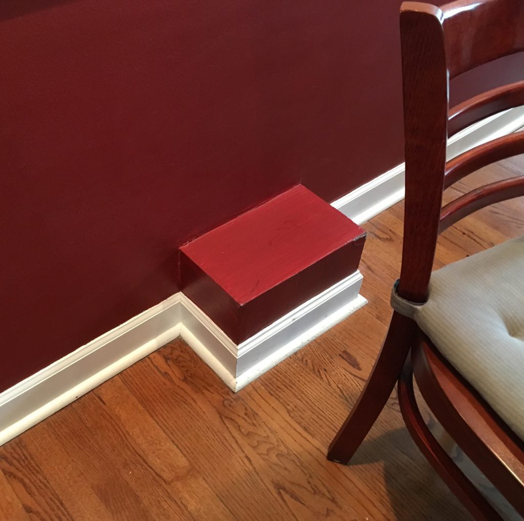
Socket Situation
We have already seen a bunch of mistakes that people have made when building houses, but this is by far the most annoying one on the list. Why you may ask? Well, because the builders went out of their way to do it!
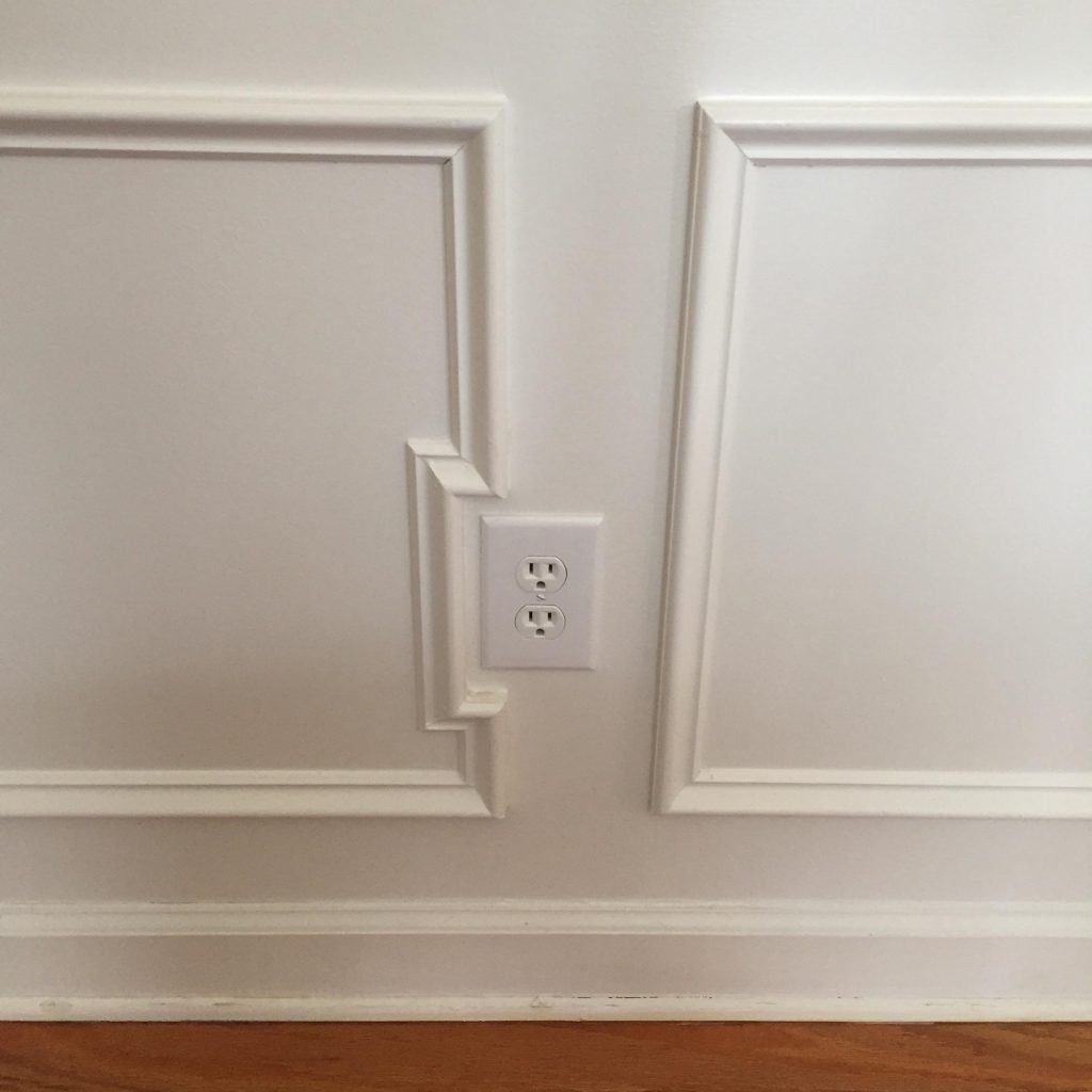
They made the design of the skirting board go right around the socket on the wall, which makes this blunder even more obvious. It feels like someone did this as a joke just to annoy the Internet. We hate to say it, but it’s working.