Rad Ads: Marketing Teams Who Should Be Proud Of Their Creative Thinking
At this point, ads are part of our everyday lives. We go on a drive, and they’re pasted on billboards. We watch some videos, and they pop up before we’re even done. We read an article online, and they’re all over the page! Yeah, they can be pretty annoying most times but admit it, a lot of them can be kinda entertaining.
Some companies have taken “brand awareness” to a whole new level, going to great, and ridiculous lengths to leave an impression on potential consumers. They’ve put out some clever, questionable, creative, and witty content to stand out from the crowd, and despite how silly that may seem, we’re all for it. We present to you the 35 most incredible ads of all time.
All images in this article are courtesy of BestAdsTime on Twitter.
McDonald’s Pedestrian crossing
For the first three days in July, the biggest festival in Zurich, Züri Fäscht, takes place. Every three years, the whole city turns into a vehicle-free recreational ground where people can come to have fun, drink, and eat. Of course, this also means loads of competition between food stalls.
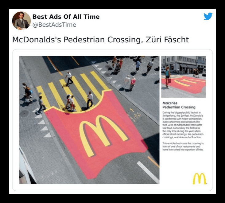
McDonald’s decided to get creative by choosing an ad tactic that truly “sticks” out. Giant fries were painted as crosswalks leading to McDonald’s outlets, and we have to say, whoever came up with that marketing campaign idea deserves a raise!
Axe
Let’s face it, looks matter. Looking your best makes you more attractive and presentable, but you know what’s just as appealing? How good you smell. That’s why fragrance brands are a big part of the beauty industry and why Axe is king when it comes to catering to the male demographic in the field.
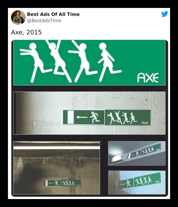
They didn’t achieve all that just by releasing products; everyone does that! They upped their game by putting out some clever ads just like this one. Women may not chase after you when you wear their product, as they suggest here, but at least they won’t be running away from you!
McDonald’s… again
A regular billboard with a couple of scrumptious treats scattered across it is absolutely nothing to write home about. But, when you add a little something extra and make it unique, you have earned yourself a spot on our compilation.
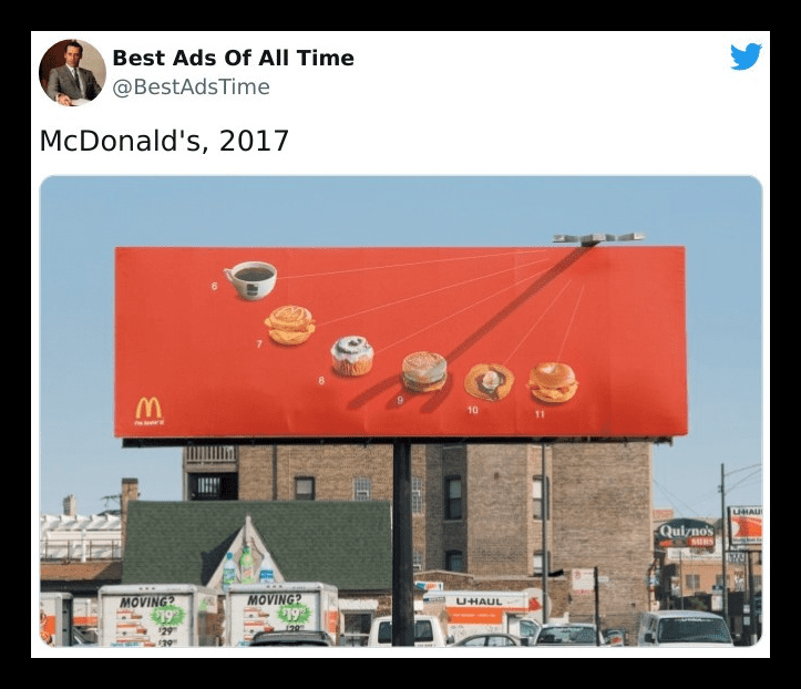
This McDonald’s sundial billboard is what happens when taste meets innovation. Here, the fast-food’s breakfast menu is displayed with the sun casting a shadow that points to an item at the time of the day people would normally eat it. At this point, isn’t it safe to say McDs is the fast-food ad king?
McIlhenny’s Tabasco
It’s the famous, beloved red sauce, McIlhenny’s Tabasco. This deliciously flavored, eye and mouth-watering sauce has been around for quite a while — more than a century and a half, in fact. And you can’t stay relevant for that long without some darn good ad campaigns.
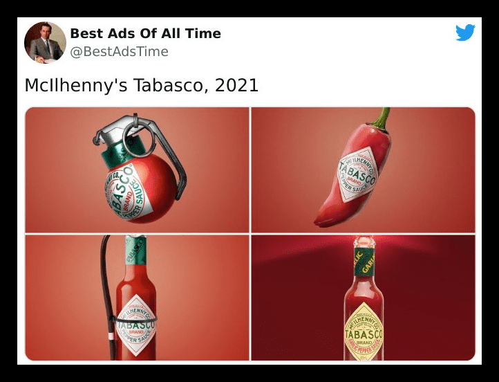
While we’re big fans, and we gotta say, they nailed the intent behind it, although the execution on the bottom left ad leaves much to be desired. Aren’t they supposed to bring the heat rather than, well, extinguishing it? Either way, we agree with the first pic. This spicy sauce sure is the bomb!
Koleston
Sometimes, the point of an ad isn’t about how practical it is. Most times, all you need is a clever idea that can make the rounds online, and what better marketing strategy could there possibly be? This ad is one for the ages and by far one of the most aesthetically pleasing we’ve seen so far.
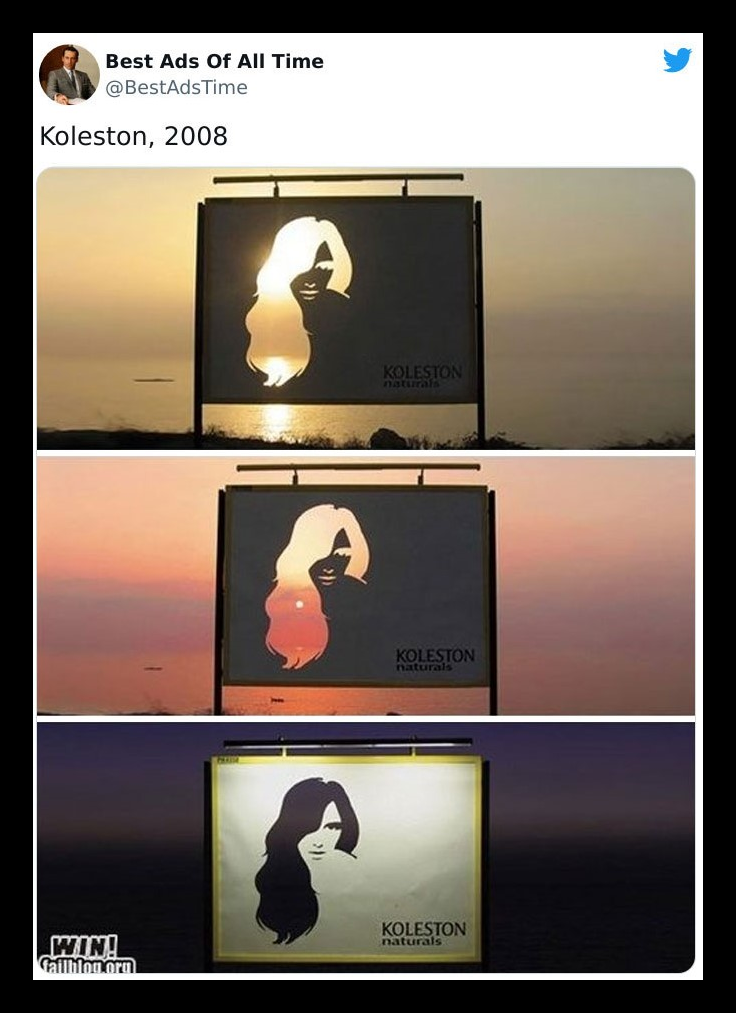
Koleston has surely given other hair care brands a run for their money regarding creative ads. The gorgeous sunset in all its glory was used as a backdrop here, but we can’t help but wonder what the billboard would look like during the day.
BMW M3
Everyone who knows cars knows the BMW. They’re a super luxurious car brand whose products always pack the latest features and technologies, earning them a spot as one of the best-known German vehicle manufacturers. And it’s not just their products that are top-notch; so are their ads.
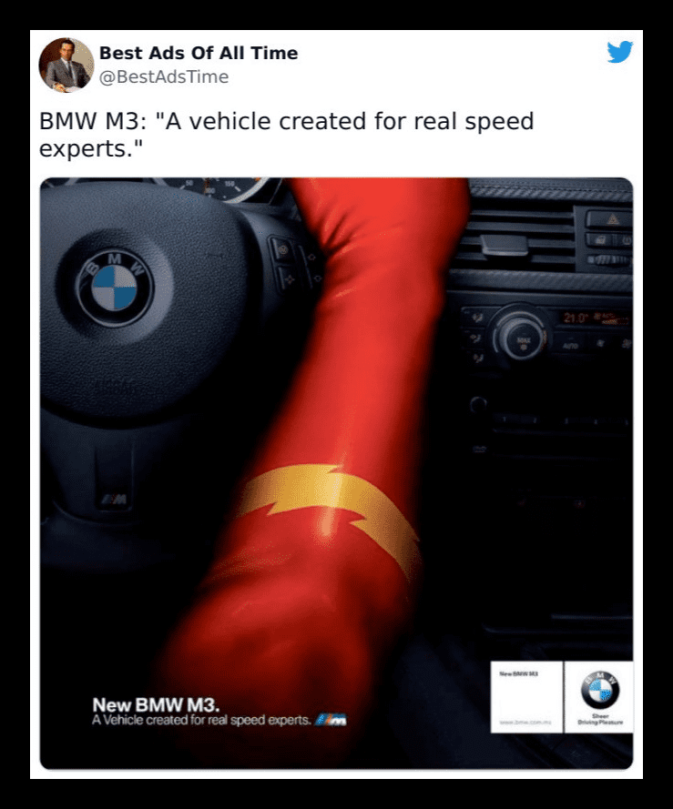
There’s a lot of tight competition in the world of ultramodern cars. With other brands like Ferrari, Audi, Tesla, and Mercedes, to name a few, being fierce competitors, how has BMW stayed on top? Well, by teaming up with DC and releasing clever ads like these!
Hot Wheels
Some companies and brands do the homework and think of something that screams “go big or go home” with their advertising, and this Hot Wheels ad shows us the toy brand most definitely understood the assignment. Here, a gigantic loopy-loop is placed on a freeway, and right beside it is their signature logo.
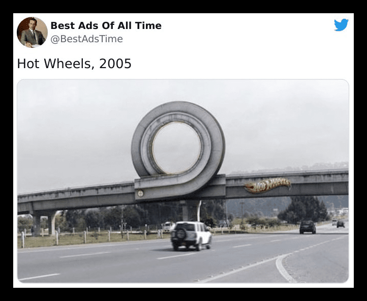
The campaign, published in Colombia in 2011, was titled “Curl.” When it’s sunny, it might be a little clear to drivers that it’s a prop, seeing as the hole in the curl will have a different color from the sky. But besides that, it’s a pretty rad ad.
Volvo’s Epic Split with Jean Claude Van Damme
Jean Claude did an epic stunt to show just how stable and precise Volvo’s dynamic steering is. And, can we just say, the narration, the music, the split, the angles, the perfect alignment of the trucks in reverse, and just, everything else came together, formed one iconic work of art — this ad.
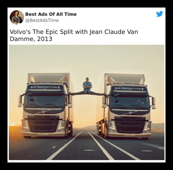
You know an ad’s just that good when even after many years, people still search for it just to behold its glory. The practice and skill this took leave us speechless, and the fact he did it in one take… no words.
Hijet MPV
The automotive industry has undergone a whole lot of evolution, and the same can be said for their advertisements. This particular ad feels like it’s taking a jibe at the Italian racecar, the Lamborghini, but really, they’re just stating facts.
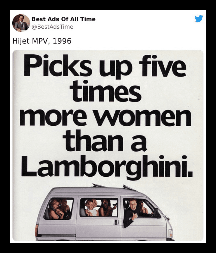
With five times as many seats and a great warranty, you could pick up much more ladies — at least in theory — for just a fraction of the price. And while people may not have rushed to buy this car because of that slim chance, this subtle ad is still great.
Apple’s Ultra-Thin Mac
Long before there were video ads and even billboards to display, magazines were one of the most prominent media through which companies and brands could put themselves out there. Although the methods of advertising are much more diverse now, we still see something worth halting the page-turning every now and then.
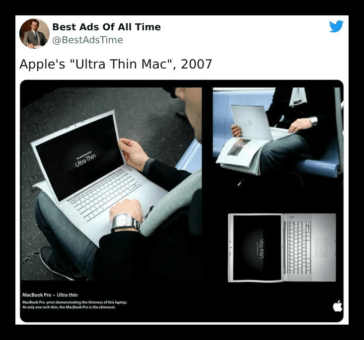
This incredibly creative Apple ad was made to show the world just how thin their product was — slim enough to be compared to a piece of paper! Although Apple’s 2007 MacBook pro was much thinner than its counterparts at the time, they should have put a little disclaimer. This ad makes the sleek tech look breakable.
FedEx
For anyone who’s ever made an order online, there’s nothing more infuriating than having it come later than you expected. Except, well, having it come and it’s not what you ordered, but that’s not the point of this post! The point here is this brilliant ad and the feud it addresses.
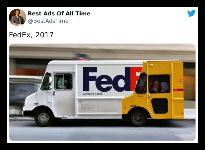
Here, FedEx lets the whole world know they’re truly the first by not-so-subtly taunting one of their biggest competitors, DHL. This is a true battle of the brands’ ads; from the looks of it, it’s clear FedEx has the edge.
The Viral Kit Kat Ad
2020 was filled with ups and downs, but mostly downs in the form of Covid 19. We all had to stay indoors and juggle the work-from-home life, which can be pretty hard. This Kit Kat ad was the message we desperately needed — take a break and enjoy some chocolate.
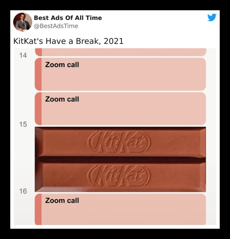
Creative designer Sam Henning thought up this unofficial ad. And with the help of Nicholas Tasker, it was polished and became a viral sensation. In fact, it was such a hit that the Kit Kat brand reached out to the creator, asking if they could share it across their social channels!
MGB
Have you ever seen a meme with the words, “Sometimes my genius… it’s almost frightening” as a caption? Yeah, this ad should have had those words in bold at the bottom because many people didn’t know what in the world was going on here.
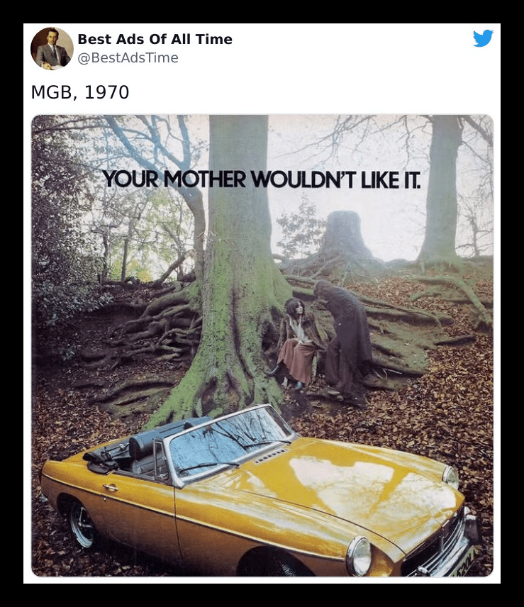
At first glance, it looks a little creepy, like he’s trying to kidnap her. Taking a closer look and considering the time it was released, you’d come to realize they’re talking about engaging in some youthful shenanigans, something your presumably conservative 60s mother wouldn’t have loved. Now you know why we referenced the meme.
Volkswagen’s park assist
With how many ads have already been made and how many are in the works, it’s pretty hard to stay unique, creative, and still drive a point home. That’s why it’s super important that companies have to think outside the box. Case in point; this VW ad.
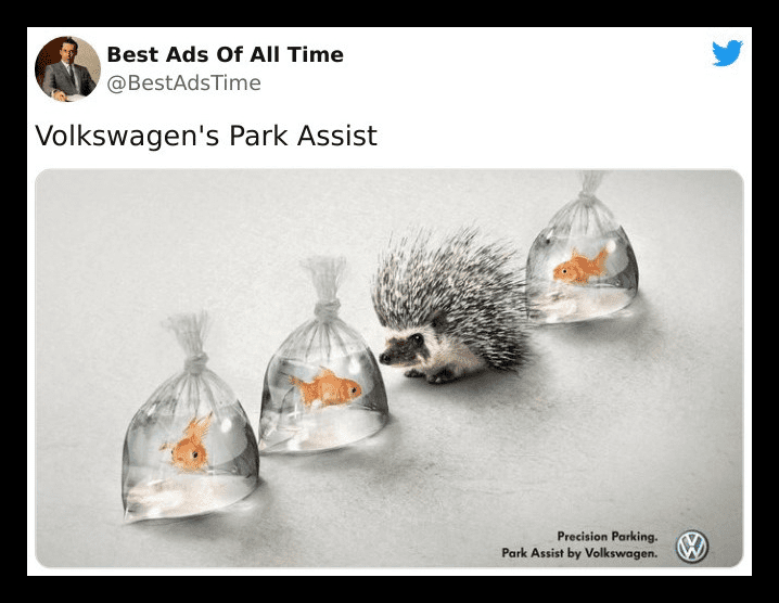
This car brand is showing us that their parking is so precise that you could fit a cute little hedgehog between two fragile plastic bags filled with water and some innocent goldfish. It’s eye-catching, and it’s one of a kind. It sends out the message it ought to; therefore, it’s effective.
Orion telescopes
What better way to market your product than to show the world — through advertisements, of course — just how it works? And when it comes to that, this ad for Orion telescopes takes the cake, illustrating to us just how powerful the lensed beasts are.
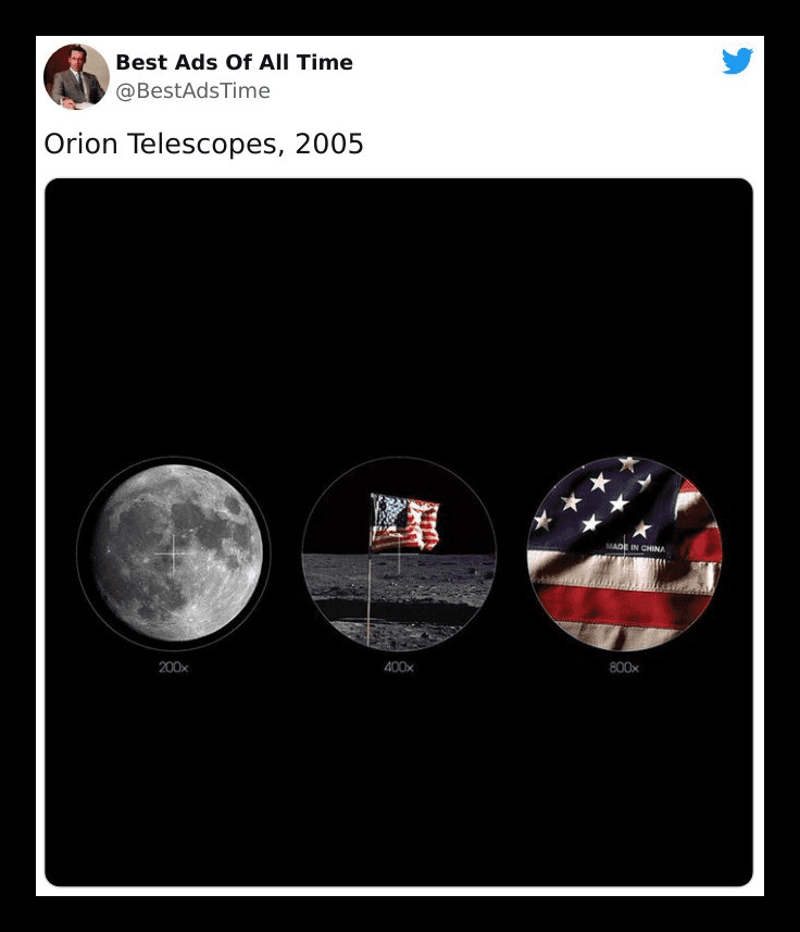
Despite being mildly amusing, a lot of sourpusses can’t help but poke holes in this otherwise intelligent ad. We just want to say: it’s not supposed to be accurate, for crying out loud! Most of them aren’t! It’s a creative way of telling us what their telescopes are about, and it’s pretty great.
Happy Father’s Day from McDonald’s
The world we live in today is all about diversity and inclusivity. That’s why McDonald’s representing the less hairy among us with this subtle ad of sesame seeds sprinkled on the sides of a burger is a clever way of giving a nod to our dads.
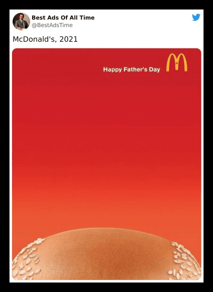
Yes, it’s stereotypical. No, not all dads are actually balding. Yeah, it’s a little silly, and no, balding is no laughing matter, but for goodness sake, let loose a bit. It’s great advertising and just goes to show just how creative the minds behind McDonald’s ads are!
“Nobody’s perfect” – Porsche in 1983, probably
With ads, there are a million ways you can approach them. Although we’re not specialists, a good strategy would be to get the audience’s attention, and reel them in. That way, they’ll want to learn more, create a connection to the brand, and be memorable. This ad does all of those brilliantly.
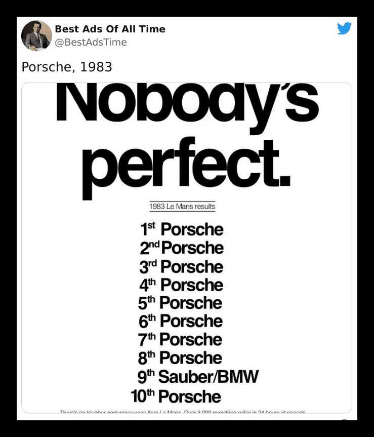
To this day, this “Nobody’s perfect” Porsche print ad celebrating the fact that they absolutely decimated the chances of any other car brand winning the Le Mans race just by existing reigns supreme. It’s by far one of the greatest corporate ads and one of our favorites.
Nike sets the benchmark
Nike has been running (get it?) the sportswear, gear, and accessories show for quite a while now, and they didn’t get there just by releasing good, high-quality products. Over the years, they also put out some memorable motivational ads like these.
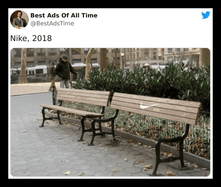
They’re leaving no room for breathers, telling people that if they’re considering taking a break from a run, they “shouldn’t” do it. However, we find it a bit infuriating. Imagine you just had the longest, most tiring run in your life, and you’re looking to catch your breath by relaxing on a bench; then you meet this.
Sharper than you think
We’ve seen it in the Orion Telescope, Axe, and Hijet MPV ads, and now it’s here again. The use of exaggerations in ads is not new to us. Despite the inaccuracy of their portrayals, when companies overemphasize just how great their product is, they do drive a point home in visually entertaining ways.
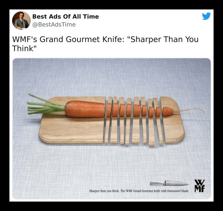
WMF is showing us just how great their Grand Gourmet knife is by suggesting they’re so sharp, that they’ll cut right through our chopping boards. This is truly genius advertising — simple and effective. We just hope our fingers never get in the way! That would be nasty.
Allstate Insurance
Nothing grabs one’s attention faster than a shocking or disturbing sight, and Allstate insurance did well by going with the good old element of surprise for their ad. Their ad had a car hanging on for its dear life at the edge of a parking garage floor.
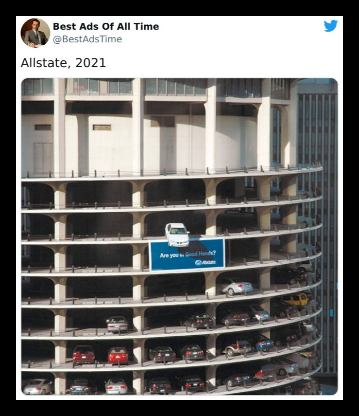
Taking a quick look at this, you might be a little disturbed, maybe even worried about the safety of the driver in the car or the poor person who owns the thing. But if you look closely, you’ll clearly see Allstate’s little blue billboard at the bottom, asking if you’ve got coverage. Well, do you?
Aston Martin
Aston Martin cars have been described as true works of art, with their brilliantly unique designs and the luxury they exude. The company decided to go for an ad tactic that’s as simple as they come; putting out amusing content that’s totally relatable.
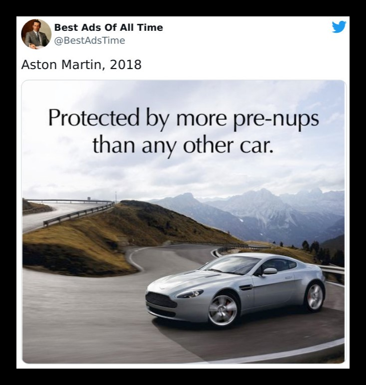
We don’t exactly know how to feel about this. On the one hand, it seems like they’re setting themselves up as a car meant for people with an impending divorce. On the other, it’s pretty clever for saying they’re so great you’ll want to protect them.
BIC Razors
Let’s be honest; an ad campaign isn’t something everyone excels at. It takes a pretty formidable marketing team to come up with an idea that truly speaks for the brand and reaches the target audience. It’s a shame Bic doesn’t make hammers because they hit the nail on the head with this one.
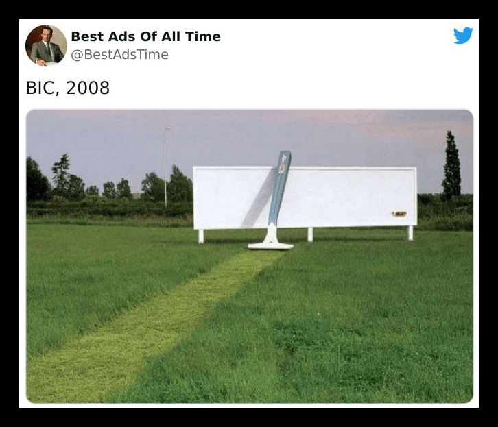
A Bic Razor cutting its way through some thick grass isn’t something you’d see every day, and that is what makes it special. It cleverly showcases just how great their shaving sticks are in a way that’s not the most conventional.
Why Dentistry really is important
What’s the first thing people notice when they look at you? It’s not your clothes. Unless you’re wearing a garbage bag; then yes, they’d definitely notice that. But assuming you aren’t putting one on, the first thing they’d notice is your smile.
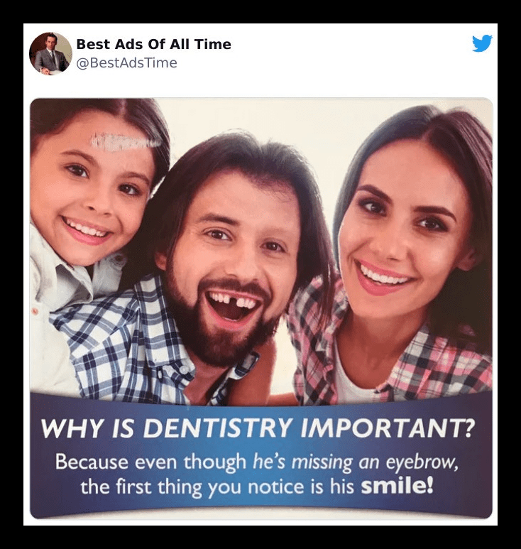
Here’s an ad that had just the right amount of humor and the “gotcha” factor. We have to admit; they’re totally right. The missing tooth drew our attention away from any other changes to the models. But, why isn’t anyone mentioning the pony’s horn on the little girl’s forehead?
Another Kit Kat ad
Stress can make us do a lot of silly stuff; that’s why we need some stress balls! You know, those malleable toys that we can squeeze to let out all the bad energy when we’re feeling anxious. Because, in their absence, we might end up doing something abominable, like breaking a Kit Kat.
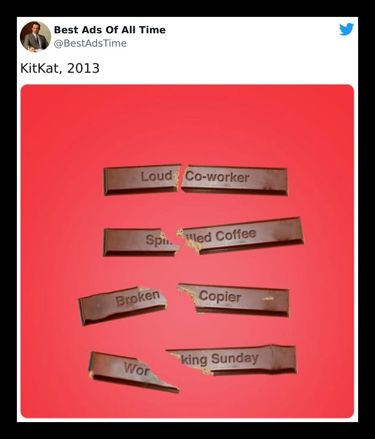
Then again, the sound of the crunch is rather satisfying. Not that we’re violent people. There’s just something pleasing about the sound of Kit Kats breaking. Perhaps it is because we know a sweet chocolate treat is on its way.
Porsche
We’ve seen many car ads so far, and one thing we noticed is they were always suitable for their target audience. And not just car ads; that goes for many others as well. One thing they all had in common was the dash of hilarity they included in their ads, as does this one.
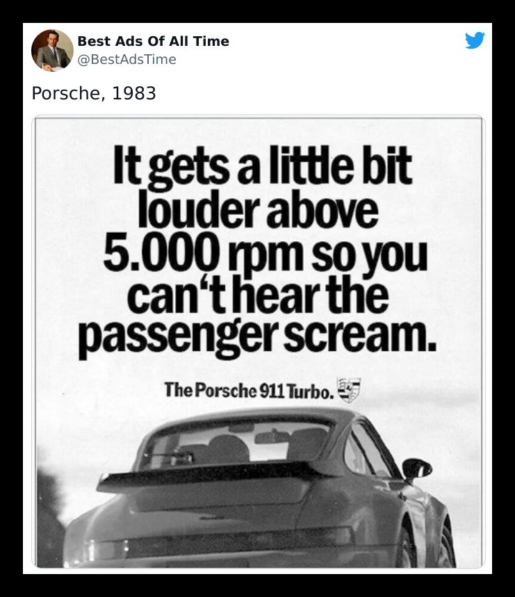
Except this Porsche ad took humor to the dark side. We’ve seen lots of funny ads, and we have to say, this one’s take was a breath of fresh air. For those of us who don’t get it, sorry. We really can’t say, it’ll ruin it for you.
Lego
This Lego ad is, beyond a shadow of a doubt, one of the most creative ones we’ve seen in a while. It has a strong underlying message — with the power of imagination, your Legos can be anything you want them to be!
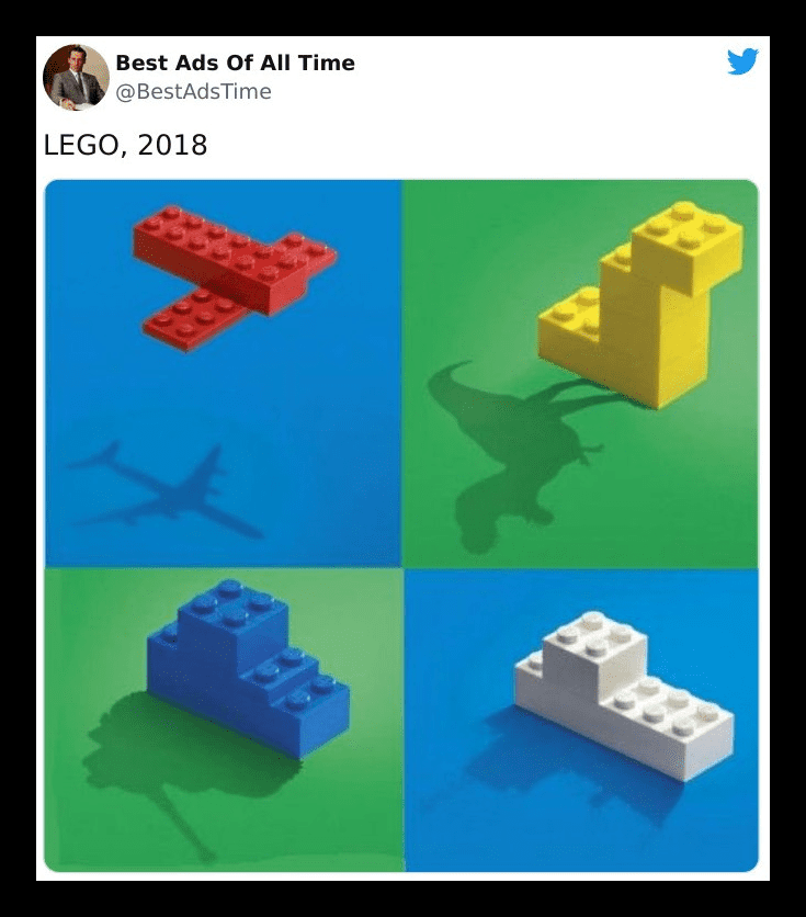
A picture says a thousand words, and that’s exactly what this Lego ad embodies. It’s very subtle, with gentle background colors and symbolic silhouettes, and here again, exaggerations come to play. And you’d think it’s old at this point, but honestly, we still love it.
San Diego Zoo
Sometimes, you don’t need to break the bank to get people to know who you are. All you need is to cleverly manipulate the environment to suit your message. The BIC razor and this ad are prime examples of that.
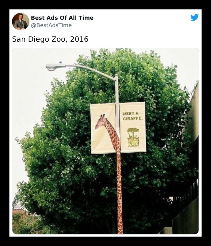
The San Diego Zoo made use of a simple banner for the giraffe’s portrait and some graphic design to turn a lamp post into the neck of the exotic animal, compelling the masses to come visit. And who can say “no” to a cute giraffe?
Chupa Chups
Print ads have evolved over the years and for the better. They’ve gotten more aesthetically pleasing and have more depth. Now, you don’t need to make a long caption for your brand; all you need is a striking image, and that’ll get the job done.
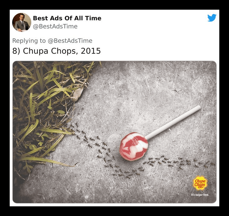
Chupa Chups came up with an innovative way of showing the whole world their lollipops are sugar-free, without using a single word! One of the candies is pictured in this sweet ad, with ants taking a longer route to avoid it.
McDonald’s… for the umpteenth time
Look, we’re not trying to start a “clash of the ads” tournament, and that’s only because there’s no competition. McDonald’s has already won. From the sundial billboard to the pedestrian crossing and now this — they continue to steal the show and our hearts.
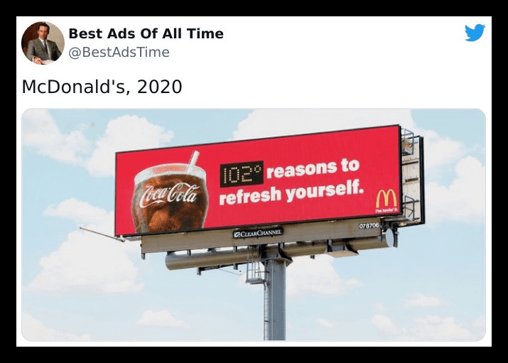
This billboard incorporates the temperature into the ad. It’s a simple yet clever reminder to anyone looking at it on a hot summer day that they could be enjoying a chilly glass of Coca-Cola instead of sweating in the sun. If that isn’t enough to get people rushing to the nearest McDonald’s, we don’t know what is.
FedEx truly is the fastest
FedEx is by far one of the biggest names in the world when it comes to delivery services, and they’ve run a lot of amazing campaigns to stay at the top of their game. This “neighbors” print ad right here is no exception.
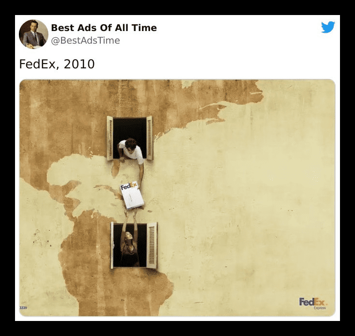
Comparing just how fast their intercontinental shipping works to giving a parcel to a neighbor is an excellent idea. We don’t know if you guys noticed, but if you look closely at the wall, you’ll notice those patches are shaped like a map of the Americas!
Ford
A simple but attention-grabbing headline and some attractive and clever visuals — that was all it took for this car brand to simulate this amazing “Key Skyline” ad. The message is easy to read and clear, and it tells us what these guys are all about.
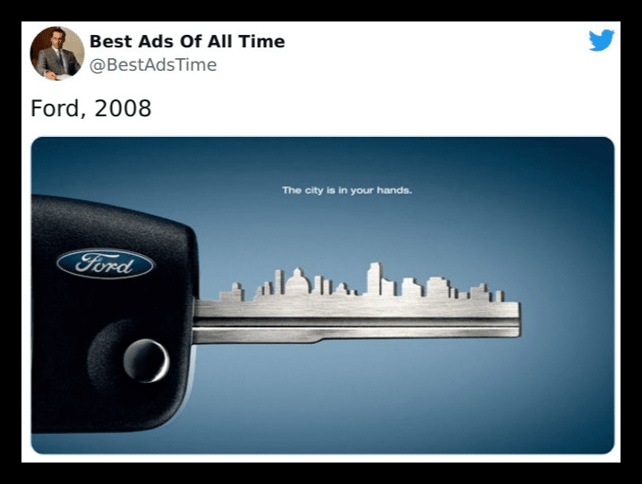
In this Ford ad, they’re subtly informing us that, by getting the product they’re marketing (a Ford fusion), we’re entering into the modern, urban world and that we hold the key to the city. Loads of car ads have come and gone, but this is by far one of the best.
Ajax Wipes
No one is going to waste their time sorting through the plethora of brands just to find yours. They’re going to grab the one they remember from somewhere else or they’ve already used at the store. So how do pull those people towards your stalls?
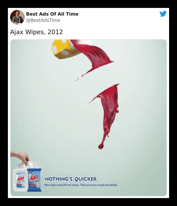
This is why ads really do matter, and illustrating what your brand offers, via advertisements, will always be one of the best ways to get yourself out there. Just like this Ajax ad. Nothing wipes quicker than a sheet of those bad boys.
Stihl’s Blowers
If there’s anything we all can relate to, it’s gotta be having bad days. A day that’s filled with bad news and bad moods; we’ve all had those come around once in a while. But what if we told you there was a way (or a product) that could take those all away?
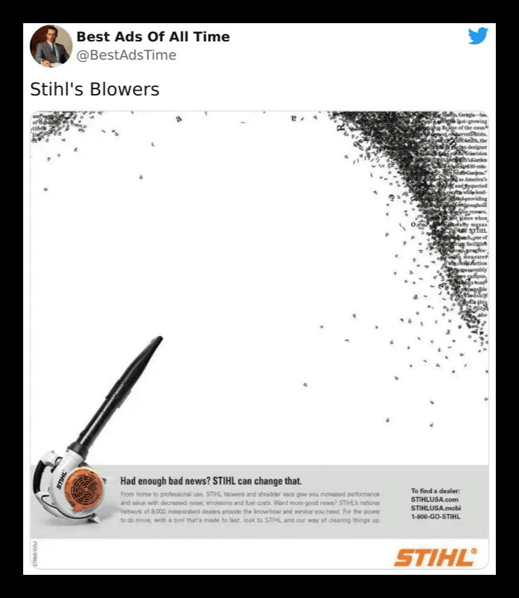
Introducing Stihl’s leaf-leaf blowers! Wait, what? We know what you’re thinking, and we thought it too. Definitely not what we were expecting either; this ad blew us away. The letters being scattered around the page was pretty nice, so we included this one.
Austin Morris
The vehicle industry is pretty competitive, and it can be difficult finding a way to stand out when there are so many top dogs. This Austin Morris ad is simply telling the masses that not only huge cars can bring joy…
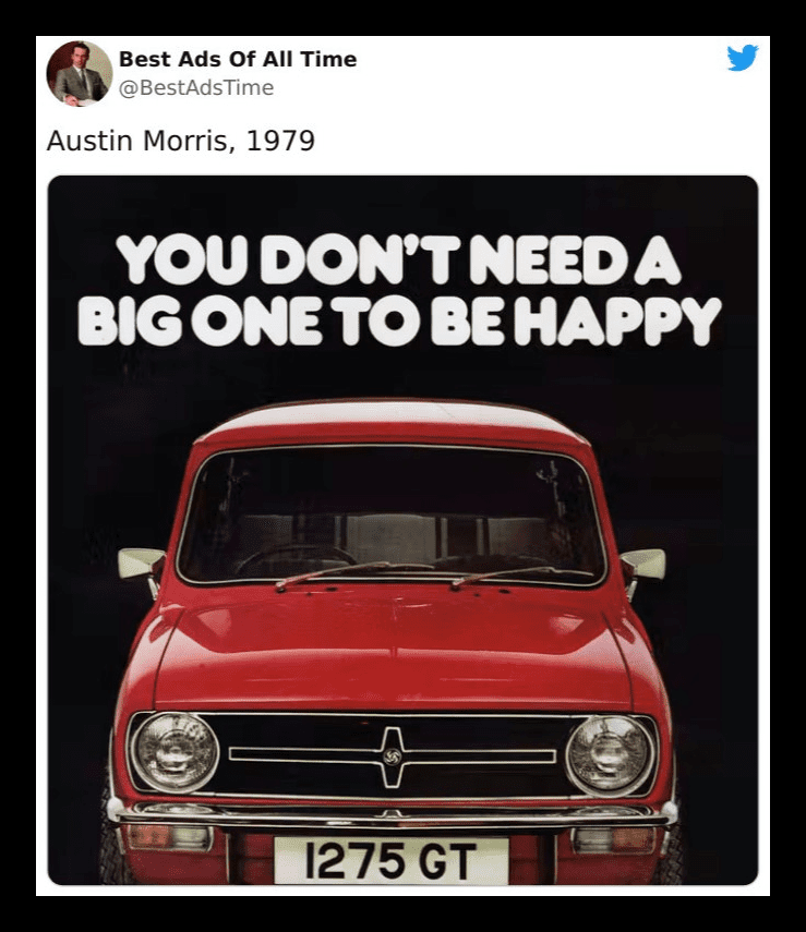
…cute little minis can as well. They’re compact, will most likely cost far less than a van, and still get you where you need to be. What more could you possibly ask for? We give this one a solid ten out of ten for clever advertising. Great job!
Porsche
Let’s start by saying we love our minis. Modest cars will always have a special place in our hearts. No hate for them, but supercars are the greatest symbols of flamboyance, and who doesn’t like to stand out once in a while?
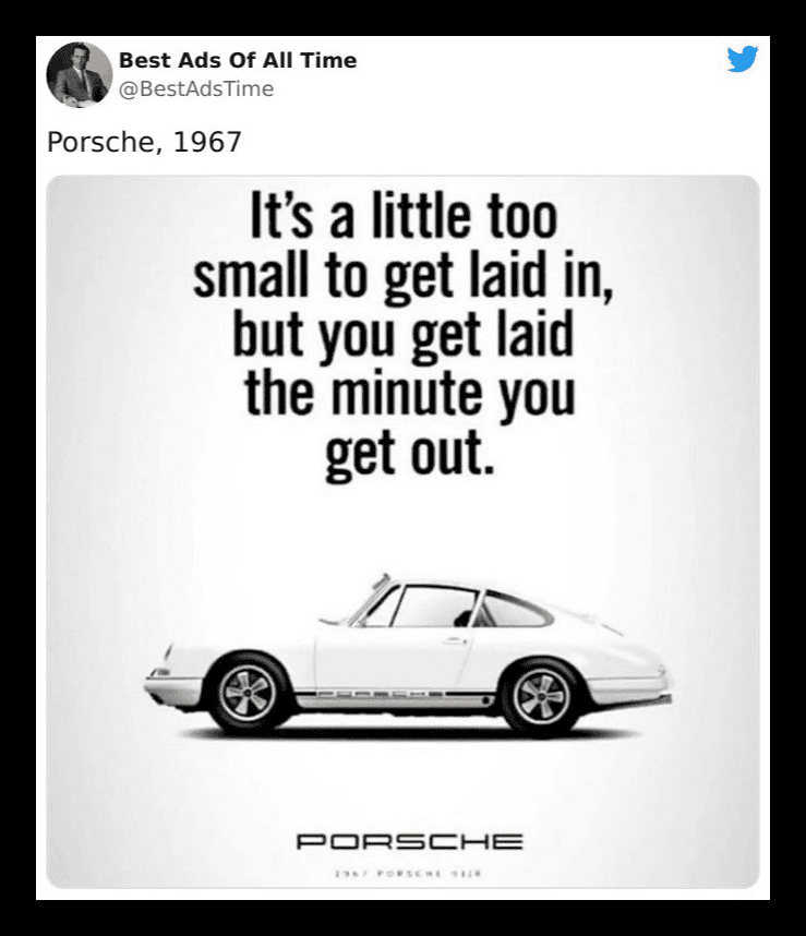
Luxury cars tend to attract crowds and a lot of great company, too. While we can’t attest to what’s written on this poster, we can assure you that cruising down a street with one of these will give you the attention you deserve.
Bearded Lady Bourbon
Look, if you ever find yourself in this situation, you probably knew the consequences already. This is not something that anyone particularly enjoys. You really think the cop wants to shove her fingers up there? Probably not. But Bearded Lady makes a good point.
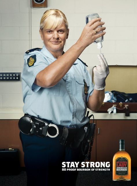
You know what would make this entire process easier? A nice dram of bourbon on the rocks. Actually, make that a double. It’s the least they can do after violating you like that. Plus, it…uh…helps you relax your muscles. And on that note, we need a drink.
