
Lost In Laughter: Maps That Deliver Laughs, Not Directions
Welcome to the world of Useless Maps, where geography decides to throw a hilarious curveball and take a detour through the land of whimsy and giggles. These maps boldly break all the rules, tossing practicality out the window, and they’re here solely to put a smile on your face and maybe even make you chuckle.
From maps that put our planet in the most absurd situations to ones that slyly bend the truth, each one offers a fresh and fun perspective on the world we know. They’re like the class clowns of the cartographic universe, and their mission is simple: to entertain and tickle your funny bone. They’re not about informing you; they’re here to ignite your imagination and make you grin from ear to ear.
So, buckle up and hop on board as we embark on a journey through these quirky cartographic conundrums. In this world, map lines lead to laughter, and reality takes a back seat to pure amusement. Get ready to explore a realm where geography and comedy collide, and the only place you’re heading is the land of pure entertainment!
Egypt is Smaller than Other Bigger Countries Combined
Behold the “Egypt vs. the Giants” map that playfully distorts reality for a good laugh. In this depiction, Egypt stands alone in sunny yellow while the colossal trio of Russia, China, and the USA loom large in blue, red, and green, respectively. The humor here lies in the sheer absurdity of the comparison.
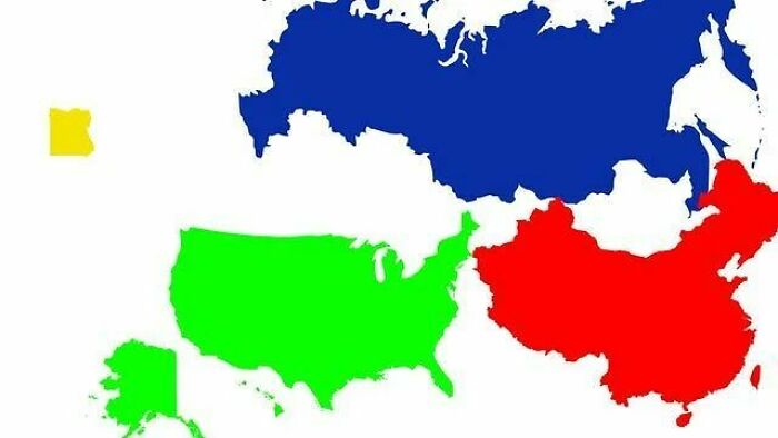
Each global behemoth is individually larger than Egypt, but this image goes the extra mile to depict their collective dominance. It’s a tongue-in-cheek reminder that sometimes, the obvious can be humorously overstated, turning an ordinary geographical fact into a lighthearted exercise in the absurd.
Antarctica: The North-South Confusion Map
In a witty twist on traditional geography, this depiction has been playfully crowned as “The Most Confusing Map.” This Antarctic rendering proudly proclaims every side as “North.” But why? In a beautifully spherical world, every direction away from the South Pole, which is the very center of Antarctica, becomes a northern trajectory.
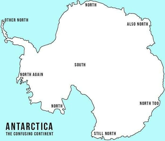
This map playfully defies conventional orientations by reimagining Antarctica as a compass rose, creating a delightful paradox. It whimsically highlights that maps can transcend utility to become mind-bending works of art that educate and amuse, particularly in the frigid expanses of the world.
First Letter Gone Missing!
In a unique turn of events, this map presents all 63 American states but with a twist that leaves you pondering and chuckling. As you glance at the map, you’ll encounter names that seem just a tad off, like “Lorida” instead of Florida, “Ew Hampshire” instead of New Hampshire, and “Alifornia” rather than California.
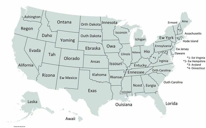
It’s a comical wordplay, where the first letter serves as the missing puzzle piece, adding an extra layer of fun to American geography. So, take a whimsical ride through this cartographic adventure that invites you to decipher these quirky state monikers, and with each discovery, it spreads a grin across your face.
Worldwide Color Blindness Incidence Map
This cheeky map takes a uniquely mischievous approach to raising awareness about color blindness across the globe. It uses shades of red to represent the prevalence of color blindness in various countries, but there’s a twist—or rather, a trick. The catch is that this map mimics the experience of colorblind individuals.
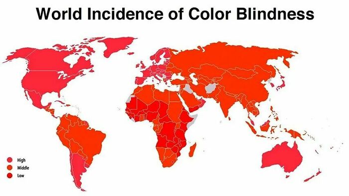
It uses shades of red that are only very slightly different from each other. This makes it challenging for people who are blind to colors to make sense of the map. Thus, it’s a reminder of the daily problems that colorblind folks navigate, highlighting the importance of inclusive design and accessibility in a good-humored way.
Namibia and Zimbabwe’s Michelangelo Moment in Africa
Artsy maps always tell a unique tale, and this one is no different. It uniquely tries to underscore Africa’s two popular countries, Namibia and Zimbabwe, akin to Michelangelo’s Creation of Adam. The two nations, highlighted with utmost precision, appear to touch fingers, much like God and Man in the iconic fresco.
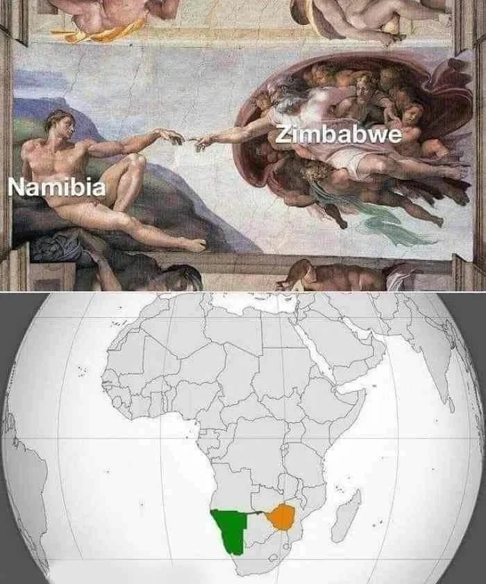
The Caprivi Strip, named after the German Chancellor Leo von Caprivi, extends like an artistic brushstroke, connecting these nations in an unusual homage to Renaissance art. It’s a humorous yet intellectual fusion of geography and creativity, showcasing that even cartography can become a canvas for inspired interpretations.
Italy: A Hand in Disguise
This map playfully challenges Italy’s familiar boot shape by subtly reimagining it as a hand with pinched forefingers. The whimsical alteration encourages viewers to see Italy’s outline in a fresh and intriguing light, inviting a unique perspective on the country’s geography.
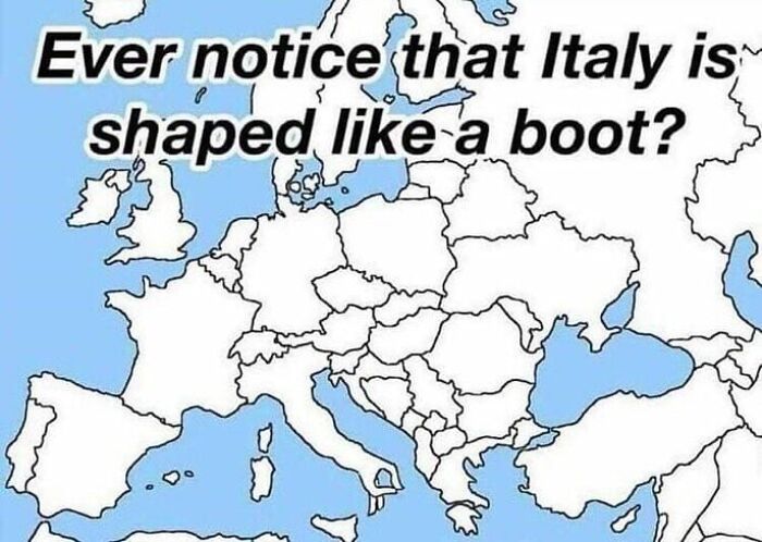
It’s a clever play on geographical shapes, sparking a chuckle as it seems Italy is all prepared to swat away Sicily with its fingers. The humor lies in the fact that although the title points us towards Italy being shaped like Europe’s boot, this map subverts our usual expectations with something quirky.
American States Represent KFC!
As ingenious as KFC recipes, here we have a map of the United States that is a gastronomic cartographic masterpiece. The states of Minnesota, Iowa, Missouri, Arkansas, and Louisiana coalesce into the unmistakable silhouette of the legendary Colonel Sanders, the hallowed figurehead of KFC.
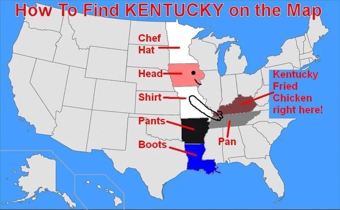
His crispy chicken visage springs to life from Kentucky, while his skillet of secret herbs and spices resembles the pan-shaped state of Tennessee. It’s a finger-lickin map of America that showcases the compelling journey of KFC’s origins and serves up a hearty helping of geographical humor.
Outdiana: The Indiana Outlier Map
Within the familiar borders of the United States, this map boldly highlights Indiana in vivid red while other states bask in sunny yellow. However, the map’s charm lies not only in Indiana’s prominence but also in its labeling—every state, excluding Indiana, sports the tongue-in-cheek title of “Outdiana.”
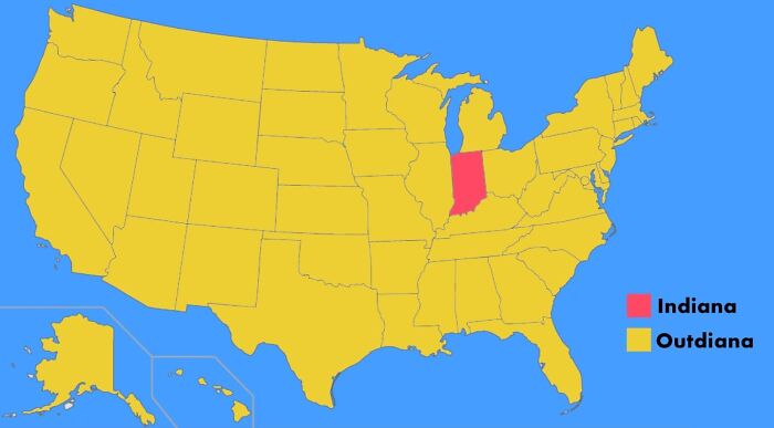
The map goes the extra mile to point out that the other American states aren’t Indiana and inanely labels them as “Outdiana.” Although it does not serve any purpose, this map celebrates individuality among American states, affirming Indiana’s distinctive status with a wink and a smile.
Africa’s Restaurant Order Preferences
This map hysterically suggests that all African countries prefer dining “for here,” as illustrated in vibrant green, except Togo, highlighted in purple. However, the question lies in why such indifference occurs. Well, it’s because of the clever wordplay with the country’s name, Togo, which sounds like the American dining phrase “to go.”
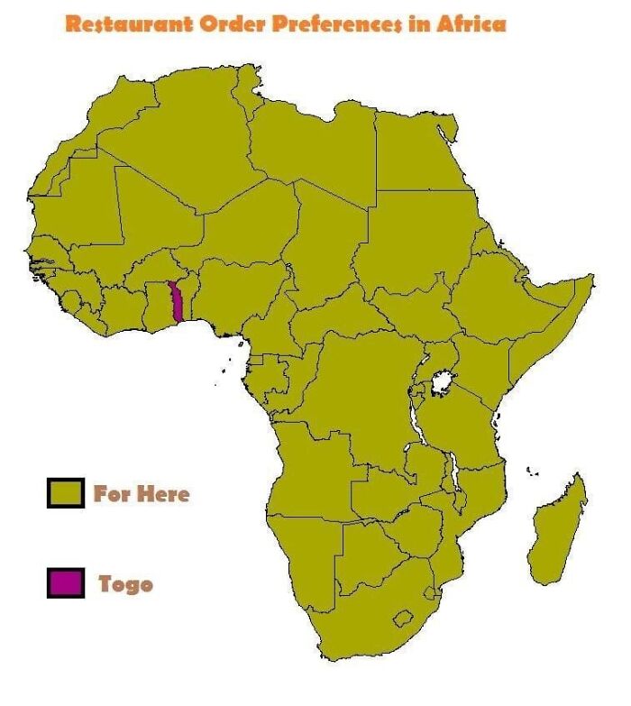
It’s a beautiful fusion of cultural references, showing that humor can transcend borders and language, making you smile whether you prefer takeout or dining in. This map does not provide us with any usable information as such, but it does bring a smile to our faces!
USA’s ‘The’ Map: A Wordy Chuckle
Picture a map that unveils the most frequently used word in each state of the USA. You’ll be surprised to notice that every state is adorned with the word ‘the,’ making it the most popular term used throughout the country.
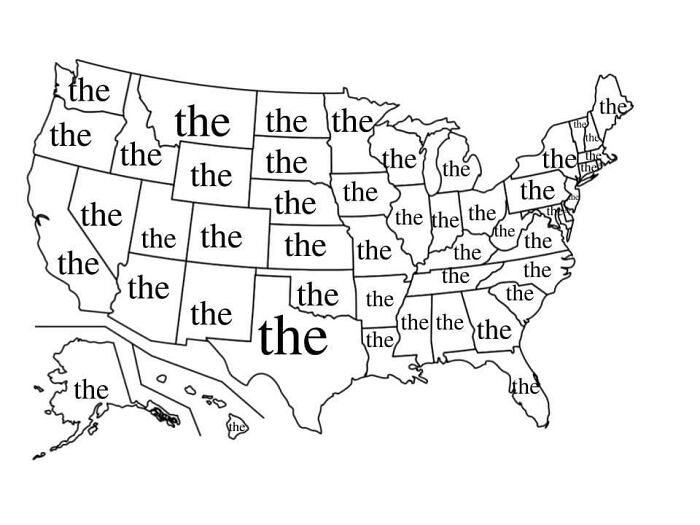
It jocosely drives home that ‘the’ is an unstoppable linguistic force, reigning supreme across the entire English-speaking nation. This proves the universality of the tiny yet mighty word, reminding us that some things remain delightfully constant even in the rich tapestry of language.
A Cat-astrophic World Map
The “Cat-astrophic World Map” playfully reimagines our globe as a quirky feline fantasy, with Australia assuming the role of a delightful ball of yarn. Beyond its eccentric absurdity, this map serves as a testament to the boundless creativity of cartography.
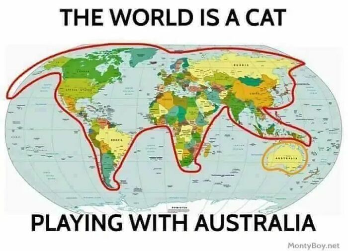
Beloved by both cat enthusiasts and dedicated globe-trotters, it demonstrates that maps can transcend their utilitarian purpose and metamorphose into captivating works of art. This piece allows individuals to appreciate the artistic potential inherent in topographic interpretations and provides an idiosyncratic lens through which one can view the world.
A Walk to Australia from Different Countries
A walk to Australia from any country sounds impossible, right? Well, this map showcases the same joke in a cartographical light! It is a chuckle-inducing take on global geography, playfully assessing whether you can walk to Australia from your country.
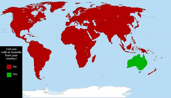
The humor lies in the color key, where only Australia is marked in green, signifying “yes,” while the other countries are firmly labeled in red, indicating “no.” The witty twist highlights the apparent geographical impossibility of walking across oceans to reach Australia and pokes fun at traversing vast distances on foot.
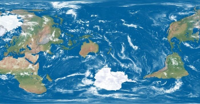
Earth Without Land
Here, we have a map that envisions a world without land, offering nothing but a vast, blank, blue, rectangular canvas. It’s the ultimate ocean lover’s fantasy where the continents have gone on vacation, leaving only the endless expanse of uninterrupted blue waters.

If Earth indeed had no land, we’d all be expert sailors. But this map points out how vital landmasses are for everything from our homes to our favorite pizza joints. With its cheeky simplicity, it’s like a cosmic joke—a reminder that our world is a lot more interesting with those continents in place.
America’s Grand Exit Plan
What if American states were to emulate the British demand for autonomy? This map seeks to present that scenario by embarking on a comical journey through the United States. Here, every state is reimagined as if it were on its independent path of self-determination, akin to the famous Brexit movement.
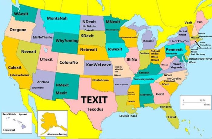
Each state adopts a goofy pseudonym, ingeniously incorporating synonyms or variations of the word “exit” into their names. For example, Texas proudly embraces its “Texit” aspirations, Oregon adopts the charming title “Oregone,” and Montana gets cheekily renamed as “Montanah.” Thus, this depiction adds a delightful twist to the states yearning for their own ‘exits.’
New Zealand as the Center of the World!
This New Zealand-centric world map takes a fun, offbeat approach to cartography. In this imaginative take on the globe, New Zealand grabs the limelight, playing the starring role at the map’s center stage. But the magic happens as the rest of the countries decide to have a geographical shuffle.
Continents and nations get into a jig, merrily rearranging themselves from their usual positions. It looks like a global dance party, breaking all the conventional geographical rules to let New Zealand bask in the spotlight. Although this map invites you to see the world from a fresh, Kiwi-approved perspective, it fails to be of any actual use.
Argentina vs. Aren’tgentina
This globe-trotting comedy act has the dynamic duo of “Argentina” and “Are’ntgentina.” ‘Are,’ the past tense of ‘is,’ denotes the existence of something in the present. Coincidentally, the country Argentina begins with the letters A and R, which sound somewhat like this verb, and the map takes this opportunity to play a joke.
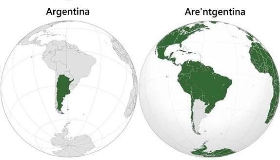
While the country highlighted in green is “Are”gentina, the rest of the world is “Aren’t”gentina. It’s a play on words hilariously presented through a useless cartographical depiction. All the other countries cannot be Argentina, and this makes the map a lame joke itself!
Unique Flag Symbols
Introducing the “AK-47 Flag Hunt” map, a hilarious take on flag symbolism. This map aims to identify countries that feature an AK-47 rifle on their flags, but it offers an amusing twist. The color key prominently displays a bold red indicator, hinting at the presence of this rare symbol across the globe.
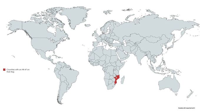
However, the punchline becomes apparent when you notice that, apart from Mozambique in Africa, all other countries and continents remain colorless in shades of gray. It displays that no other nation worldwide has adopted this unique flag motif. Thus, it’s a witty commentary on Mozambique’s exceptional flag, showcasing how symbols can sometimes create map-based humor.
Americans’ Quest to Locate Ukraine on the World Map
This map unveils the outcomes of a survey that tasked 2,066 Americans with finding Ukraine on a world map. While many participants successfully located Ukraine, a cluster of dots amusingly gathered over Kazakhstan. As Kazakhstan lies right next to Ukraine, many people made this mistake while pinpointing the exact location on the globe.
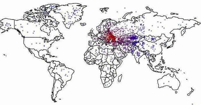
However, what’s surprising to notice here is that sporadic dots appeared in faraway regions like Canada, Japan, and India, as if Ukraine mysteriously cast its influence across the globe. Hence, this map humorously illustrates people’s obvious and unpredictable geographical confusion when testing global knowledge.
The UK’s Great Euro-Japanese Odyssey
In this map, the UK is conspicuously absent from the continental landscape. Instead, it has been detached and placed adjacent to Japan, which remains hidden in this Europe-only map. Therefore, this map of Europe suddenly becomes one devoid of the country of the Britons!
The humor arises from the concept’s absurdity, as it interprets the idea of “if the UK were next to Japan” without considering the impossibility of such a scenario. It’s a fanciful take on geographical rearrangement that encourages a chuckle at the expense of conventional map accuracy.
A Geography Joke in Ink
Imagine a world map tattooed on a man’s arm, a permanent testament to his love for the globe. But do you know what’s the humorous twist? It comes with a time-traveling punchline. With the Earth’s geography changing over millions of years, the tattoo might hold no value, looking utterly ridiculous.
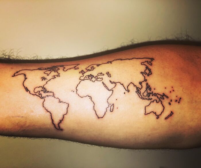
But the irony is that no man or his tattoo would be around until those changes occur, making a joke out of the entire scenario. Nevertheless, it’s funny to know that even tattoos can’t escape the ever-changing face of our planet!
Fish’s Eye View World Map
Subverting typical cartography, this map transports enthusiasts on a whimsical journey far removed from traditional geological concepts. It paints a vivid picture of the world through the eyes of marine life. The map highlights the vastness of oceans, the intricate details of coastlines, and a curated selection of enchanting islands.
With a dash of humor, it encourages viewers to dive into the perspective of underwater denizens, inviting them to ponder how our planet might appear to the creatures of the deep. While this creation imparts no practical knowledge, it enriches the collections of map enthusiasts with a delightful plunge into an aquatic dreamscape.
A Darkly Humorous Take on European Dining Habits
In this amusing map of Europe, countries are color-coded to indicate whether or not they have “eaten” their prime minister, metaphorically speaking. Most countries are shaded in green, implying they have never resorted to such culinary measures. However, the Netherlands stands out with a red mark, referencing a historical incident with black comedy.
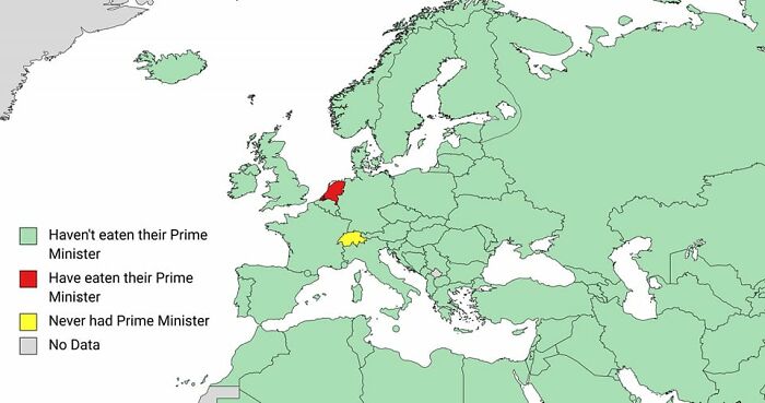
In 1672, the citizens of the Dutch Republic killed and consumed their Prime Minister, Johan de Witt’s liver! On the contrary, Switzerland is humorously colored in yellow, emphasizing its historical lack of a prime minister. Hence, this map is a playful, dark take on a bit of gruesome European political history that might leave you with less appetite.
Football’s Jersey Sales Showdown Map
This map humorously delves into the fame of American football players, highlighting their popularity through jersey sales data. It playfully reminds us that factors like team performance and regional marketing can significantly impact these rankings, making it more than just a reflection of skill or renown.

But this map considers jersey sales the sole indicator for determining the most sought-after player, which can lead to amusingly inaccurate results. It aims to offer a fun perspective on the quirks of sports fandom, where the numbers don’t always tell the whole story.
A Map of Date Formats
This map is like the stand-up comedian of the cartographic world. With a bold splash of red, it spotlights the United States and Alaska while declaring, “Map of Countries That Use the MM/DD/YYYY Date Format.” It’s a chuckle-inducing reminder that not everyone writes their dates the same way.
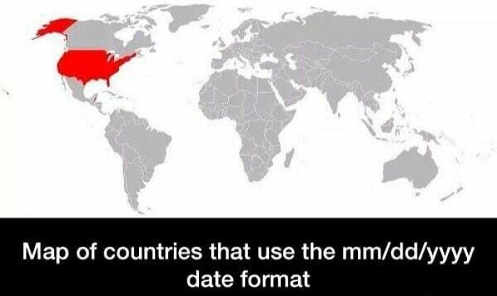
As the world uses DD/MM/YYYY, the US stands firm with MM/DD/YYYY. It’s like a geological inside joke, emphasizing that even minor quirks can spark a good chuckle. So, when you see a date, know that the Land of the Red goes by the MM/DD/YYYY beat!
The Polar Express That Never Was
Here’s a map that proudly boasts itself as the “Railway Map of Antarctica.” Yet, upon closer inspection, it becomes clear that no railway line or station is in sight. Of course, owing to Antarctica’s unforgiving icy landscapes and harsh conditions, even the concept of railways is irrational.
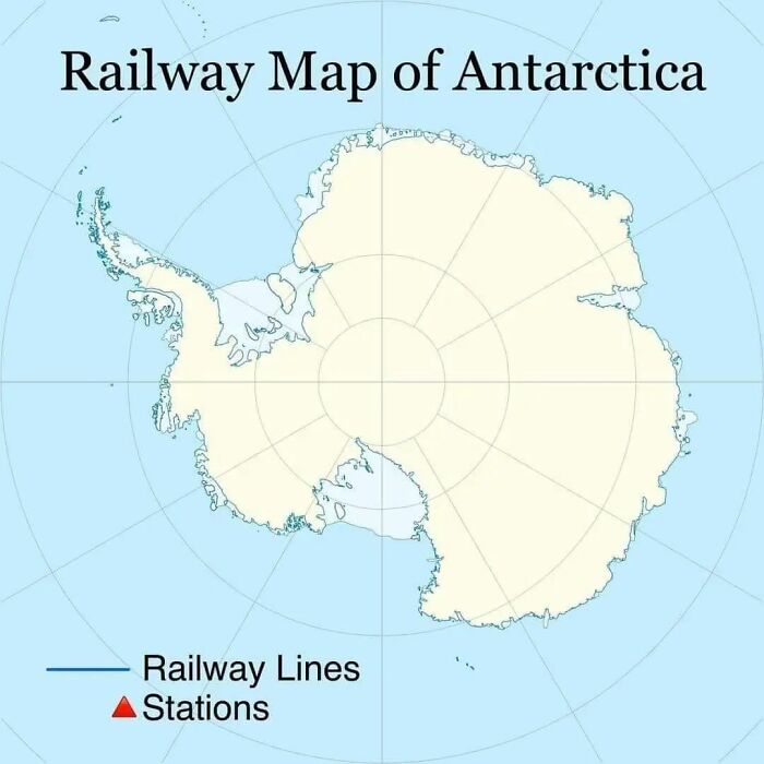
Thus, the map tickles the funny bone by poking fun at the sheer impracticality of trying to lay tracks in the frozen heart of the South Pole. Unless mankind somehow gains the power to make the magical Polar Express a reality, this map will remain a humorous joke and an uninformative depiction!
A Narrow View of the USA
This map pokes gentle fun at the notion of American exceptionalism. Embracing a minimalist design, it simplifies the complex tapestry of the United States into four distinct regions: “New York” in the east, “LA” in the west, “Yeehaw” in the south, and “Disney World” in the southeast.
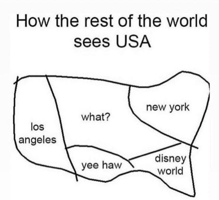
Usually, people outside the USA know only some of its significant landmarks, viewing the rest of the country as shown above. So, this map playfully mirrors international stereotypes through humor and satire while offering a lighthearted critique of how some perceive the United States through a narrow lens.
World Map Transformed: The Polar Bear Mirage
Here’s a captivating topographic masterpiece that defies convention. All the continents are represented in stark black, while the vast oceans are rendered pure, glistening white. However, the magic of this map lies in the land masses being ingeniously reconfigured and tilted at various angles, forming the unmistakable image of a majestic polar bear.
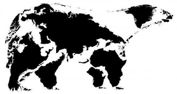
This map showcases the limitless creative potential of cartography. It encourages us to explore the world with fresh eyes, revealing the ordinary as something extraordinary. It’s more than a map; it’s a work of art that celebrates the magic born from the union of imagination and the Earth’s innate splendor.
Italy’s Regional Data Palette
Look at this map of Italy that delves into the regional statistics characterizing the country. Starting from the north, regions are shaded in lush dark green, symbolizing positive data trends. As you move toward the central part of the nation, the colors shift to a gradient, transitioning from light green to yellow, representing average data.
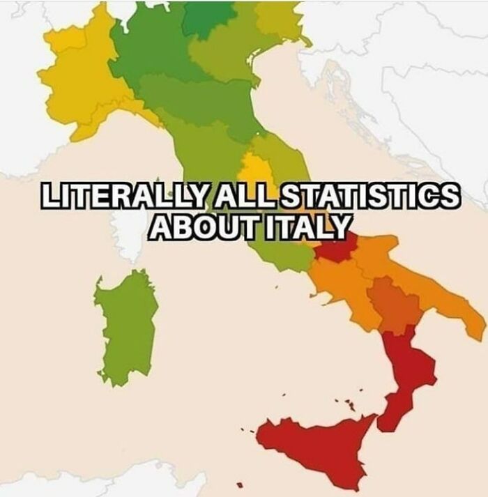
Finally, as you reach the extreme southern regions, they are depicted in fiery red, humorously indicating negative data. It’s a clever way to encapsulate Italy’s regional diversity and statistical quirks in a playful visual, reminding us that the country’s metrics can be as varied as its landscapes.
Data Quality in Europe: A Candid Assessment
This data map adds a touch of humor by playfully assessing data reliability across European countries. The UK, Spain, France, Germany, and Sweden are commended with glowing reviews, while Poland, Hungary, Romania, and Bulgaria receive an “OK.” Greece and Turkey fall into the “average” category, offering a lighthearted take on data quality.
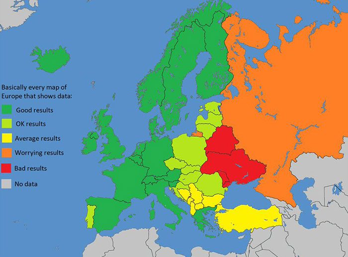
However, the humor escalates as Russia’s results turn “worrying,” Romania gets labeled “bad,” and the rest of the countries receive a comically unhelpful “no data” rating. It’s a satirical take on data reliability, making light of the complexities involved in collecting accurate information across diverse European nations.
The Self-Explanatory States Map
This next map displays the most common answer from respondents when asked what state they live in. Each state is proudly labeled with its correct name, and the joke lies in the simplicity of the result—every respondent got it right!
This map humorously underlines that basic geographical knowledge is a strong suit for most, making room for zero mistakes. It playfully emphasizes that some questions have such apparent answers that they hardly warrant asking, injecting a dose of lightheartedness into confirming our general awareness.
The USA’s Oddly Named Towns Map
Regular informative cartography can be tedious, so this map takes you on a tour of the nation’s quirkiest-named locales. Now, you can travel from Big Bottom in Washington to Ding Dong in Texas, explore Catfish Paradise in Arizona to Satan’s Kingdom in Massachusetts, and enjoy some Spuds in Florida to Fries in Virginia.
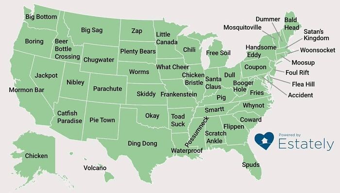
This map beckons you to dive headfirst into the nation’s rich tapestry of humor, one peculiar town at a time. It’s an entertaining journey through the idiosyncrasies of place-naming in the land of the free and the home of the brave. Each town name here is no doubt a nugget of linguistic treasure.
Identical Borders? No Wonder!
We all know that the US and Mexico are neighboring countries, but this map showcases them separately to illuminate a pointless discovery. It comes with a caption deadpanly stating, “The southern border of the USA is identical to Mexico’s northern border.”
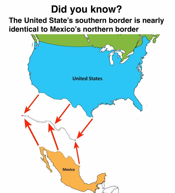
Although neighboring countries naturally share a border, the way this map presents them separately adds an almost miraculous touch to this straightforward fact. It serves as a reminder that even the most evident statements can be incredibly amusing when viewed differently.
Super Bowl Wins Worldwide: USA Dominates
The Super Bowl Championship has become increasingly popular worldwide. So, here we unfold a map designed to uphold Super Bowl victories by different countries. Sarcastically, the map only highlights the USA in triumphant red as the exclusive winner, seemingly in a global competition.
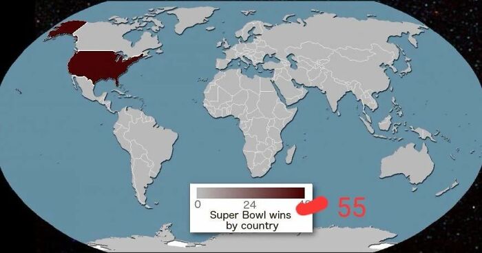
With no international competition, the Super Bowl’s all-American nature crowns the USA as the undisputed champion. This portrayal turns the whole concept into a light-hearted joke, playfully reminding us that you can’t win if you don’t participate. It’s a playful nudge at the absence of international teams in America’s Super Bowl.
The Curious Case of Roman Airbases
Historical humor is the spirit of this intriguing image that defies expectations by illustrating the locations of Roman airbases, but it cleverly shifts the perspective to a map of Europe. In the 2nd century AD, the Romans ruled vast territories and established strategic bases across Europe.
This map wittily recasts those bases as landmarks on a modern European map, offering an amusing blend of ancient history and contemporary geography. It’s a delightful juxtaposition that reminds us how the past can be reimagined with a dash of hilarity and a pinch of topographical creativity.
The Asia Shirt: A Geography Mishap We Can’t Unsee
Check out this hilarious picture! A light brown shirt boasts a map that will make you double-take. It labels Africa as “Asia,” creating a humorous clash of continents. The source of laughter here is the sheer absurdity of the mistake—Africa and Asia are distinct and universally recognized.
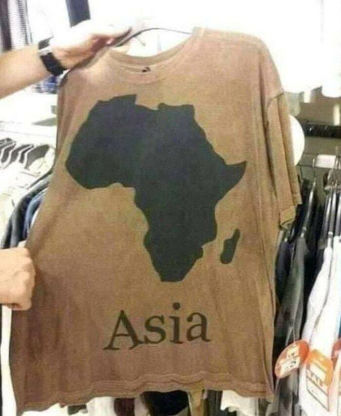
However, the glaring error serves as a playful commentary on the importance of precise information. It highlights how even the most fundamental facts can sometimes be hilariously misconstrued, leaving us with an unforgettable and quirky style statement. Well, for the sake of fashion, geographical accuracy can always be sacrificed, right?
European Pedestrian Mannerisms Map
This amusing cartographic creation gives us a lighthearted glimpse into how people walk across diverse European countries. Using simple black stick figures, it portrays various nationalities, each with a distinctive walking style. Some figures stride with purposeful swiftness, reflecting the fast-paced lifestyle of the nation, while others stroll, mirroring a more relaxed way of living.
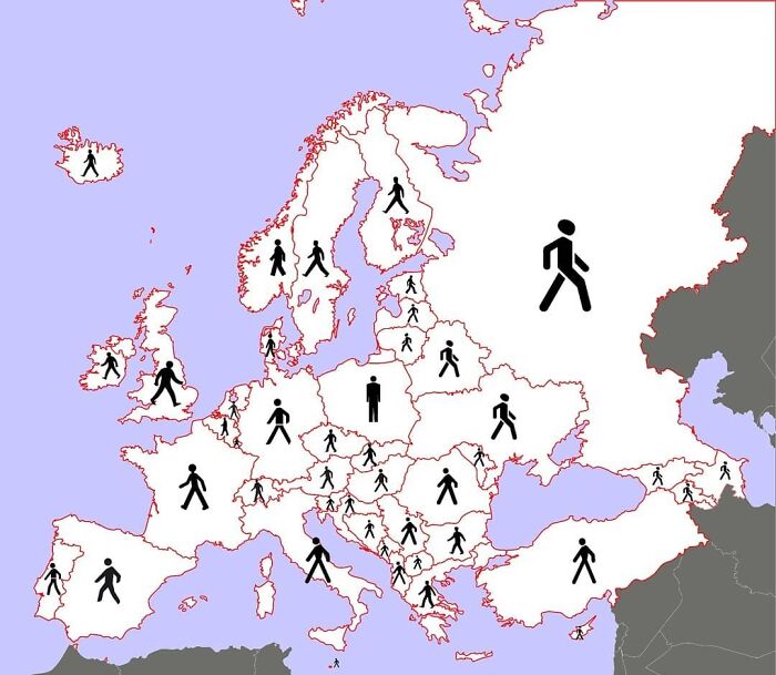
In the midst of this animated parade, Poland’s solitary figure remains motionless, creating a whimsical contrast. Situated at the map’s center, all the other countries are strolling away from it. This lighthearted depiction playfully explores the cultural traits of European nations through the shared act of walking.
In and Out of Finland!
The humor in this pair of maps centers around a simple visual gag. The first map proudly displays the letter “F” within Finland’s borders, appropriately labeled as “Finland.” However, the second map hilariously places the same letter “F” outside the country’s borderline, marking it as “Foutland.”
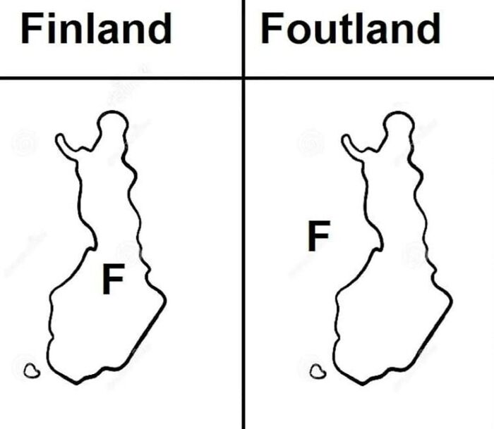
Here, the essence of the joke is rooted in the absurdity of the name change—moving a single letter transforms a familiar country into a comically-altered version. It’s a nod to the idea that sometimes the tiniest tweaks can create the biggest laughs, emphasizing the joy of clever wordplay and unexpected comedy.
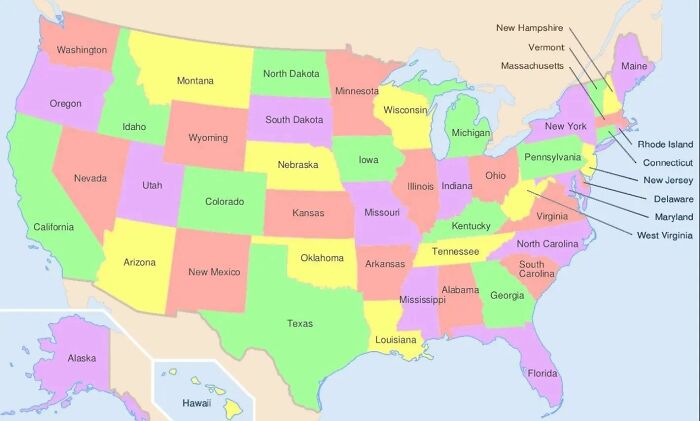
US Kangaroo Ownership Legality Map
A humorous yet partially informative depiction, this map simplifies the complex web of kangaroo ownership laws across the United States with a handy color-coded system. You’ll find only three states shaded in green where you can hop into kangaroo parenthood without legal red tape and don’t require any permit to own one.
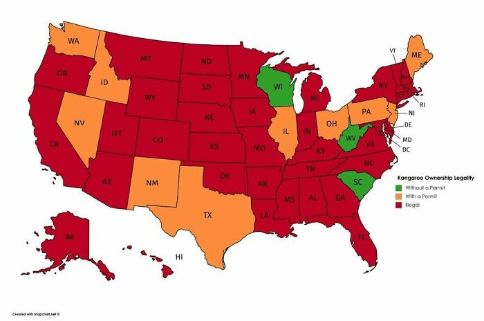
On the flip side, states adorned in lively orange demand permits for kangaroo companionship. Yet, most American states take a firm stance—those painted red mark a clear “no” to kangaroo ownership. Hence, this map is a reliable legal reference for aspiring kangaroo wranglers.
When Beige Rules the Road
On this map, we take a lighthearted journey back to 1960. The map’s index shows three colors—beige for 0 fatalities, green for 1-99, and red for 100-999. However, the entire American map dons a beige hue, humorously reflecting the absence of texting and driving-related death cases during that era.
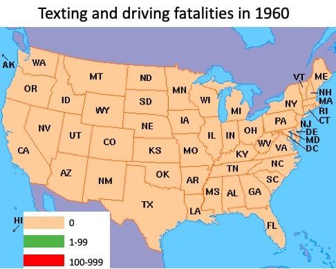
The irony is that in 1960, the SMS concept was only a distant technological dream, so people could neither text while driving nor anytime else. Hence, this map reminds us of how technology has transformed our daily lives now, including the hazards we face on the road, prompting a nostalgic chuckle.
The Overwhelming Pubs of the UK
In this quaint map of the United Kingdom, every pub is marked with a vibrant red pointer. The joke, however, lies in the mirthful chaos that unfolds—the sheer number of pubs across the country is so staggering that the entire map becomes a riot of red, obscuring other details.
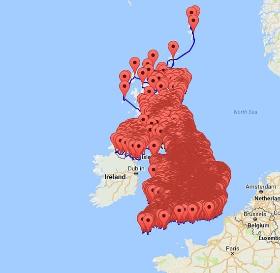
It’s a useless and useful map because although it shows you multiple pubs in the country, you need help understanding their exact locations. It’s a playful nod to the UK’s rich pub culture, where there’s seemingly a watering hole on every corner, and finding anything else on the map becomes an amusing quest.