Creative Bus Advertising That Got People Taking Notice
Companies set aside a substantial amount of their budget for advertising because it is crucial to get the word out about your brand, products, and services to get a piece of the consumer pie. However, it isn’t only the budget that determines a successful ad campaign. You have to think out of the box, and you have to be a maverick because if you do what others are already doing, you will get lost in a sea of advertising campaigns and marketing pursuits. There are plenty of companies offering the same products and services as you, so why should consumers choose you? Bus and bus shelter advertising are great ways of reaching your targeted audience, and these two mediums have been utilized well in the last few years. To get your creative juices flowing and to put a smile on your faces, we have rounded up the most innovative and eye-catching bus ads from all over the world.
Faster than the competition
The world of logistics is packed with competition, and if you’re not fast enough, you’re going to lose. What does it take to stand out from the competition and get people’s attention? FedEx’s “Always First” campaign seemed to have hit the right note and found the perfect formula.
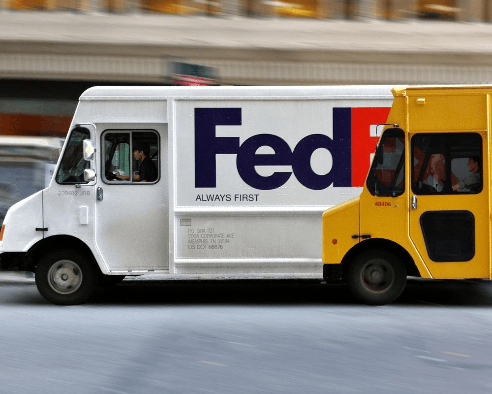
Not only does it show their familiar white truck on the way to deliver packages, but it also takes a jab at DHL in a subtle way. The front wheel of their yellow delivery truck is positioned over FedEx’s back wheel, implying that the competition has a lot of catching up to do. Whoever thought of this deserves a raise.
Get people to the zoo with your ad
Nowadays, there are so many attractions that if you don’t market aggressively, you will be lost in the crowd. So, the National Zoo and Aquarium in Canberra, Australia, came up with something sure to drum up publicity and get people back to the zoo in droves.
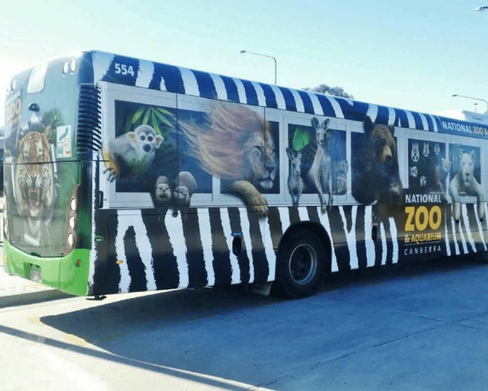
Their bus advertising shows a variety of animals as passengers on a bus, such as kangaroos, birds, bears, and monkeys. There is even a lion with his mane blowing in the wind. If you happen to drive by the bus with kids in the car, you’d be heading to the zoo in no time.
Men at work
Monster.com is a website that connects employers and job seekers. However, it is not the only website of its kind in the world. To get people to use the platform, the company took out advertising space on a double-decker bus.
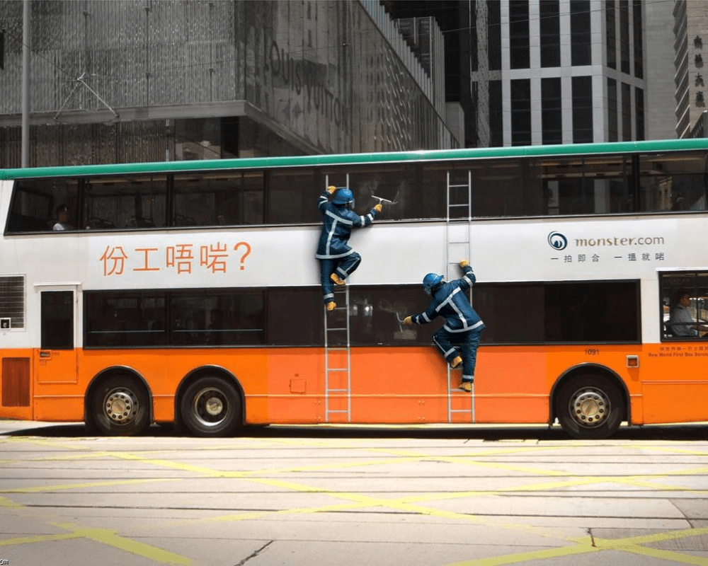
The clever use of shadowing makes the two men standing on ladders and washing the bus windows look very real. It also came with a tagline that said, “Stuck in the wrong job”? We won’t be surprised if they had a surge of sign-ups after the campaign.
Clever Ghost Rider Bus Ad
How do you convey to the masses what a movie is all about in just one advertisement? Those who were in charge of marketing the movie Ghost Rider hit the nail on the head with their innovative bus ad. Just by looking at the bus wrap, you get the idea that the movie has cool visual and special effects.

We’re quite sure that this helped increase the number of audiences in cinemas all across the country. It captured the movie’s essence, and it also used the bus wheels to add some style to the ad. The ad agency certainly did an awesome job on this one.
Kiss me honey, honey
They say putting logos and ad placements on bus sliding doors can be very tricky. However, if you do things correctly, it could pay off big-time. This ad for Smint breath mints hit the jackpot with their sliding door ad.
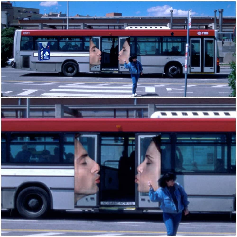
It shows a man and a woman puckering up and getting ready to kiss each other when the door is open. When the door slides close, it shows them kissing. We are just wondering why the guy’s lips seem to be redder than the girl’s.
Snakes on a plane? No, it’s Snakes on a Bus
The attendance in zoos these days must be slow as this is the second but not the last zoo bus ad you will see on this list. Promos have been battle-tested to bring patrons in droves, and Connecticut’s Beardsley Zoo didn’t waste any time getting the ball rolling.
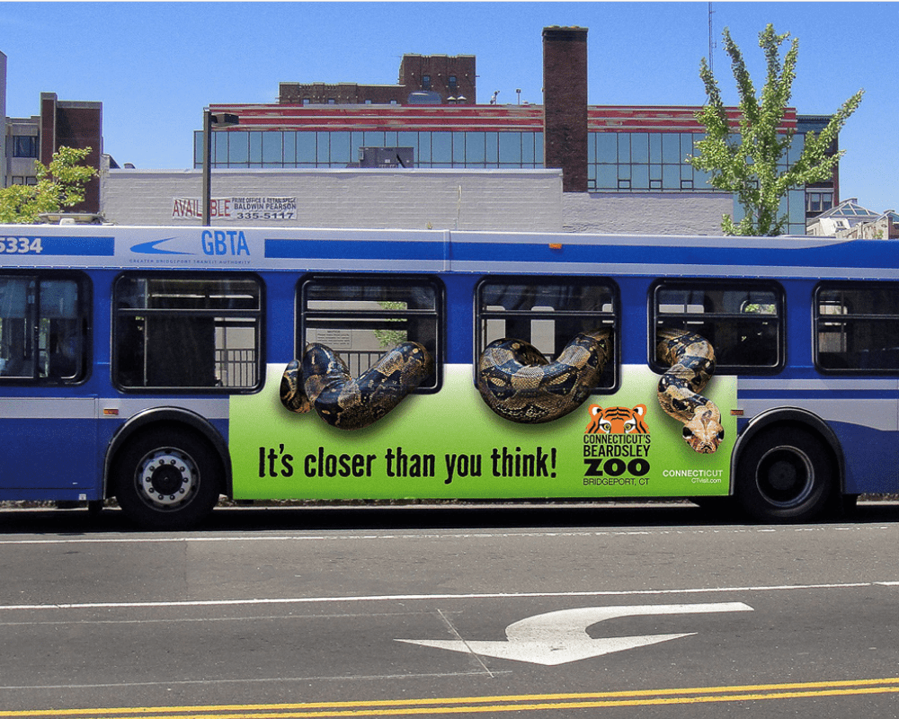
They cleverly created an illusion of a giant snake slithering in and out the bus, but don’t worry, though, as there’s no danger here. However, it’s another story when you get to the zoo. You’re gonna see a variety of creepy crawlies, as well as some adorable animals.
Make your first-class dreams come true
It’s always fun to fly first class. You get the best seats on the plane, bottomless free drinks, excellent meals, and over-the-top amenities. Just think of yourself walking down the aisle to your seat. This bus ad will put you in first class in no time.
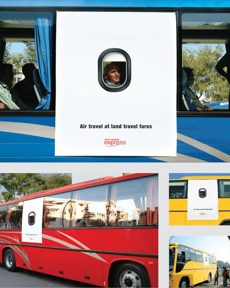
Just a simple sticker brings your flying dreams to reality. The best thing about the ad is that it is perfectly placed to show the passenger’s face for people on the streets to see—way to make good use of those creative juices.
Who let the dogs out on the bus?
This ad is in Spanish, so for those who don’t speak any Español, Tiernitos means “little cuties” or little tenders.” Now that we have that important information out of the way let’s talk about the ad. When you look at this bus ad, you immediately have the idea that it has something to do with dogs.
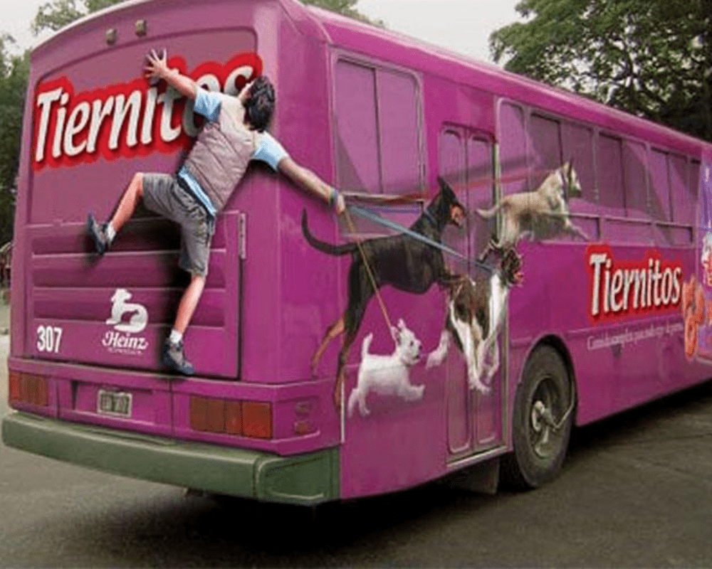
It shows a man holding on to the back of the bus, trying to walk four dogs that are chasing Tiernitos dog food. This ad is a great invitation to get pet parents to try the product. A tip for pet parents, if you’re taking that many dogs out for a walk, you better be fit.
Flipped out for ice cream
Ben & Jerry’s is a brand that is not shy about clever and eccentric ice cream flavor names. Just think of Netflix & Chill, Chip Happens, Minter Wonderland, and Cherry Garcia. They get people’s attention, and it makes the brand stand out from the rest of other ice cream companies.
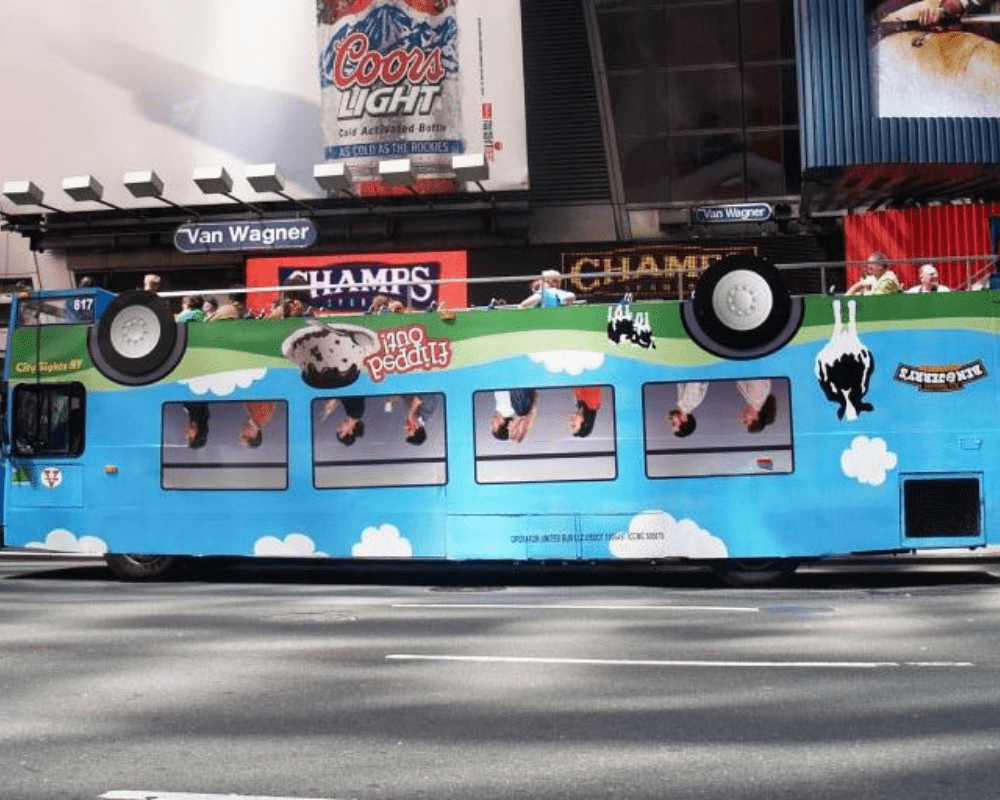
To get people talking about Flipped Out, their newest ice cream flavor, they placed a wrap sticker on the bus that made it look like it was upside down. Not only did it get people’s attention, but it also succeeded in driving the point home too.
The humungous Mars bar
Mars bars have been around since 1932, and it has seen a lot of changes, as well as the emergence of other chocolate bars onto the market. To stay relevant and keep up with the competition, the company thought of a clever way to remind people of its goodness.
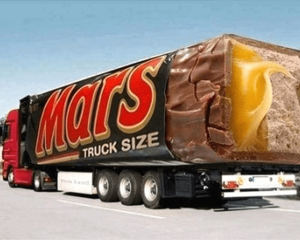
The truck’s shape imitates that of the chocolate bar perfectly. How would you feel if you saw a giant, truck-size Mars bar on the road? It would absolutely make our mouths water and prompt us to stop at the nearest store so we can get some.
Air New Zealand flying high above the competition
With the travel industry hibernating in 2020 because of the coronavirus, many are excited to go on a vacation somewhere once the situation is better. Although this ad by Air New Zealand was done a few years ago, we think it would still be a hit if it was launched now.
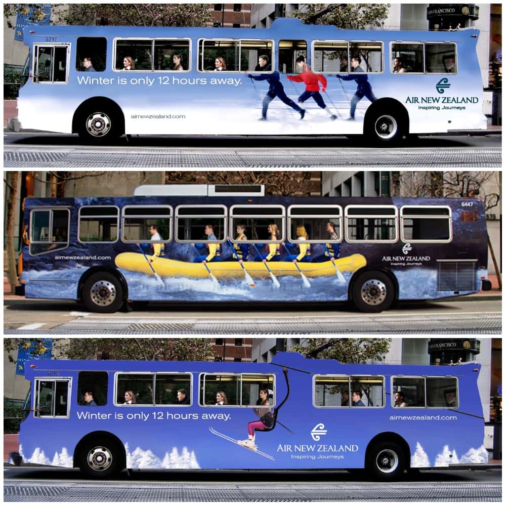
Not only did they come up with a single ad, but they also came up with a few interactive ads for busses. It shows all the great activities their passengers can look forward to when they fly with Air New Zealand. Imagining all the fun activities makes us want to book our tickets now.
The new bus Batmobile
The Batman trilogy with Christopher Nolan at the helm and Christian Bale in the lead was not only commercially successful, but it was also critically acclaimed. The Batman vs. Superman: Dawn of Justice movie with Ben Affleck as Batman had very big shoes to fill, and sadly it wasn’t able to live up to its hype.
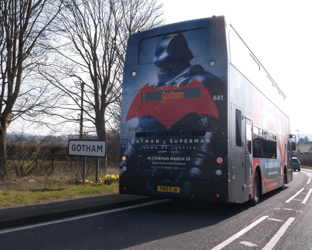
Although this bus ad is unlike the other ads on this list, we still think that the funny coincidence deserves a spot. The bus with the ad for the movie was driving towards a town in the UK named, drum roll please, Gotham. See that sign on the left?
How would you like to ride on the X-ray bus?
Most of the time, we have no idea what people are thinking and what kinds of things they have on their persons? Do people on the bus have dangerous paraphernalia? Would it interest you if there was a way to know?
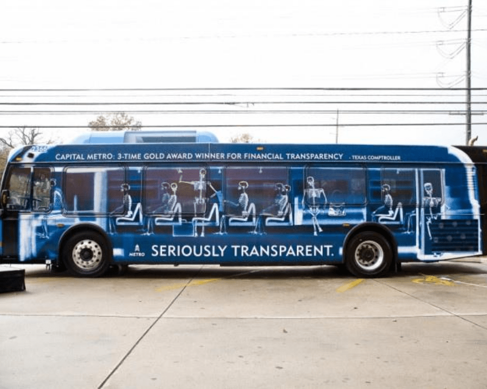
The idea seemingly proposed by this X-ray bus seems scary. It gives other people a glimpse of the bus and its passengers. If there was a bus X-ray just like this, I’m sure people would have second thoughts about riding it.
Genie in a bus
Before the live-action version of the Disney classic, Aladdin was released in theatres; there was so much talk about who was gonna be playing the roles of the titular character, as well as his beloved Jasmine. Walt Disney Pictures was hard at work, promoting the movie at the same time.
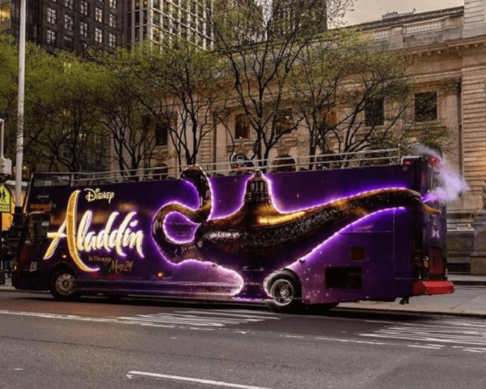
To make the bus ad more realistic, the designers thought it would be brilliant to position the lamp’s mouth next to the bus’s exhaust pipe! This gives folks the illusion of an actively-smoking lamp. We’re sure passengers scrambled to get a spot on the bus.
Super fun Safari
Children are an essential demographic to marketers because they have considerable purchasing power. They will cry and throw tantrums until their parents get what they want. Suffice it to say that they have a huge influence on their parents’ buying decisions.
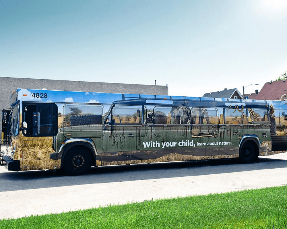
This bus ad for a family-friendly safari activity puts great emphasis on education and fun. Putting the entire safari on the side of the bus also helps parents everywhere imagine themselves in a safari vehicle with their kids enjoying nature.
The bus that stretches
If you want an advertisement that drives the point home for your audience, your ad should not only be visually appealing; it should also make good use of wordplay that ties everything together. If you want to get noticed, you better get all your ducks in a row.
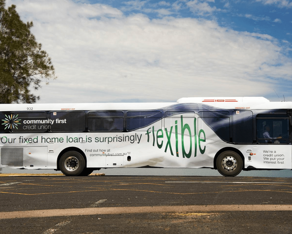
Banks are generally not known to be attention-grabbing. After all, loans, mortgages, and refinancing are not sexy topics. However, how this bus looks super stretchy and warped right where it says flexible is guaranteed to get heads turning.
Keep your distance
It’s guaranteed you’ll keep your distance when you see this ad. This distinct ad stands out because it looks like there is a car sticking out from the back of the bus. Although there isn’t any company associated with the ad, it makes us think that it has got something to do with insurance.
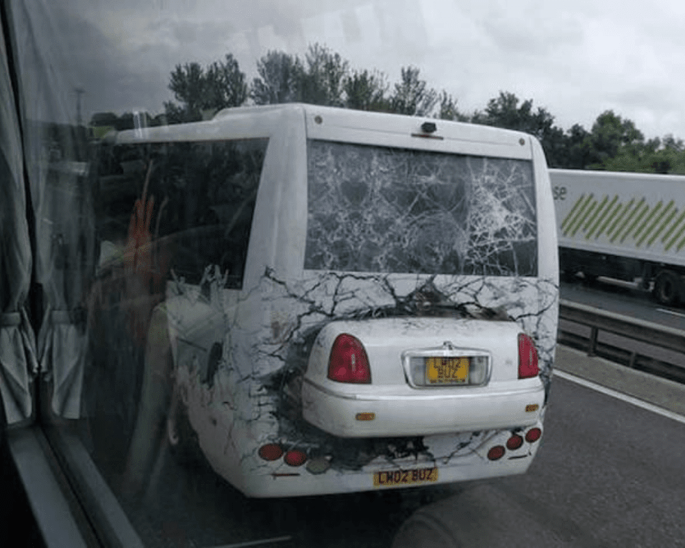
There are no words on the ad, only an image, yet it conveys the message articulately. Drive carefully or get into an accident and when you get into an accident without any insurance, you will be in very big trouble.
No crime goes unpunished
This ad placed on the back of the bus seats doesn’t mince any words. It strongly warns that vandalism will not be tolerated, and those who are caught will be arrested. Graffiti and vandalism are some of the major problems, especially in huge cities.
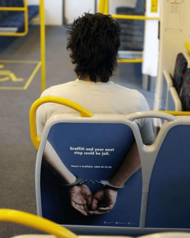
The passenger’s physique in this photo is perfectly lined up with the size of the ad, as well as the placement of the arms. At first glance, it looks like he is handcuffed. It is another example of a clever and fun ad.
It’s time to lose some weight
Some people might think this ad is distasteful, but we find it brilliant. Weight Watchers, the weight loss and wellness company that offers various services and products in weight management effectively got their message across to their intended audience with this bus ad.
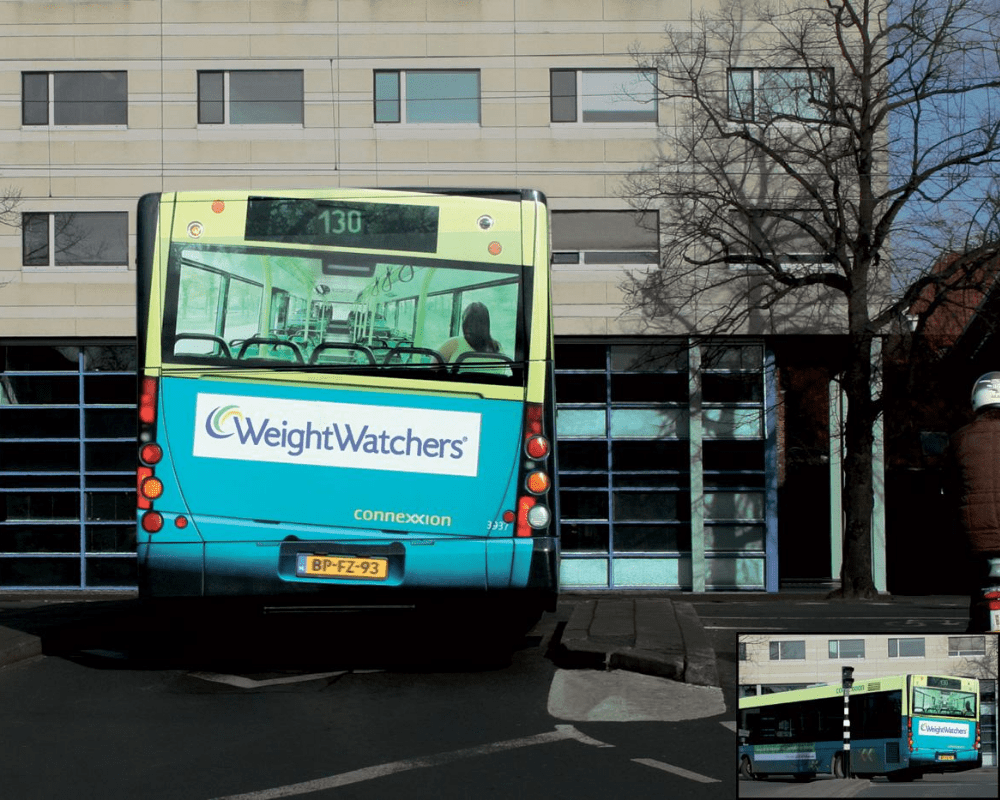
Say what you will about it, but the message is loud and clear. If you think and feel that you’re off your target weight, it’s time for a change, and it’s time to lose a few pounds. The bus is the perfect medium to illustrate what Weight Watchers want to say.
King Kong crushed the bus
A movie as colossal as King Kong wouldn’t be brought to life without the use of visual effects. The larger than life production was perfectly portrayed in the movie’s advertisements and the company behind it spared no expense with their promotions.
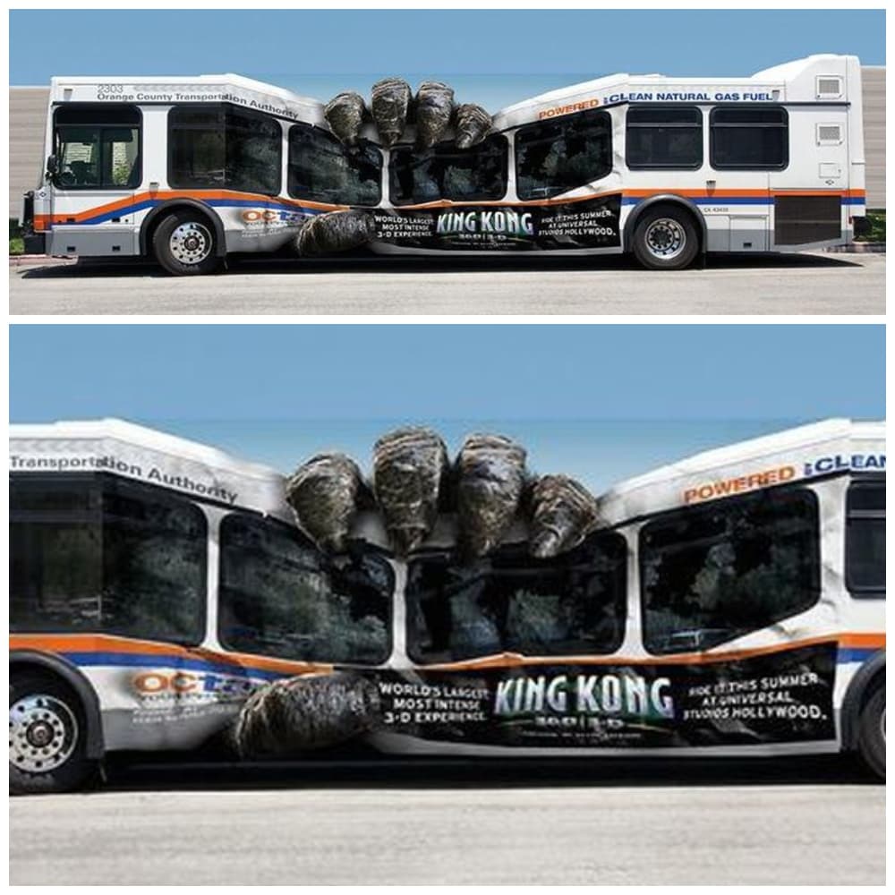
The advertising firm behind this ad within an ad concept deserves to get kudos. It shows a bus with a standard ad for a movie being crushed by King Kong’s hand, along with the bus. This makes you want to go to the cinema and see the movie.
Time to release the Kraken
No, we’re not talking about the legendary monster that made an appearance on The Pirates of the Caribbean, but rather the energy drink. Naturally, the brand’s mascot is the fabled giant octopus that pulls ships and sailors to the ocean’s abyss.
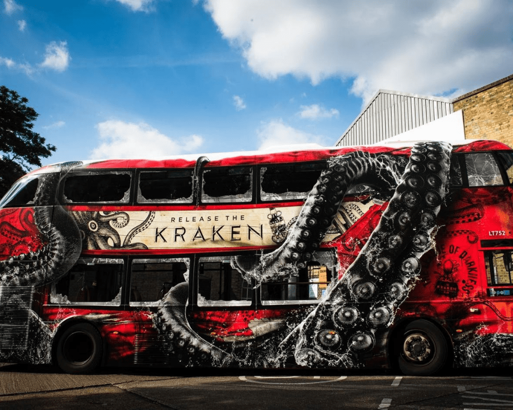
Unlike other advertisements, the energy drink’s marketing team did not even give any hint about what the product is all about. It leaves the viewers to make their assumptions, and this ad is the best example of how you can pique people’s interest.
A bright idea for lights
Duracell, the American company that produces smart power systems, as well as batteries, had a clever idea for promoting their new flashlights. They had the designer position the flashlights to make it seem as if the bus headlight came from it.
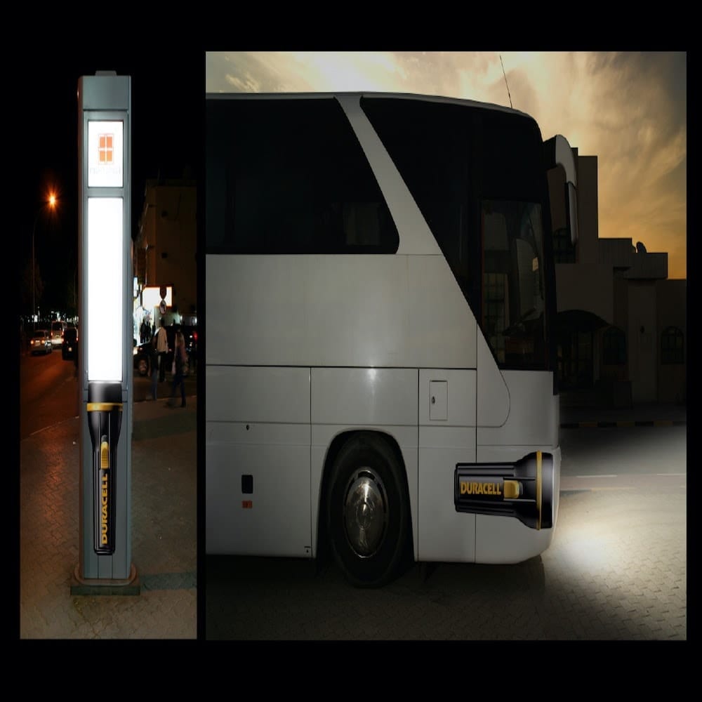
They also employed the same concept on the stations of the bus’s route maps. Drivers of other vehicles, as well as passengers and pedestrians, couldn’t help but notice the bus, as well as the stations. We can bet that the team who thought about this got a nice bonus.
Play some music on the bus
We are not sure if this is an advertisement for a product or a service as there is no tagline or company name, but we still think it is one of the most innovative brandings out there. This is an excellent way of creating an illusion by using parts of the bus.
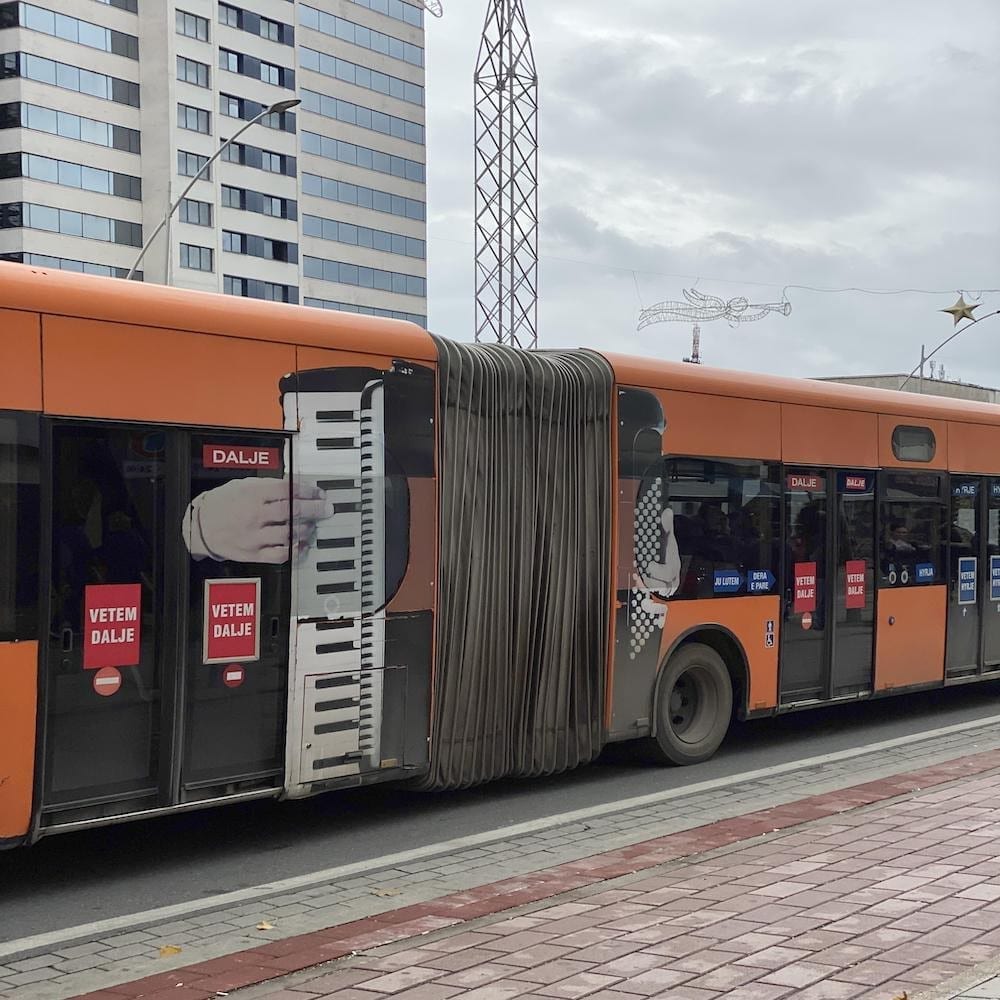
This bus is also called an accordion bus, so this might be the bus company’s ploy to make it look more attractive and bring some life to the exterior. Regardless of the reason why the bus was designed in such a way, we find it very amusing.
Watch it
Unlike other advertisements on this list, this can’t be seen on the exterior but rather on the interior. The use of the bus’s holding straps to promote a watch model and brand was ingenious, to say the least. Once you put your wrist through the handles, it seems as you are wearing the new watch.
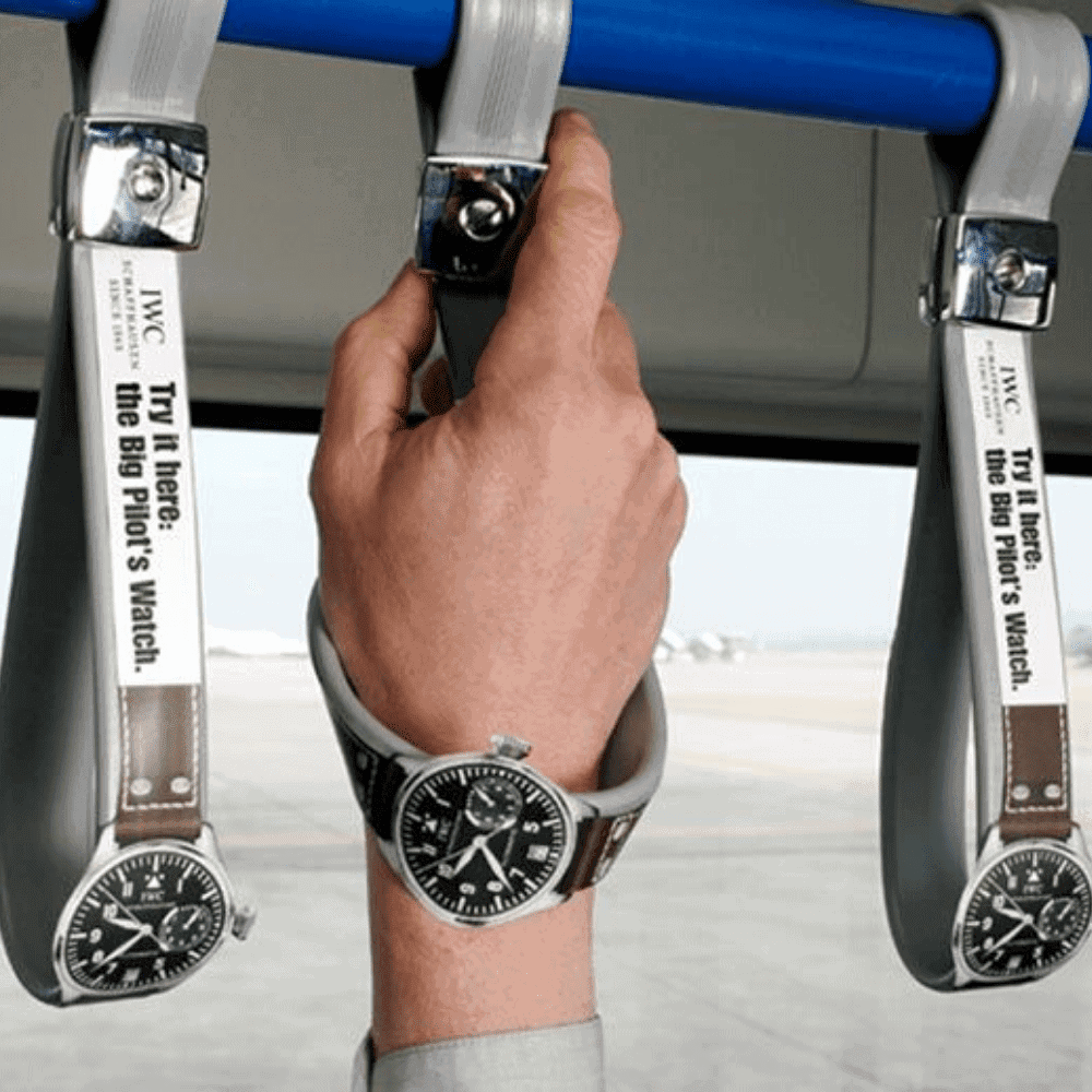
This technique makes the ad highly conspicuous to all passengers. Not only do they get to hold on for safety, but they also get to try on the watch. Doesn’t this want to make you go and buy the watch?
Long, smooth legs with no effort
This man on the bus must be wondering why people in passing cars and other vehicles, as well as pedestrians, are looking at him. He must also be thinking if he has dirt on his face when he sees people giggling after glancing at him.
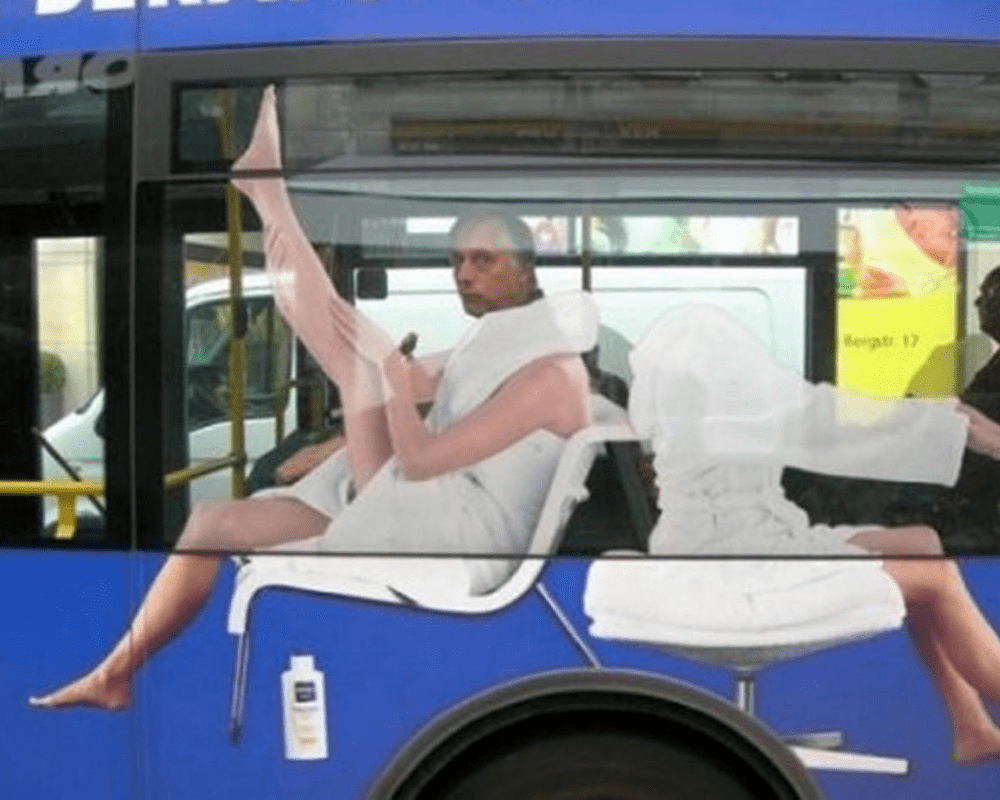
Instead of getting a perfect model to promote their skincare product, this company thought it would be more memorable and funny if they left out the head and let the bus riders do the work. We thought it was outstanding.
Shark attack
To drum up interest and ensure increased viewership for Shark Week, the National Geographic Channel thought of a clever ploy to draw people’s attention to their bus advertisement. The layout was perfectly executed with the bus door virtually becoming the shark’s mouth.
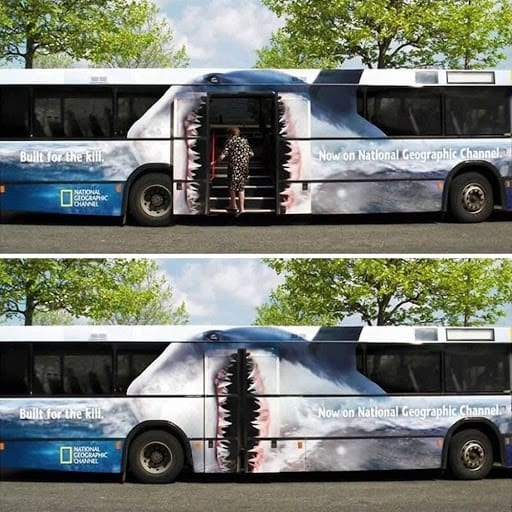
Whenever someone gets on the bus, it seems as if the shark is getting ready to eat another meal. This is an excellent advertising concept and the firm who drummed this up wasn’t biting off more than they can chew.
The perfect way to advertise specs
What do you think is the most effective way to advertise optical services? Specsavers found the right ingredient. The design was executed flawlessly, and at first glance, it looks as if the bus driver needs help with his eyesight.
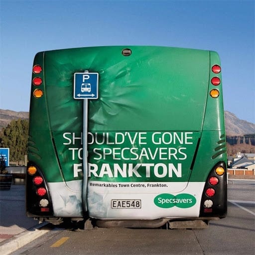
The ad sticker placed on the back of the bus looks like the bus has backed into a signpost. If you drive behind this bus, two things will pop up in your head; one is that you need to keep a good distance, and second, you need to visit your eye doctor soon for a check-up.
Be clean and green
The Netherlands is known all over the world as one of the cleanest and greenest places on earth. When you visit the country, you will be surprised just by how litter-free the cities are. Their recycling initiatives are also exemplary.
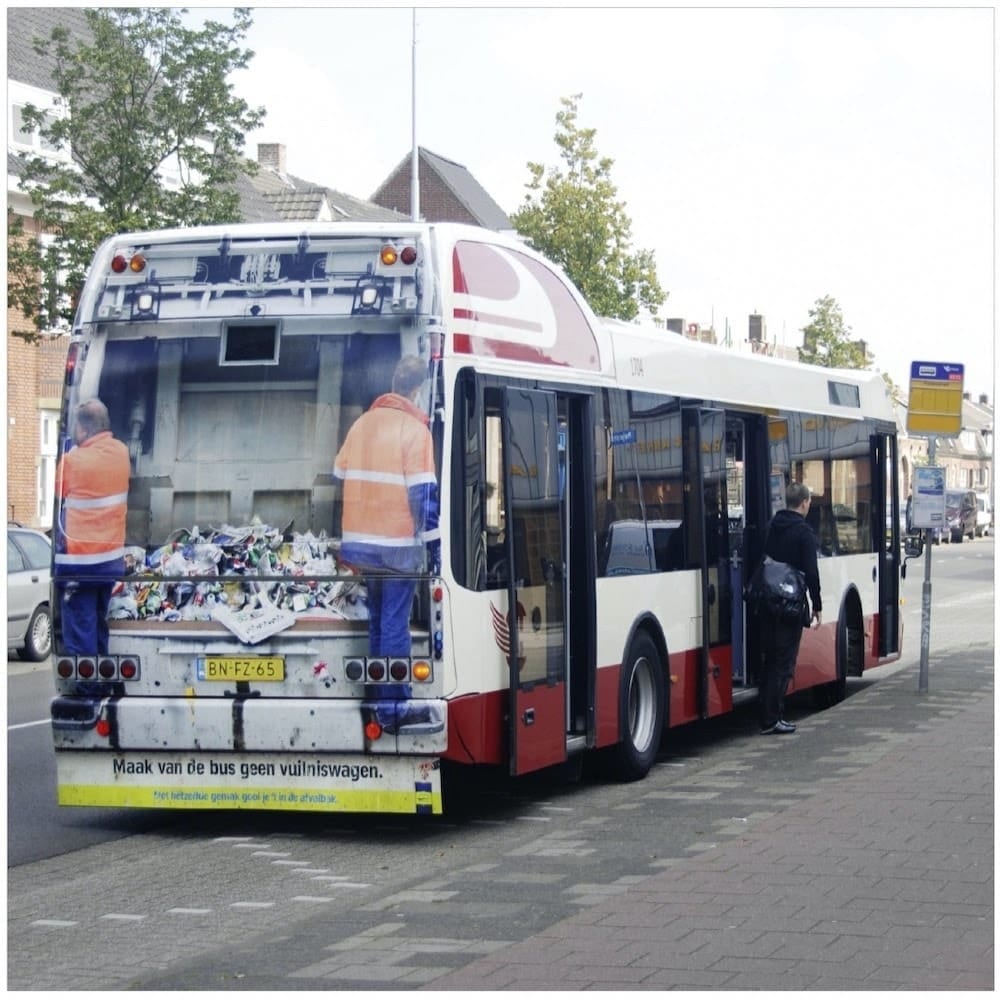
To remind people not to litter on buses, the government thought of an advertising campaign to effectively convey their message to the masses. Although you will only see the ad when you drive behind the bus or pass behind it, you will get the message loud and clear.
Watch the Stranger Things
If you have been living under a rock for the past five years, then you have a lot to catch up with. One of the most popular shows on Netflix, Stranger Things is set in the 1980s in a fictional town called Hawkins.
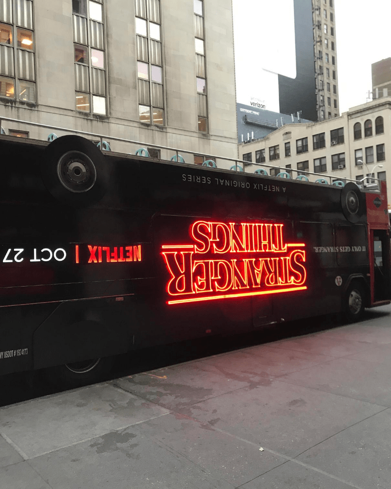
The supernatural horror TV show explores a twisted world known as “the upside-down.” To get people interested in the show, Netflix came out with an ad that made the bus look as if it is upside-down. Someone who doesn’t know the show would check it out after seeing the bus.
Craving for a bite
Bus doors can be handy tools when it comes to creating outstanding bus ads, and this company in South Korea understood that perfectly. Although we can’t determine which company placed the ad on the bus, it is clear that they are promoting food.
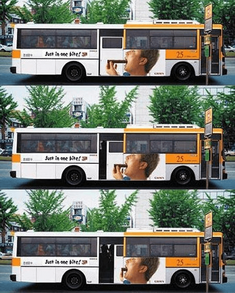
A man can be seen trying to eat a bar of chocolate. When the door opens, you will be able to see the man successfully devouring the whole bar. We’re not sure if the company is trying to persuade everyone to eat chocolate or avoid it, but we’re hooked either way.
Keep your mouth and teeth clean
With all the toothbrush and toothpaste companies, you need an inventive and original idea to stand out from the rest. Dr. Best thought of utilizing an accordion bus to advertise their flexible toothbrush. If you want to emphasize flexibility, this is the best way to do so.
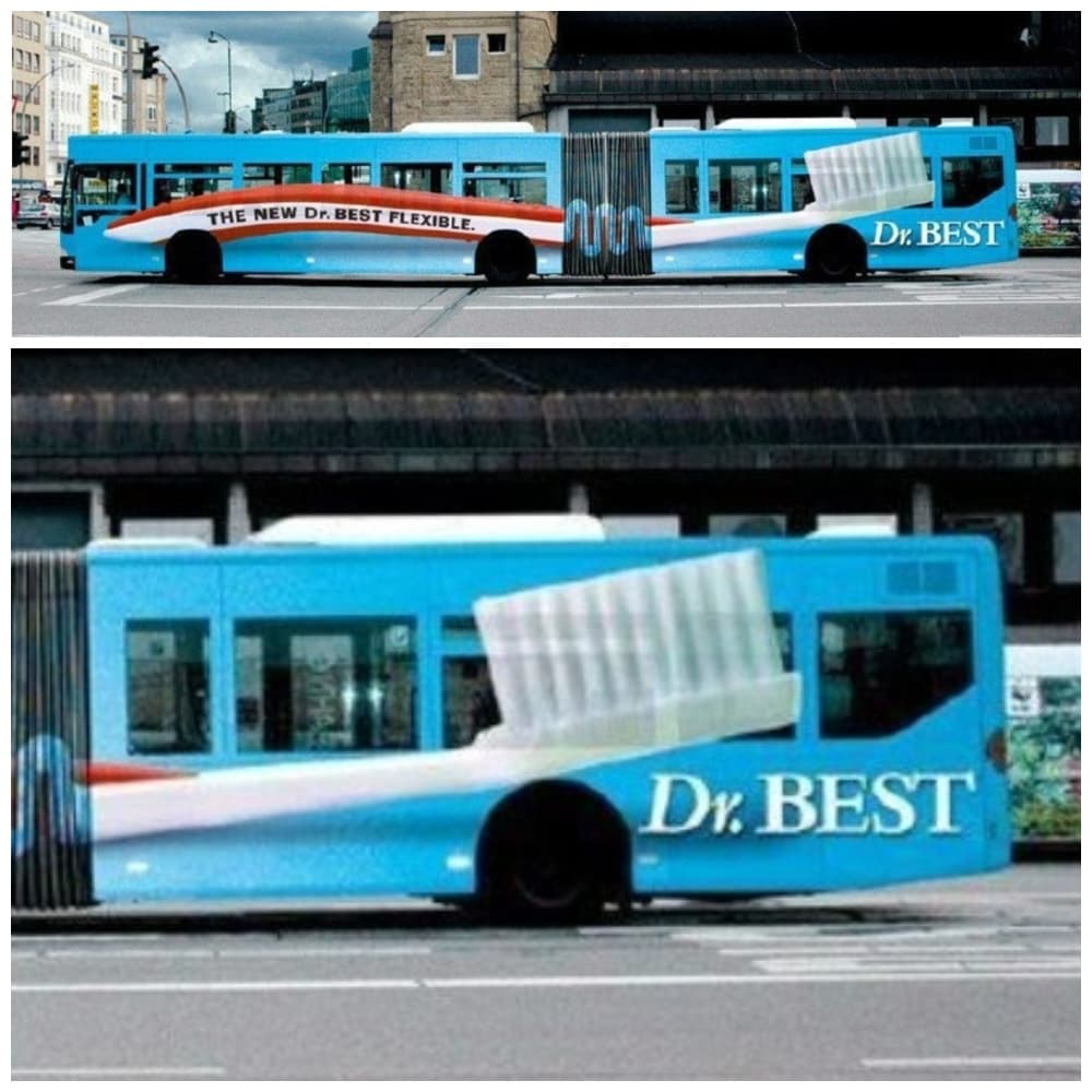
Just take our money already. The name alone wants us to buy all our hygiene products from them. Even if the brand is new to the market, just seeing this bus pass by is enough for many to consider Dr. Best toothbrushes.
Who wants to watch Horton?
Horton the Elephant is a fictional character from Dr. Seuss’s book with the title Horton Hatches the Egg and Horton Hears a Who. This clever bus ad for the movie emphasizes Horton’s weight by making it seem that the bus is getting crushed underneath him.
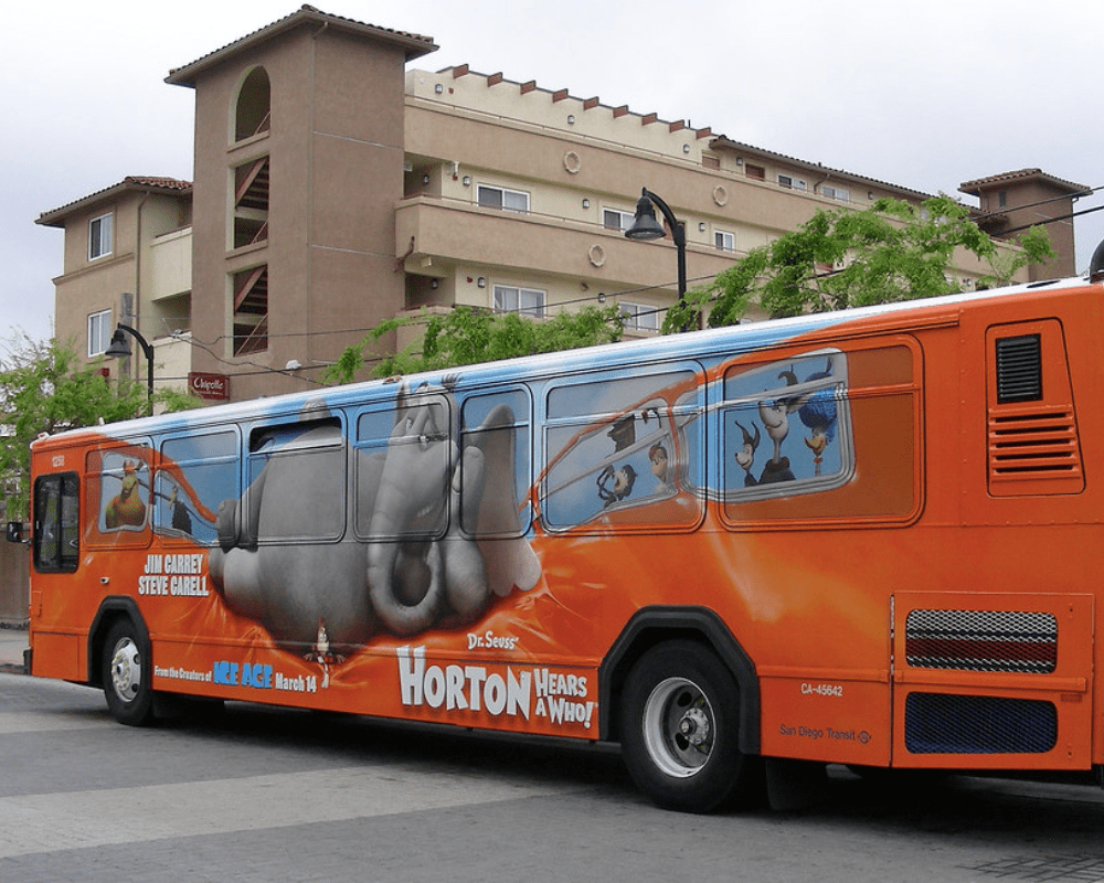
Next to Horton are the names of the leading stars, two very popular comedians. We would be surprised if the movie wasn’t a hit in the movie theatres. Just looking at Horton being cute and all make us want to go to the cinema.
A message that tugs at your heartstrings
If you want to tug at people’s heartstrings and get your message across, you need to do more than just write a few paragraphs. Sometimes, it is better just to use a few words and a powerful image. That’s what this advertisement does.
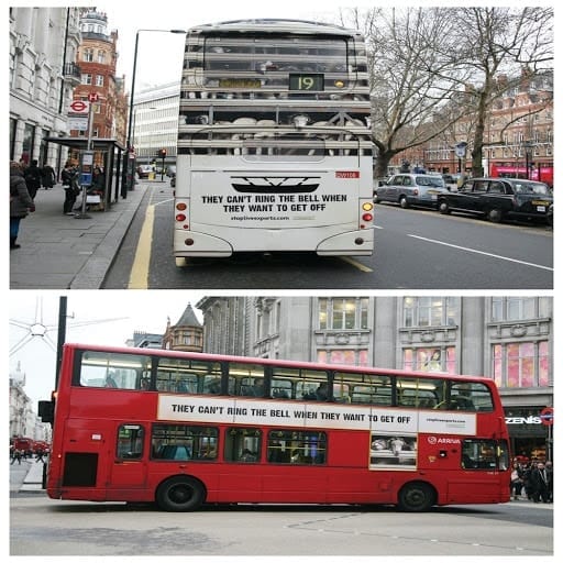
In a bid to educate people about compassionate farming, they wrapped the whole bus with images of captive animals and a message that says, “They can’t ring the bell when they want to get off.” The ad invites the audience to interact and do something about the billboard’s message.
A bus that glows in the dark
When you’re promoting new technology, you need to do something you’ve never done before, which is exactly what Mercedes did. To promote their Night View Assist, a new feature on their vehicles that makes it safer to drive at nighttime.
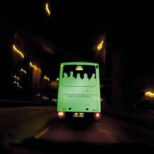
Pedestrians and other potential hazards are more visible to the driver, reducing potential problems. To highlight this, Mercedes went on a campaign using glow-in-the-dark silhouettes on the bus’s back window.
Passengers powering the bus
This advertisement won’t make any sense to the people inside the bus, but to pedestrians and people outside the bus, it is amusing, and the illusion leaves a lasting impression. To promote an energy drink, X4 thought of something out of the box.
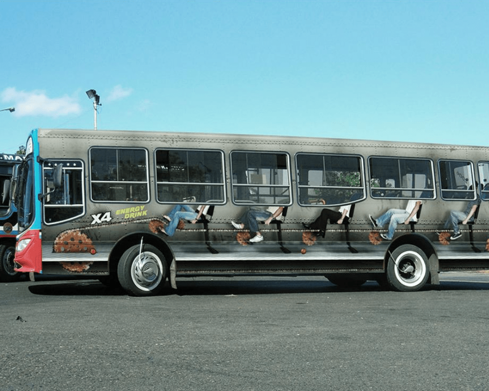
The ad gets the right message across. It shows passengers cycling hard to power the bus, and if that doesn’t demonstrate just how powerful the energy drink is, we don’t know what does. We’re going to the store now to get some of the drinks.
Get your morning news with coffee
News is relevant when it’s still fresh, so just like a hound dog, you must be fresh on the scent of the latest happening. This is what The Dallas Morning News wants people to know through the ad they took out on a whole bus.
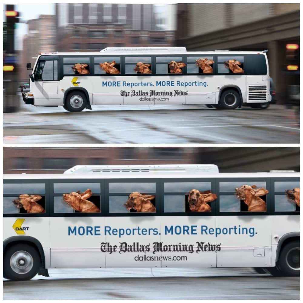
Hound dogs are known for picking up a scent, and showing hounds riding on the bus makes the ad even more relevant. We can ask The Dallas Morning News how effective this campaign was, but we’re quite sure it was.
Get your laundry done
When companies have the money to spend on advertisement, they go all out. This bus, covered with dirty laundry, is an ad for, you guessed it, a laundry detergent. It certainly has a unique concept that we haven’t seen ever before.
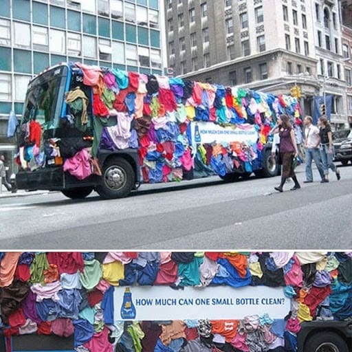
It certainly turned heads and got people talking. Who wouldn’t be intrigued when they see it on the street? We are just wondering if the bus was stationary or if it was plying its usual route. Also, what’s gonna happen when it rains?
Sit back and relax
DIY furniture giant Ikea advertised their chairs on a bus, and there was only one way to go about it. This is one of the ads that work only with proper window seat and placement. If this was on other parts of the bus, it wouldn’t look quite as nice.
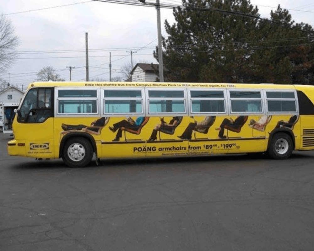
This ad will grab the attention of other drivers, passengers, and pedestrians, but the people on the bus won’t know that they have become Ikea endorsers during their commute. This doesn’t only make the ad funny; it also makes it memorable.
Pushing it too far?
Reverse psychology is defined as a technique that involves the assertion of a behavior or belief that is opposite of what one wants and when reverse psychology is used successfully in advertising, it can lead to great success.
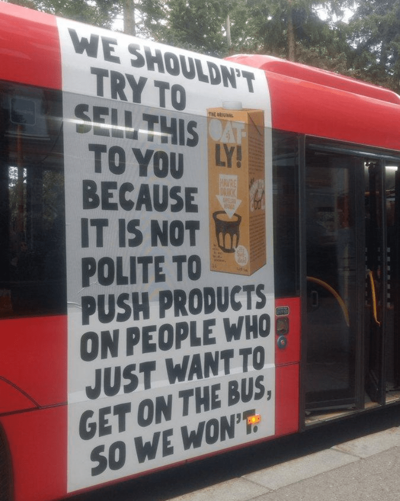
That’s what Oat-ly achieved with their bus ad that says they shouldn’t be pushing products to people who just want to get to and from work, school, and home, but they are doing it anyway. It got a lot of eyeballs, and we’re quite sure their sales went up too.
Smile, you’re on camera
There are many ways to make great use of bus spaces if you want to push products, and this camera bus ad has got the sweetest spot. It creatively uses the bus wheels by turning them into the lens of the camera. Who knew wheels and lenses look so much alike?
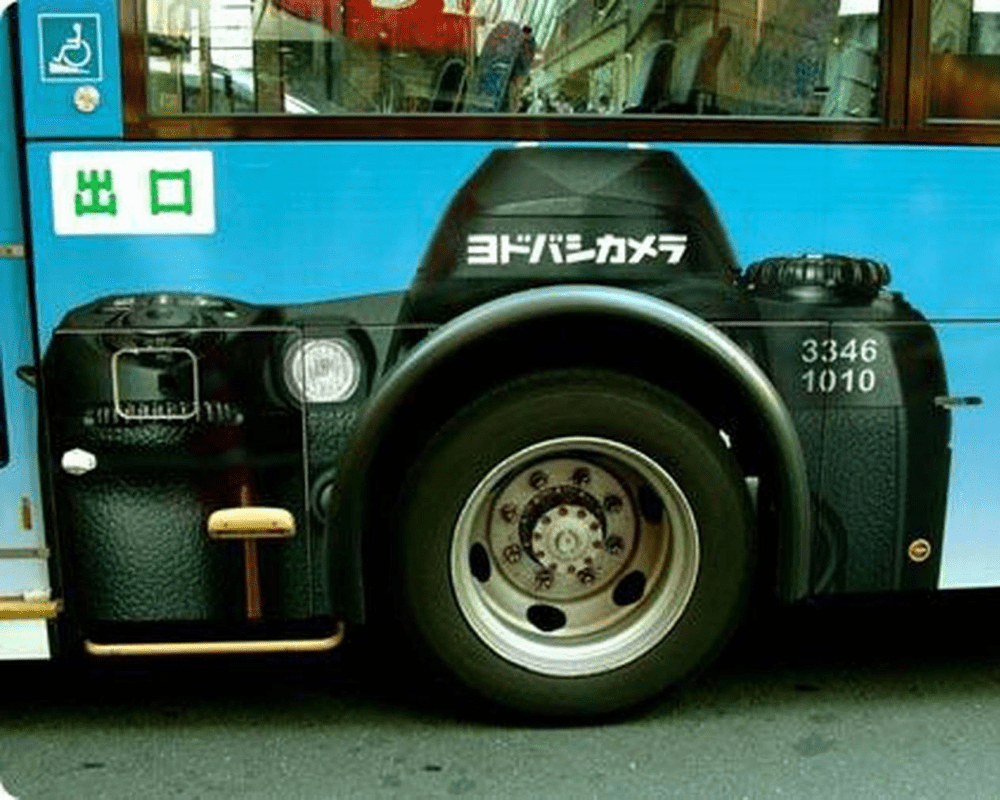
This proves that if you have the right designers and creative minds in your time, you can develop some of the most unique, talked-about, and creative campaigns that can push your product to the forefront and leave your competition in the dust.
The way to a shapely waist
Bus ads are excellent ways to make a statement, and they have an advantage that other types of ads don’t have. They get more eyeballs because they don’t just stay in one place. Depending on their route, thousands of people can see buses, which is good news for your promotion campaign.
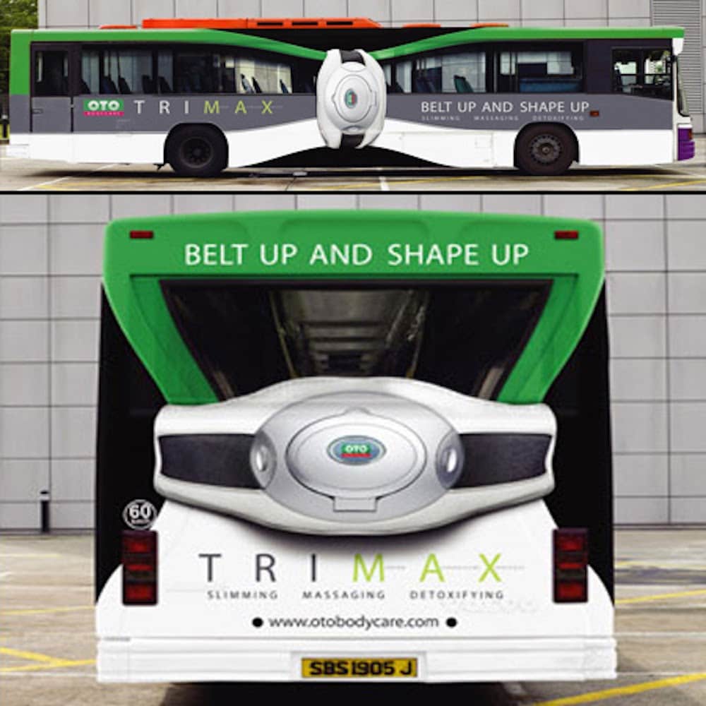
This bus ad for Trimax uses the back and sides of the bus to promote their slimming products. If you haven’t heard of them before, this will surely help with brand and product recognition. Instead of saying so many things, they are just showing a narrow waistline with a belt, and it gets the message across.
Skating on the bus
Another excellent example of incorporating the bus wheels in a bus ad is this work done for a competition called the Real Street X Games. We forgive those who do not or have skated before if they don’t know about this competition.
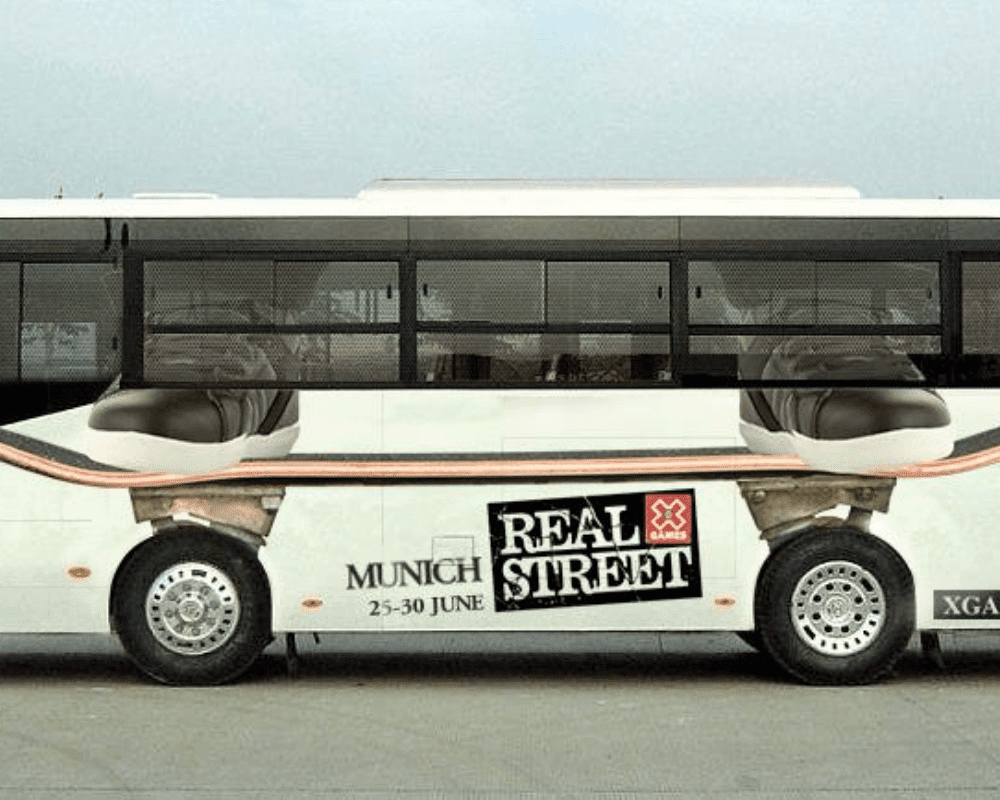
The ad is designed in such a way that the wheels of the bus also become the wheels of the skateboard. So, when the bus moves, it makes it appear that the skateboard is moving as well. This ad brings back many memories so excuse us for a bit while we get our dusty skateboards out for a spin.
No ifs ands or butts
Having a colonoscopy and having someone doing god knows what to your bum in the exam room can be daunting. Many of us are ashamed or afraid to go to the doctor for a colon and rectal exam, but it is something that must be done to ensure our well-being.
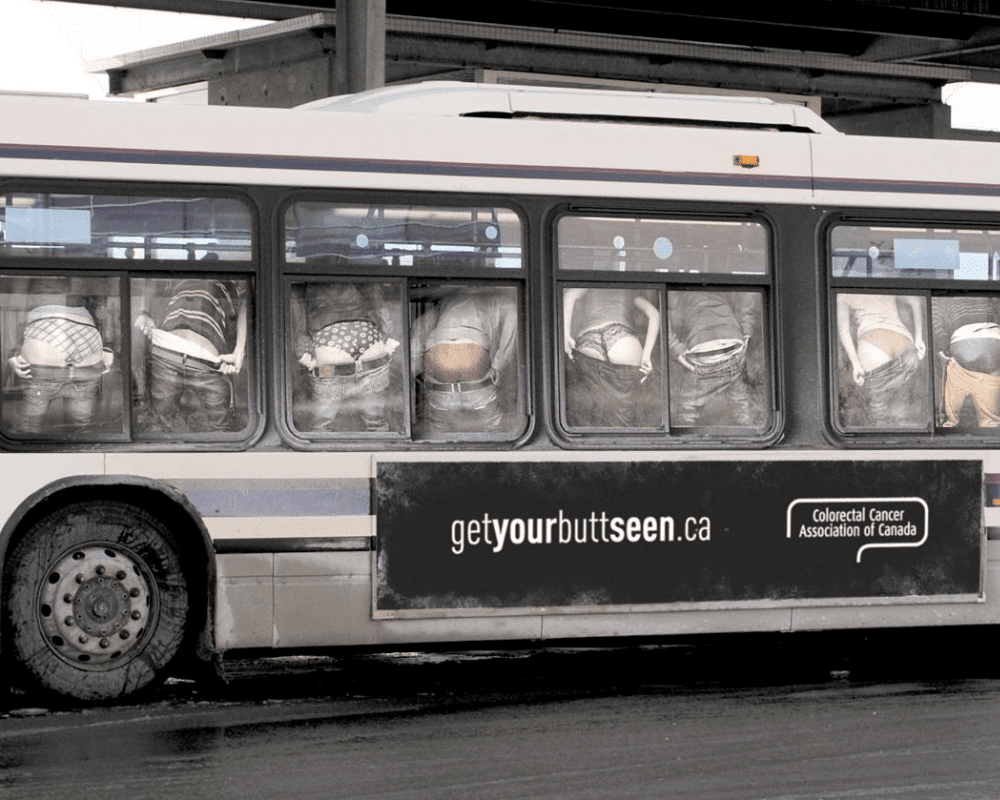
The Colorectal Association of Canada thought that they could encourage people to go see their doctor for colon and rectal cancer check-ups through a humorous campaign. The bus ad aims to dispel anxiety and embarrassment by telling people to get their butts seen. We’re ready to go see the doctor now, no ifs and butts.
Go nuts with The Peanuts
The Peanuts is one of the most popular comics ever, and plenty of us recognize the characters because they were part of our childhood. When The Peanuts Movie, an animated adaptation of the well-loved classics, was released, the company thought of advertising it on buses.
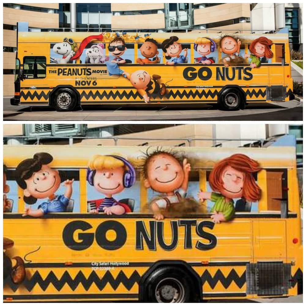
Since the characters are school-aged children, it made great sense to turn the bus into a school bus with the beloved characters on their way to school and having fun. We’d say it’s a great idea to drum up interest in the movie.
Bringing a bit of London to Norway
How do you entice people to book tickets with your airline when traveling to London? That must have been the question in the minds of the people at Norwegian.se Well, if there is one thing London is well-known for, it’s the city’s iconic red buses.
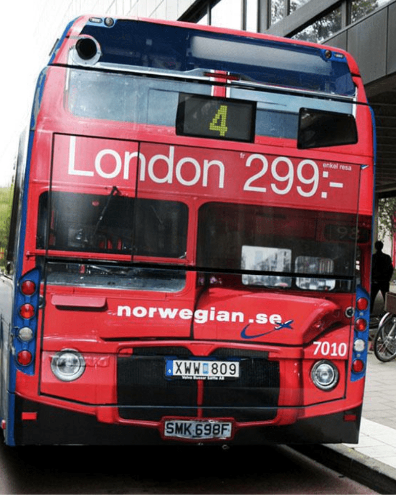
Although they couldn’t bring the original red buses from London, Norwegian came up with the next best thing, making local buses look like London buses by wrapping them in red complete with London ads and plate numbers. This makes us want to hop on a flight to London right now.
