Hidden Histories: 40 Familiar Symbols That Hold Untold Tales
Symbols and logos have something in common: they are created to communicate an idea or message to an audience. Some are obvious and simple, while others are challenging to decipher, with subtle nuances and hidden meanings. Designers sometimes use veiled messages to communicate things, from clever wordplay to unnoticeable imagery. Most of you are familiar with the items on this list. You see them every day or use them so often that you no longer pay much attention to them. Have you ever wondered if the colors on barber poles were randomly chosen and what the numbers and letters on the labels of beauty products mean? Get ready to dive deep and uncover the hidden meanings of many of today’s most popular brand logos and symbols.
US pennies
Seeing your face on a currency is a pointer that you’ve made it and have become a legend – somewhat. The penny, which isn’t used much anymore, has carried the face of former US president Abraham Lincoln since 1908. Have you ever wondered who created the portrait?
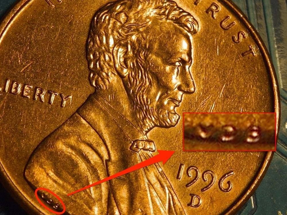
Well, let’s give the audience what they want already. The portrait credit goes to Victor David Brenner. The initials V.D.B. on Lincoln’s shoulder say it all. Victor engraved his initials on all his works at the US Mint so he could be remembered forever.
FedEx
Do you know that our favorite delivery company has a hidden symbol in its logo? The company, which is known to make deliveries easier and available to millions of people, started back in 1971. Back then, they could only deliver a few parcels daily.
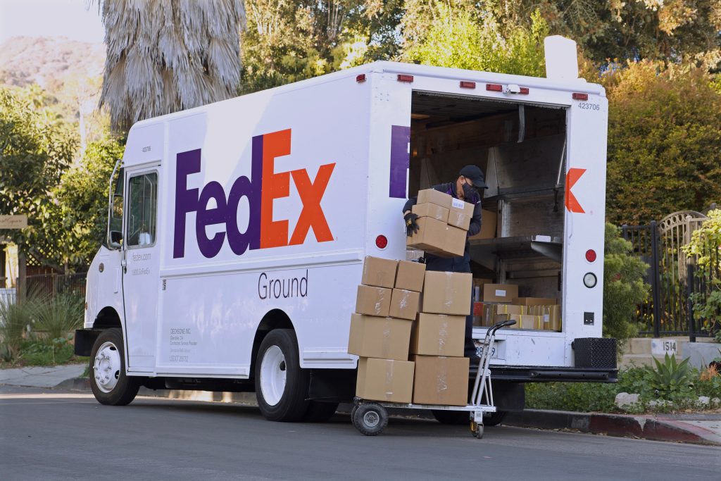
In 1994, the company’s name was Federal Express, but it was shortened to FedEx. Their logo has a hidden arrow between the X and the E. The arrow is meant to signify their speed and accuracy. Also, the color of the “Ex” differs, depending on the branch- FedEx express or freight.
Coca-Cola’s Polar bear
This glorious soda often quenches our thirst and always leaves us wanting more. Well, a pharmacist created it but it kicked off when John S. Pemberton, the founder, died. After his death, Asa Griggs Candler had to step in at the helm of affairs.
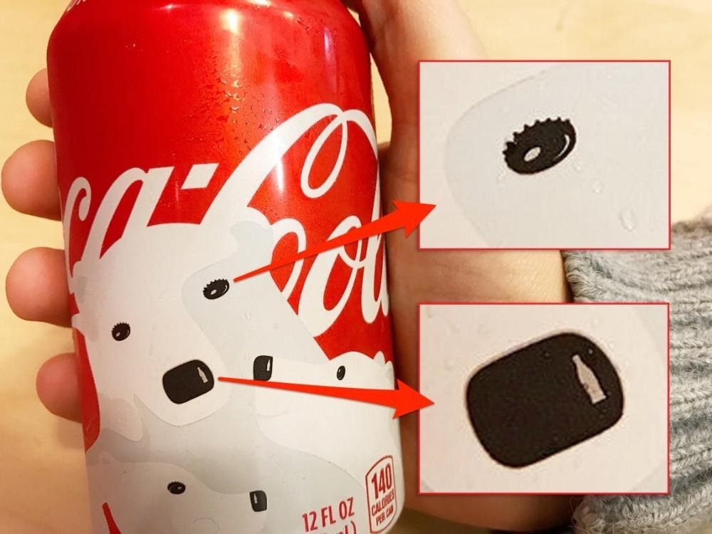
He gave out free servings to people and was confident they would come back. And come back, they did with more referrals because Coca-cola has always been delicious. If you look at this can, you can see the bear’s eyes are made from bottle caps, and the shine on its nose is a bottle.
NBC logo
Because of the shape and color scheme of the company’s logo, NBC has often been referred to as the “peacock network.” Once a radio broadcasting network, it’s the oldest television station. However, most of the symbols they used didn’t last long until they took to the small screen.
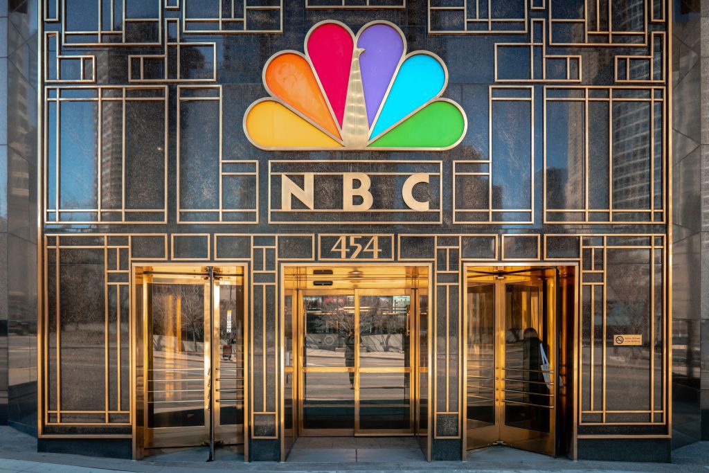
The logo first came to light in 1956 and was finalized as the permanent logo in 1986. It is good that they chose the “peacock” logo since they are the most colorful (i.e. popular) of all the older networks.
Barber poles
Barbershop poles have been in existence for several decades. The number of locations was few, and we had barber surgeons. That means you could get a haircut and surgical procedure simultaneously, and barbers had to be experts in both professions.
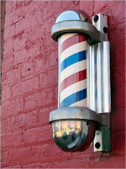
Because most people couldn’t read or write, they used other things to express themselves, like the colors of the barber pole. The red represents bloodletting or oxygenated blood, white stands for bandages, and blue is deoxygenated or arterial blood.
Hershey’s kisses
In truth, most of us love Hershey’s Kisses because they are super delicious candy. The many flavors have made them a hit among the world’s populace. But, surprisingly, there are things you might not have noticed at first glance.
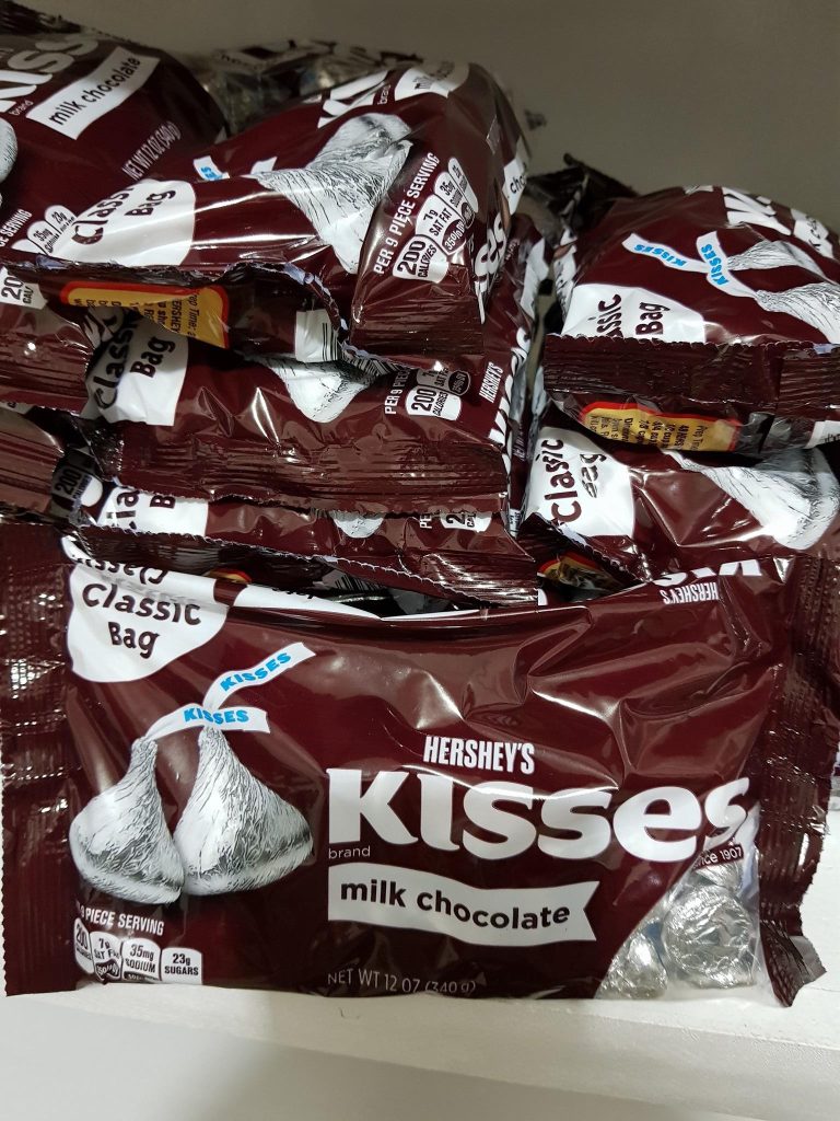
Notice the space between the K and the I; if you pay attention, there’s an extra brown space there. It means there is an extra Hershey’s Kiss just for you. Now, you should be able to miss out on yours!
Beauty products have strange symbols
Because there are so many beauty products available, it can be overwhelming to try to figure out where to begin looking for the right product. After finding what you need, here’s a tip to keep you satisfied with your choice.
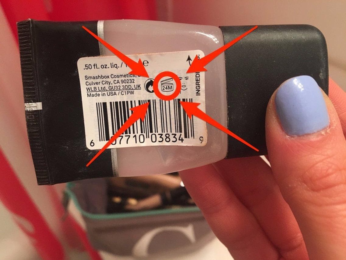
This picture shows you how long the product stays good after being opened. This information is in the PAO (Period After Opening) on every product, just like here. This is handy and helps make sure you’re not using expired products.
Gillette’s logo
Logos are essential to a brand, so creating just the right one could take time. It needs to be simple and give a subtle (but clear) hint to what it symbolizes. Gillette has done justice to that idea and created a great design.
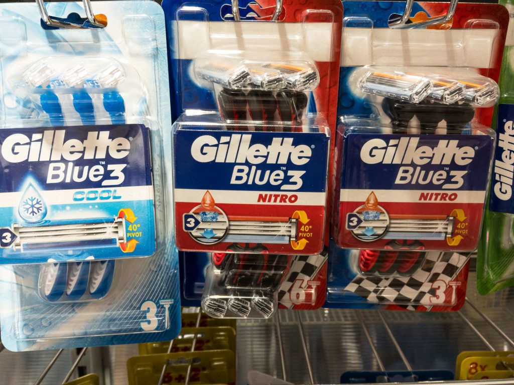
Their razors, one of their top-selling products, give a really nice clean shave, better than any razor (so they say). One can be sure of this at first glance since Gillette’s blades are sharp enough to cut through its letters – peep the G and I.
The Beats’ logo
Some logos seem to take authority, and Beats is not left out. Founded by rap mogul Dr. Dre, he later sold the company to tech behemoth Apple. The name “Beats” came from – you guessed it – the beat of the music, and it keeps music lovers satisfied and bouncing.
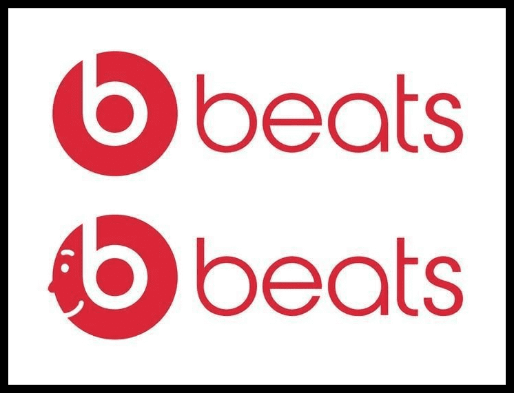
It seems elementary, with just a b, as seen in the name, but there is a picture hidden in this popular product’s logo. The headphone’s design looks like a cheerful person wearing the product. That smile is something you can find on its users’ faces.
Northwest Airlines
When you take a quick look at the logo of Northwest Airlines, you may feel it is an N in a circle and has little to no meaning. But if you look at the airline’s symbol in detail, you’ll discover some key facts.

The N represents the North, and the arrows point towards the northwest. Founded in 1926, Northwest Airlines was a standalone organization for several years. Then, in 2008, it merged with Delta Airlines, which made it the company you know today.
Subway logo
Many of us have pulled over to grab a quick bite at a fast-food chain at one time or another. Thankfully, Subway has made it easier. However, the only downside is that no nuggets or burgers are available. This might be some people’s nightmare.
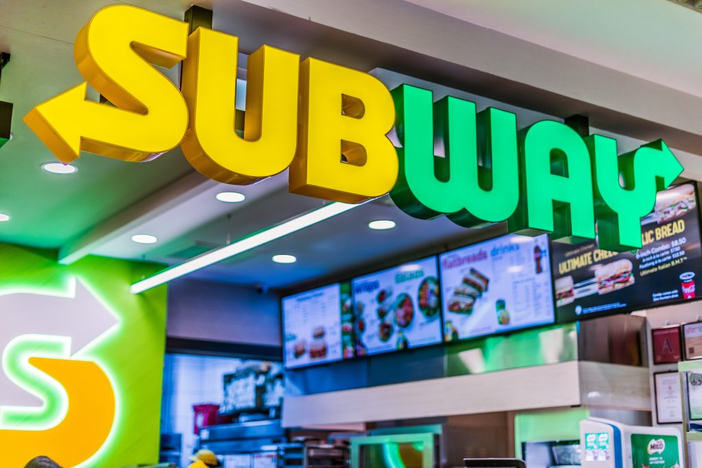
But others have fallen for the chain. Also, the arrow on the first and last letters, S and Y, help show the restaurant’s entrance and exit. So you only have to walk through those doors and embrace your mouth-watering sandwich.
Different colors of bread ties
You are what you eat! Anyone who has come to agree with this statement knows that they ought to eat healthily. So, it may be good to let you know about the bread tie system that uses colors. Hardly anyone knows about this.
Without looking at the date, you could go by these little tags to know if the bread is still pretty fresh. Each day has different colors — blue for Monday, green for Tuesday, and so on. People guessed that the system works for only some states.
Coca-Cola’s coincidence
The O in the Coca-Cola logo is similar to those in our grade school handwriting classes. Who knows, maybe Coca-Cola wanted to add a little spice to the writing of its name. It turns out their idea to use cursive was super successful.
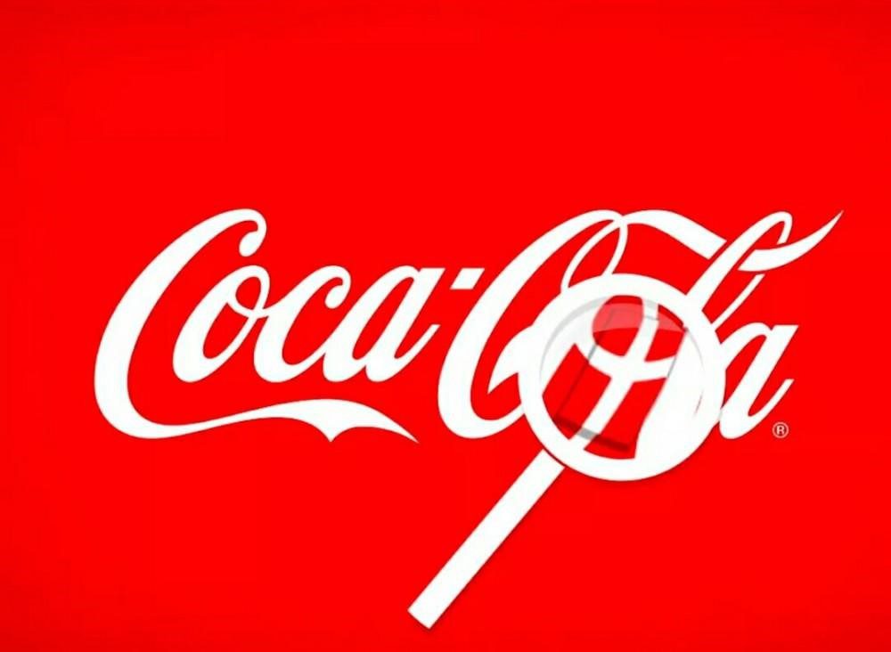
Another exciting thing about this is that the O forms a cross with the C, which makes it look like the flag of the happy country, Denmark. Being smart enough, the company took this as an advantage and welcomed people with flags at the country’s busiest airport.
The secret in Amazon’s logo
Did you know that Amazon was once an online bookstore? They expanded to sell virtually everything under the sun in a span of four short years following its establishment. The logo was created in 2000 and has stuck since day one.
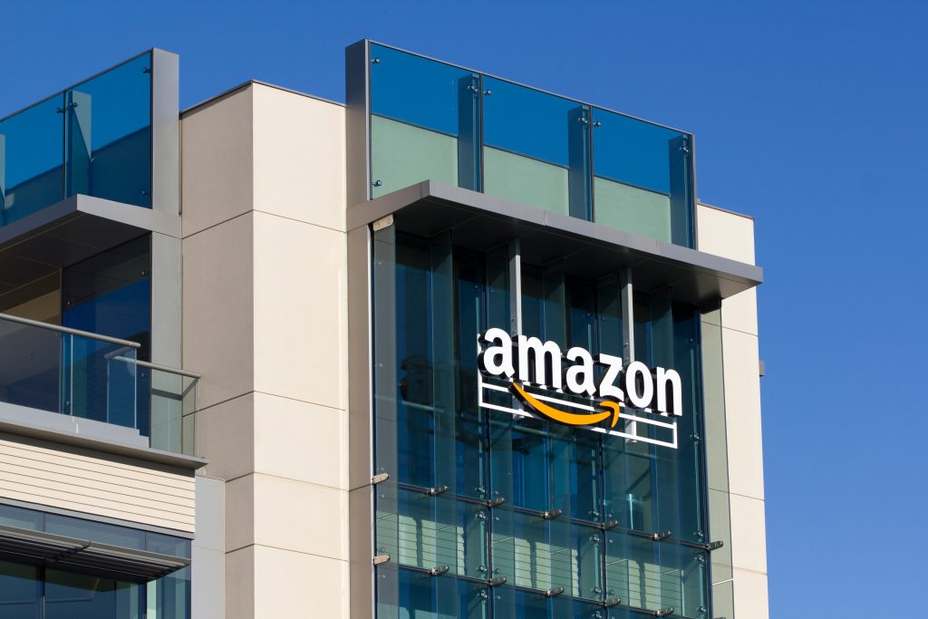
The yellow curve under its name represents a customer’s smile, which shows satisfaction. If you notice, the points of the grin link the A to the Z in “Amazon,” meaning that you can find and buy anything from A to Z.
Unilever’s symbols
At first glance, the Unilever logo seems like a simple but pretty U, right? However, we realized that one letter contains smaller symbols in it when we look closer. There are 25 symbols altogether, and each one represents something significant.
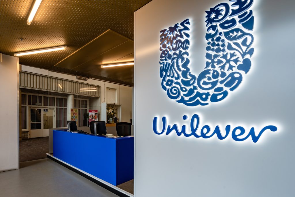
The ice cream symbolizes treats and pleasure, and the lips symbolize communication and openness. Its unassuming but intricate design makes this one of the most impressive logos on this list. We never looked twice before learning this tidbit of info.
Eight of diamonds
In 2018, a social media user severely shocked everyone when he revealed a secret concerning the eight of diamonds card. A number lies hidden there between the shapes. Yep, you guessed right, it’s the number 8. What an incredible discovery.
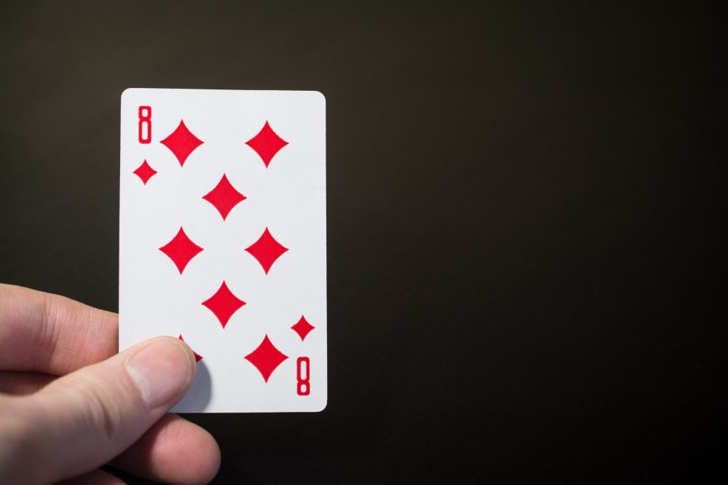
Most of us have played with cards for several years; we never saw it. Due to this discovery, some people also checked other cards to see if they had similar hidden features. However, it seems like eight of diamonds card alone bears such a feature.
Hyundai logo
Many of us still love Hyundai even though it is not the most popular car manufacturing company. Since 1967, it has been in business and has ranked pretty high when it comes to quality. In 2005, the company began trading in the US.
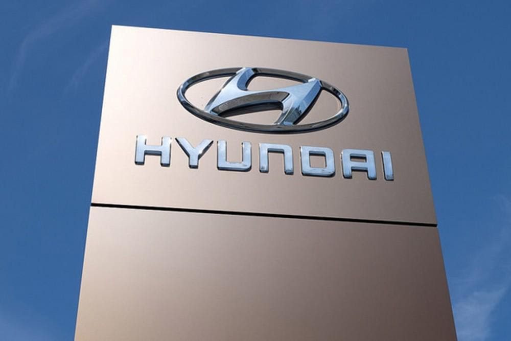
The big H on the logo has a cool, hidden meaning. You can see it is the letter H, of course. That’s the obvious part. But why would it be designed so wonky? Because it is the silhouette of two people shaking hands.
The power button
Many things seem to go unnoticed by people, us included. The power button on our laptops seems just to blend in. We never looked deeply at it, and expect you haven’t either. Just to let you know, a lot of effort went into making this one sign.
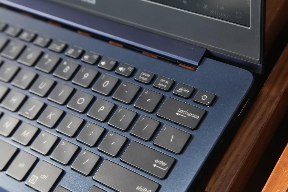
The sign gives the impression of an O and a little number one in the middle, right? Thanks to the binary system, it is now more explanatory. Zero means that something is off, and One means on. The power button, therefore, means “standby power state,” as it is never totally off when pushed.
The Truth in Le Tour de France’s logo
The fittest and best cyclists from across the globe all come together to compete in this famous bike race. So many athletes spend their entire career training for this, and it is indeed a tremendous honor to emerge as the winner.
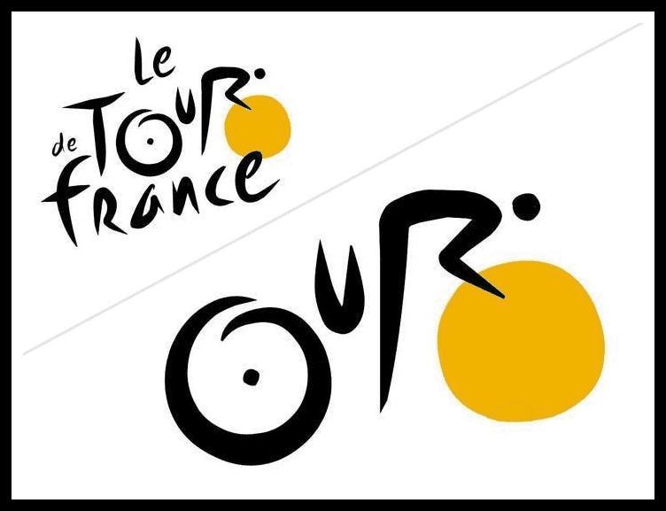
There is a perfect little picture hidden within. You can see it in the “our” in “tour.” Do you see it? The O is a bicycle wheel. This has to be one of the most adorable logos we have seen.
More about the Falcon’s logo
The Atlanta Falcons’ logo looks like its namesake bird. Go figure. But the designer dug deep into the creative bag with this one. This falcon has its eyes on the prize – just like the Falcons team. The falcon in the logo forms the shape of an F.
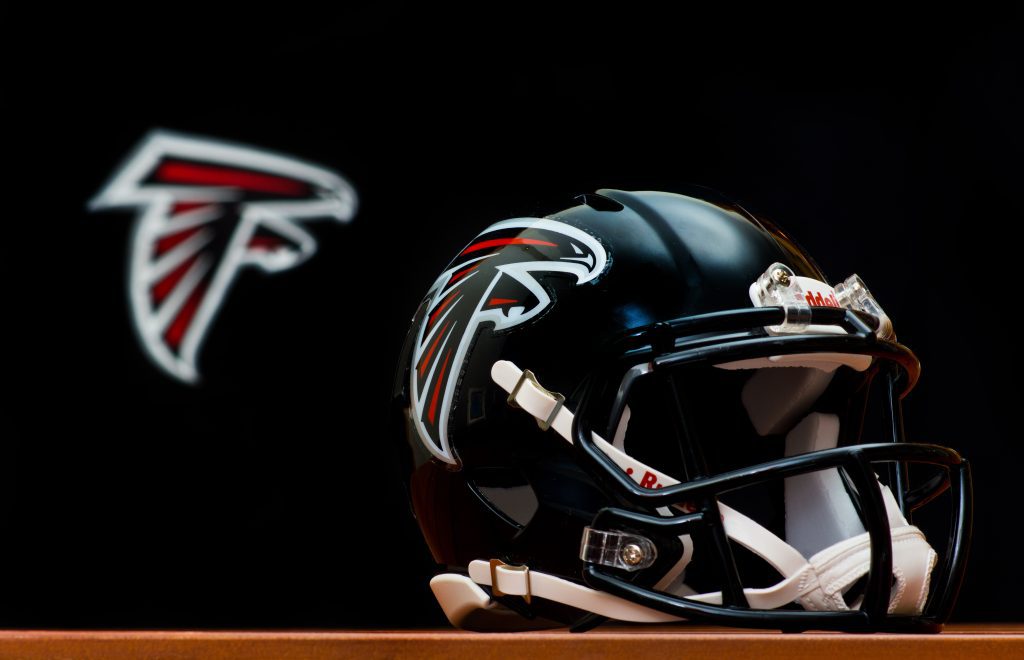
The team has played very hard and kept their spirit alive for years now. The logo has been seen on the field, along with their helmets, all the way back since the team’s founding. The team released a white helmet back in 1974, but they’ve never worn it.
The BMW logo
The BMW logo looks like a blue and white checker’s wheel. But in 2010, the New York Times reported that the belief that this was the origin of the logo was a myth. In 1929, a decade after BMWs hit the market, they tried the design on two aircraft.
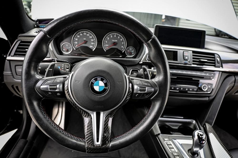
Over the years, many people have researched BMW’s logo history, Dr. Triebel being one of them. After much research, he and some others have decided that the logo’s colors were motivated by the colors of the state of Bavaria, the company’s birthplace.
Tasty Tostito
We love our salsa and cheese dip. We take time to find our favorite chips and salsa based on the flavor and price. And honestly, we don’t take much time to appreciate the design of the brands we love the most or how that influences our love for the product.
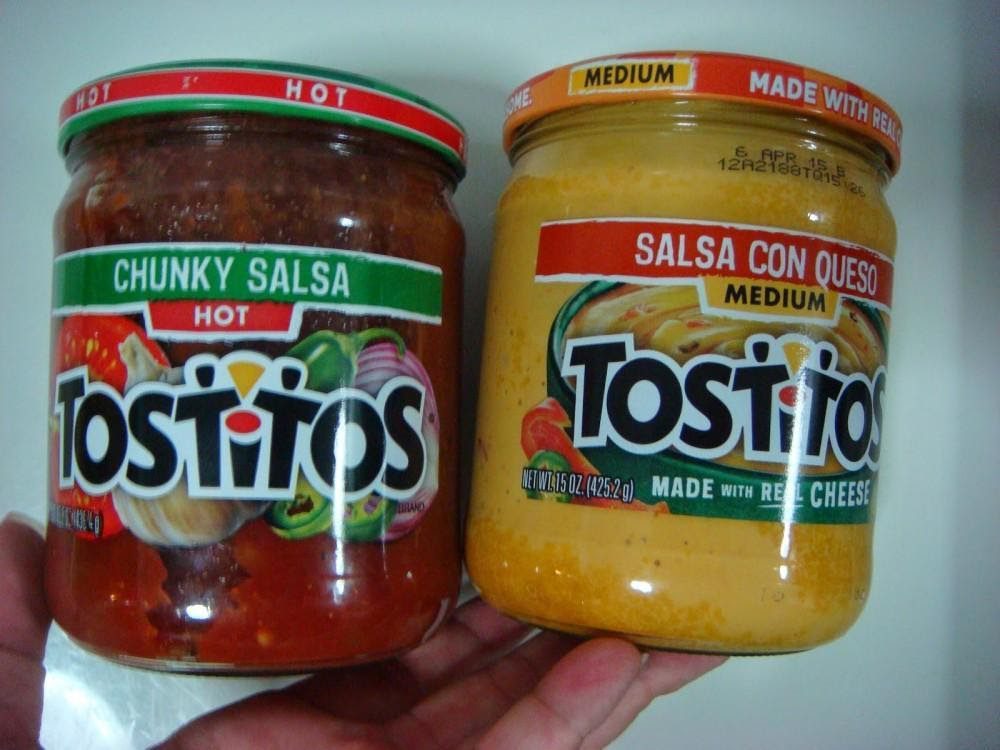
Both T’s in the middle of its name are two people with dots as their heads. Yep, the yellow color signifies the chips that they are sharing, and the red color, which is the dotting on the I, signifies the bowl of salsa.
King of Hearts’ lost mustache
Next time you play cards, observe the king of hearts, and you’ll notice he’s the only king without a mustache. There is a reason for this. Some time ago, cards were printed using wooden blocks. It means that the designs are carved out before they are printed carefully on the cards.
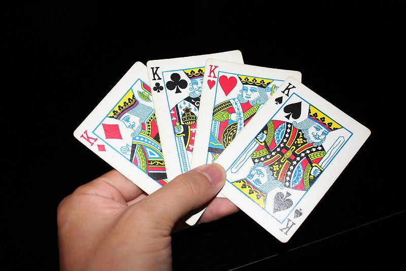
So it was thought perhaps that unskilled workers mishandled the image and lost the king’s mustache. The king is meant to carry an ax and resemble Charles the Great, but this was also not done well. As we see it today, there is only a sword in the image that looks like it passed through the king’s head.
All in one Toyota
People have different guesses as to what the Toyota logo stands for. To some, it’s a cowboy wearing a hat, even though the brand is Japanese. That’s why that isn’t the case. Instead, it’s two elliptical shapes interlocked, representing two hearts uniting (product and customer).
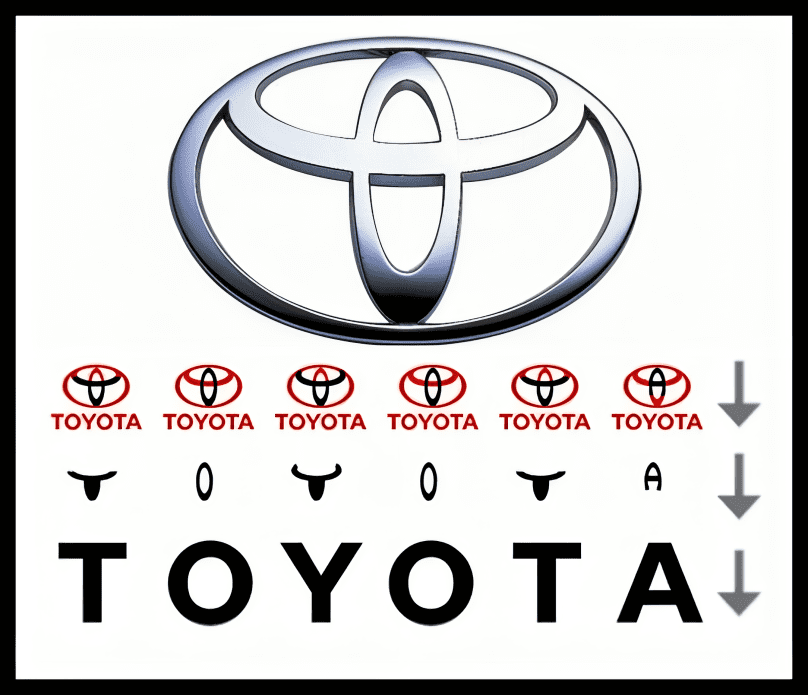
Also, every letter in TOYOTA can be spelled out using the logo. This is indeed a beautiful way to combine letters all in one logo. So, next time you see a Toyota vehicle, imagine how far the company has come.
Wendy’s
Wendy’s is a champion in the fast-food world, at least in our eyes. While others try experimenting with new flavors, Wendy’s often sticks to classics we love. Our beloved Frosty has stayed with the establishment from the start.
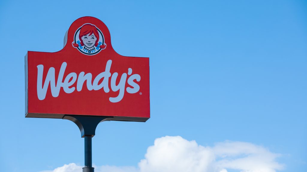
Check out the sign; you’ll notice the word “mom” on her collar. This tells us that their meals are made with the same love and care as a mother would take. This is a customer-created myth, but we love it anyway.
Bluetooth symbol
We have become familiar with the Bluetooth symbol to a good extent. Who knew technology and Vikings were so compatible? It allows us to transfer data wirelessly and jam to our music without the burden of wires. Jim Kardach was researching Vikings (for fun) while the team was working on the tech.
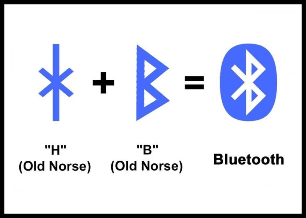
From the book, he learned that King Harald was also nicknamed Blue Tooth, and no one knows why. Some guesses that he loved blueberries. Jim suggested the name, and it just somehow fit. The logo was taken from the Vikings’ alphabet. It forms the king’s initials, HB.
Baskin-Robbins logo
A good percentage of us love ice cream. Back in 1953, Burt Baskin and Irv Robbins worked on each of their ice cream companies and recipes before they decided to unite and form one giant brand called Baskin-Robbins. Suddenly, they had 31 flavors on the menu.
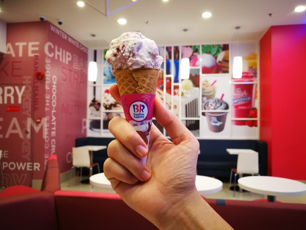
This was rare at the time, and so Baskin-Robbins wanted to brag about it. They incorporated the classic number into their logo after using it on their storefront signs for many years. We think this is design at its peak.
The Apple’s bite
Many stories have been told concerning the design of Apple’s logo. Rob Yanov, the designer, came to the limelight after creating the logo. He started by buying a bag of apples. Rob wanted to create a simple yet outstanding image, so he began working.
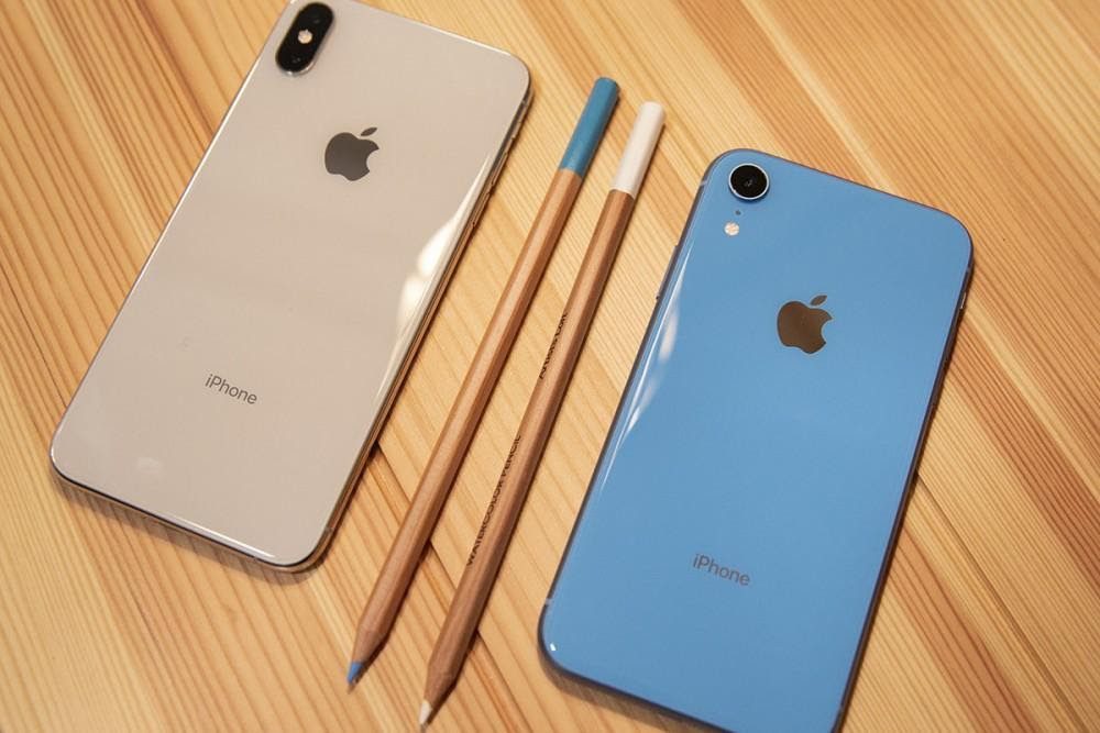
Then, he had a major epiphany. “Byte” and “bite” sounded too alike to miss the opportunity, and Rob added a bite to the design. Monochrome colors were later used as the final touch, and the globally recognized symbol was born.
Pepsi’s logo
It can be hard to imagine that Pepsi spent millions of dollars to create its logo. However, it later seemed worth it due to the fierce competition in the market at that time. They used their logo’s colors, red, white, and blue, to show pride in the US.
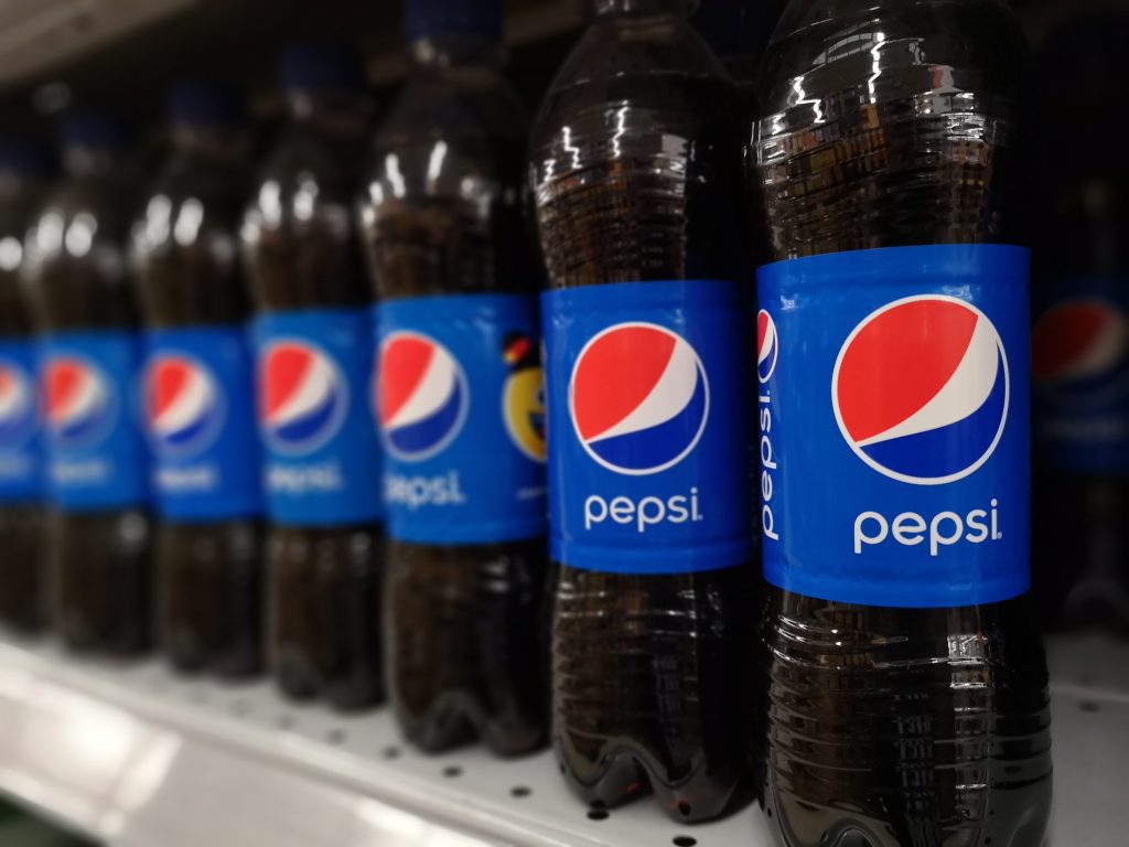
This logo was revealed in World War II. Reports also said the logo also stands for Pythagoras geodynamics, theory of relativity, and the expansion of the universe, among others. It was said that these reports were aimed at pulling people to their products.
More about a Jeep
Jeeps are known for their incredible performance. After all, they don’t usually get stuck, even in the stickiest of places. Some have Jeeps as a fashion statement, while others use them to go off-road. The thought put into this particular design had us in awe.
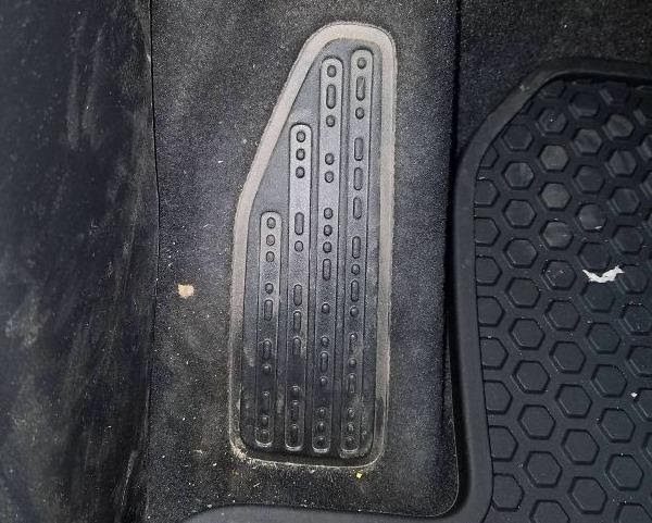
Someone noticed a patterned Morse code on their footrest, or that’s what they thought it was. When it was looked into, they realized the Morse code marks essentially stand for “sand, snow, rivers, rock.” Some discoveries can indeed make one thirsty for more details.
Hidden bear in Toblerone’s logo
Toblerone is a go-to sweet treat for travelers all over the world. (What is it about traveling that has the special power of making us want to munch on constant snacks?) It turns out there has been a bear on the packages all this while.
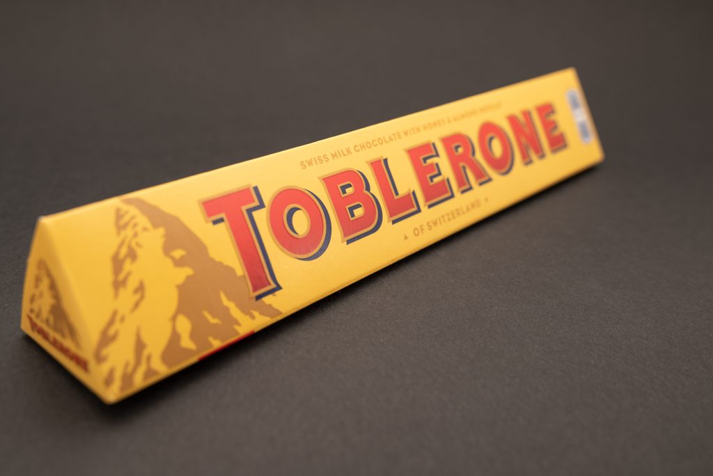
You might have never paid more attention than noticing the mountain if you are like us. The hometown of the chocolate, Bern, has a bear on its coat of arms. So, the candy’s origins are honored right there in their logo.
Goodwill’s smiling logo
Over the years, thrift stores have made all kinds of things available for people. The best and most unique Halloween costumes, coincidental matches to incomplete inherited sets of dishes. And, of course, we can’t forget to mention the creepy dolls.
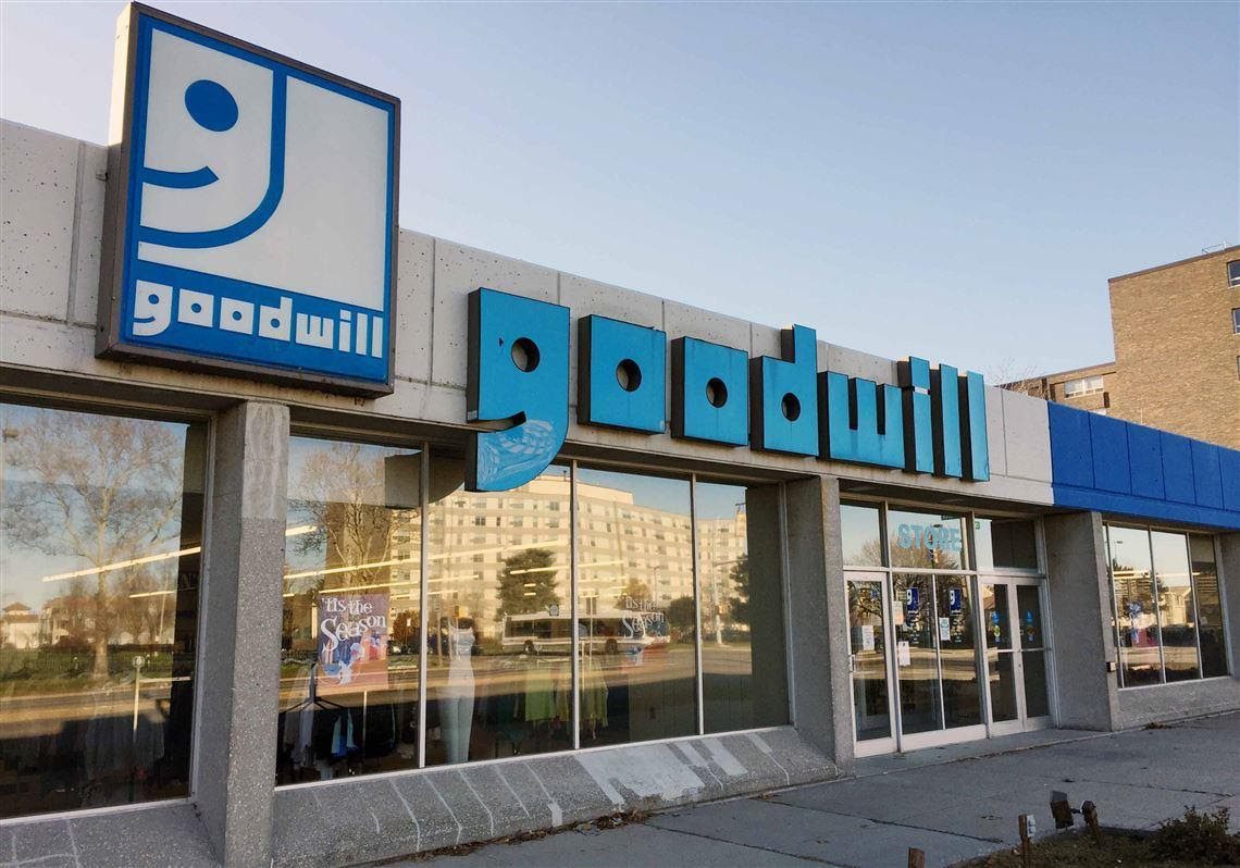
Helping people makes us feel very good. That must be exactly why the logo is a happy, smiling face. Looking closely, you will notice that the G in the name is a smaller smiling face. It does fit the name perfectly.
The similitude of the Stardust casino logo
Some casinos have become iconic and famous over the years, and the Stardust casino is one of them. It was a great place to have a fantastic time. But in 2006, its doors were shut for good, leaving people with their memories.
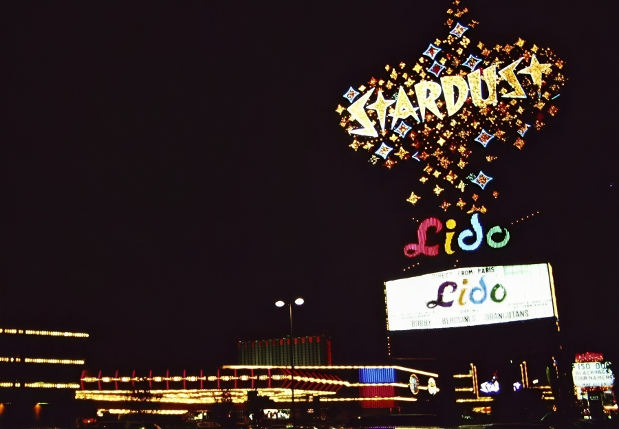
Back in the 1950s, the Nevada Test Site was established. This site gave the military a place to openly test nuclear weapons, which made people around there used to seeing mushroom-like clouds. This activity influenced the Stardust’s bursting logo.
Sony Vaio logo
The market is currently filled with plenty of electronics, making it difficult to find the right thing when you need something new. That’s why most companies use their logo to attract people to buy their products; some of these logos hold some hidden truths.
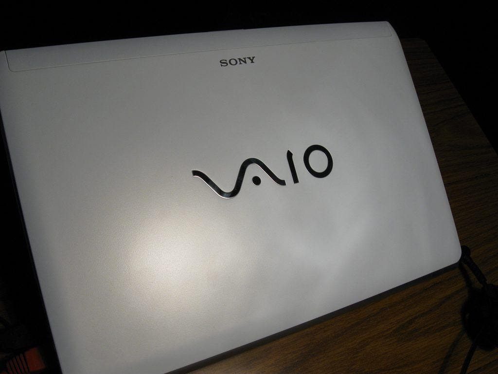
This company designs phones and laptops, and a lot of brainstorming went into creating the logo. The VA on the logo represents an analog symbol, while the IO is a digital sign. Merging the two, we now get the full name “VAIO.”
Pinterest’s logo
Social media sites have a unique way of allowing people to interact and share ideas. However, Pinterest adds more spice to our surfing. It allows users to “pin” ideas they like to their virtual vision boards. If you’ve browsed it, you’ll have seen thousands of ideas.
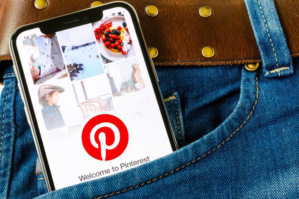
The launch of the website didn’t meet the expectations of the creators. After the app was created, it finally became popular and has since exploded. Over time, the founders settled for P as the logo – which looks like a pushpin.
Toothpaste tubes
We know that toothpaste is for brushing our teeth. Naturally, therefore, we barely spend time noticing the lines on the tubes. However, somewhere in your brain, you registered the colored stripe. It’s not for decoration purposes, but it has an important role.
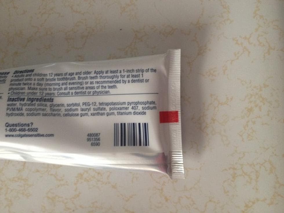
It is a code that shows what ingredients were used without the need to read the whole label. Essentially, red means it is natural compositions and chemicals, and black means it is purely chemicals, to mention a few. We honestly never put any thought into this. What a revelation!
Lady Liberty’s crown
So much history surrounds Lady Liberty. Since 1886, she has confidently stood in New York Harbor. It was gifted to Grover Cleveland, former President, by France to mark its 100th anniversary of independence. It took 214 crates to ship the statue. Now, she stands at 305 feet and one inch tall.
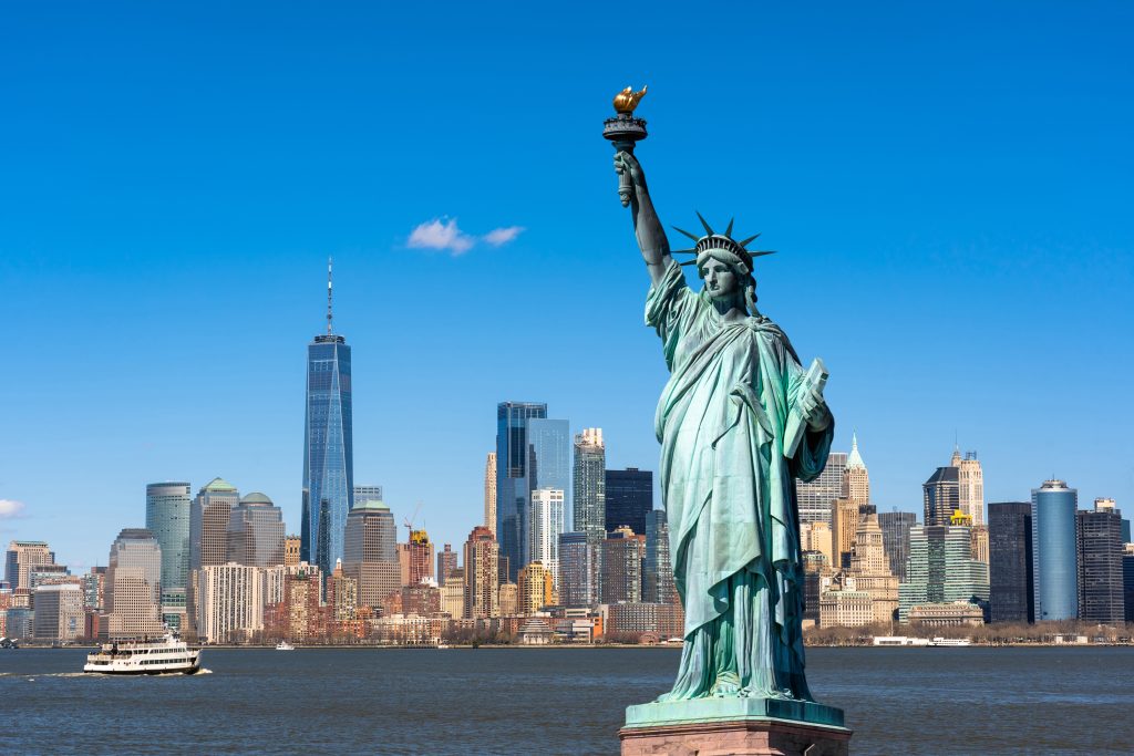
It attracts around 3.5 million visitors a year. So, it means a good percentage of people have observed the crown she has on her head. It has seven spikes around it, and it’s believed to represent each of the world’s seven continents.
Paramount picture’s stars
Over the years, Paramount Pictures has been one of the many film studios producing major hits. The studio produced the likes of Forest Gump and Saving Private Ryan. When it first emerged in Hollywood, Paramount Pictures had 24 stars in its logo.
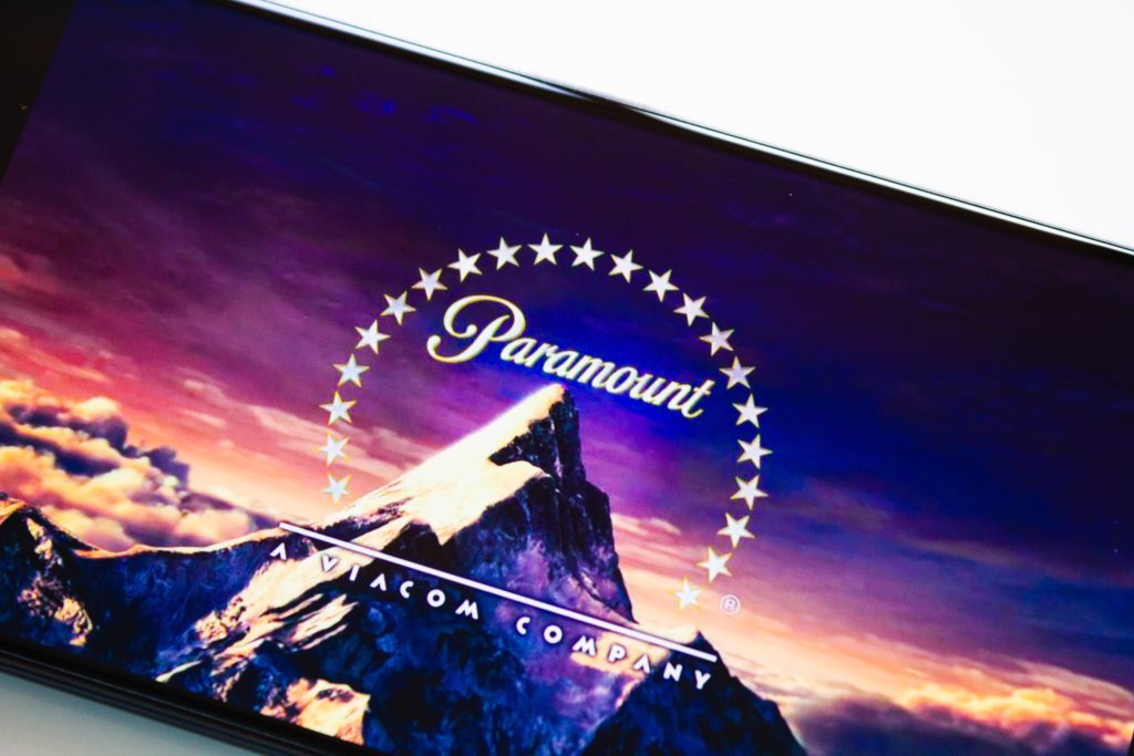
At that time, each star represented an actor they signed to their studio. The company is now well-known across the world. In the 1970s, after changing the logo, it had only 22 stars, with no one knowing what happened to the other two stars.
USB symbol
We are surrounded by technology nowadays because the world has evolved to become a global village. It could be a part of your job or hobby. The point is we’ve seen a USB or two. USB symbols are found on everything, from computers to phone chargers and everything between. But did you know, Neptune’s trident was what inspired the symbol?
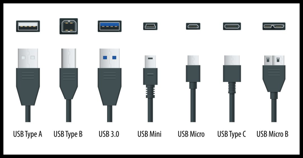
The trident signifies power, and that’s just what we look for in USB. The shapes also have their own meaning. The square represents ground voltage, the circle stands for five voltages (5), and the arrow represents serial bits or data.
Gas gauge
Several responsibilities come with owning a car. Being a licensed driver with your own vehicle is not about zooming off into the sunset whenever you like. Checking the tires, fuel level, and anything else that might be going wrong is essential.
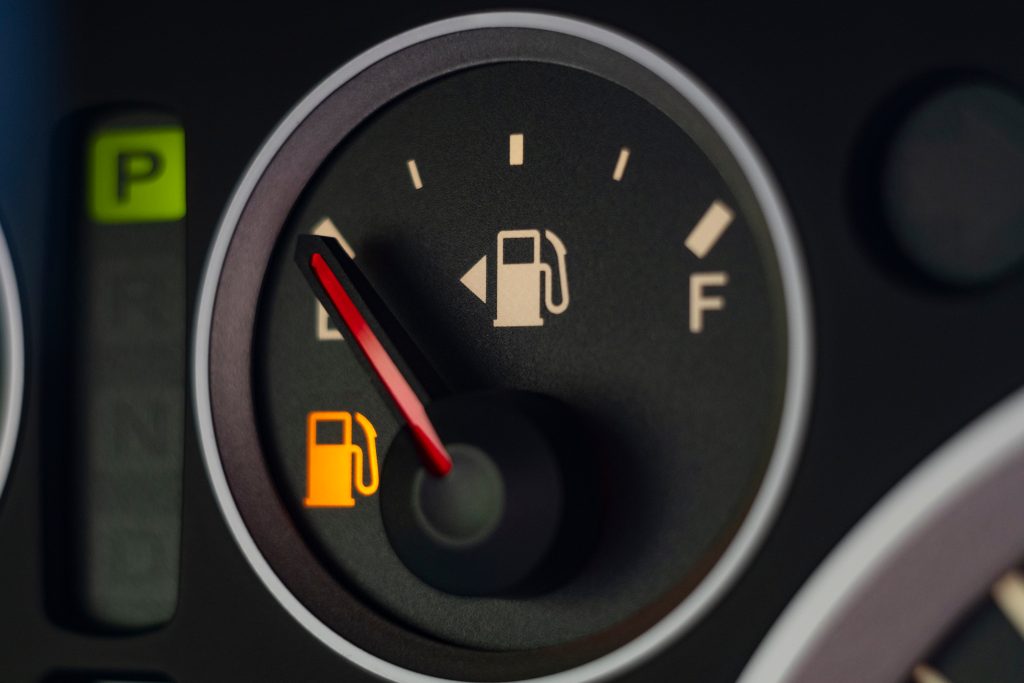
After several trips to the gas station, there’s every chance you can forget which side of the car has the filler cap. Relax, you can find that out quickly. All you need to do is check where the arrow on the fuel gauge points.